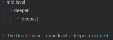
I heavily agree with having more documentation for RemNote’s customizability.
Regarding cleanup and more user-friendly/powerful interfaces, here is a summary:
Custom CSS
Here is a list of suggested markup changes I wrote over the time:
-
[Poll] Should we further improve the markup? quite old poll and discussion about this topic.
-
Custom Rem-level formatting with tags still contains a few general issues I have with the markup. More specific suggestions are in:
-
Guide: data attributes contains
data attribute related improvements.
-
WIP: Stable Markup: Show Tags incomplete post about a general Custom CSS problem I see: Some small UI elements (e.g. tags buttons, toggleButton) should always be present in the DOM, and just hidden with
display: none when not hovered. This would 1. leave people more options for customization (e.g. always show the toggle button for all pages on the rem) and 2. allow easier inspection with DevTools without pausing JavaScript execution with F8.
-
Community Project: Modular CSS Theme This could be used to document selectors and show their usage live and in action and provide a repository of snippets to copy, remix and further customize into own styles.
- I planned publish some dev helpers with a similar intention on the Library as well.
Some thoughts about a more long term UI refactoring. (Note: I’m not saying that these things are correct and this is how it should be done. It’s very likely that I just have no idea how things work. These are just some ideas to discuss and possibly throw out the window.):
- There are a handful of good themes linked on awesome-remnote. We should make sure they continue working as best as possible, e.g. by providing a migration guide documenting the changes (this was well done in the November 2020 udpate) or manpower from the community or the dev team themselves.
- I personally can make sure everything (I published) on the Library works. I intentionally kept the number of published styles scroll for that reason. I have planned a number of additional metadata like compatible RemNote version, and a
featured/official flag indicating long term support which would it make easier for me to just upload more experimental stuff. This rework should be incentive for me to finally implement automatic version checking or even automatic updating.
- I’m not sure if there is a semi-automatic way to do this. Eg. dumping the html before and after an update and check if the selectors of a theme still select the correct elements. But most likely this is totally overengineered and not very valuably spent resources.
- One must-have for a Custom CSS friendly design is a consistent naming scheme and almost flat, class only selectors.
- Consistent naming is mostly for my OCD, but also useful for writing CSS from memory. Apart from that just looks like good practise and high quality software.
- Flat selectors make styling more predictable and you don’t need to check the Styles panel of Devtools frequently to see if you need to prepend another
#hierarchy-editor to have a high enough priority. It keeps selector chains short, easy to understand and maintainable. Roam does this well with their .rm-* classes.
- I think some component-local nesting is acceptable, e.g.
.search-result__container .item, but then you could also just use .search-result__item.
- Last I heard Roam was being reworking to BEM I think. Maybe there are some lessons learned from their process already.
- Make sure to name every semantically relevant item with a class. There are quite a few cases in the Library where elaborate
:nth-child chains are required. I feel these are especially fragile.
- If I understood correctly currently RemNote uses a single large, nested, manually written SCSS plus some Semantic UI components. Flattening the manually written styles out using unique class names (e.g. by using BEM) could become hard to manage (i.e. requiring much developer discipline to keep consistent). Besides BEM and similar CSS conventions there are other technologies/organizational approaches to consider:
- A utility-first CSS framework like TailwindCSS
- CSS in JS like Styled Components or Emotion
- In both cases the styles would be applied by a set of single classes which are easy to overwrite.
- The semantic classes to name components would not necessarily contain any styles at all then. They are just there to identify a UI element to let it be targeted by Custom CSS.
- They are easier to maintain than a large CSS file because styles can be locally defined on the component. (Again, I don’t know what RemNote does internally. Might be that this is already the case.)
Plugins and User Scripts
Plugins were less of my focus lately. My next goal on this front is to make a simple slider plugin that simply renders and updates some children’s content. I’d personally favor a github template + a workflow to github pages here though glitch can do the same with remixing and a project being automatically hosted.
Discord@panopticon’s Table plugin (GitHub - samuelnunoo/RemTable) also pioneers some novel patterns like storing plugin settings and runtime data on a dedicated page. I think this should also be supported by the API directly at some point.
For better integrated plugins see
Obsidian’s API can function as a role model here:
- Nicely documented TypeScript API installable with NPM
- Allows creation of all kinds of UI elements like toolbar buttons and settings dialogs
A global interface to savely insert data into the IndexedDB and to paste text into the rich text editor could enable all kind of hacks like  Smart Rem. These can then function as a playing ground to explore ideas which - if proven useful - could be in incorporated into the


 Smart Rem