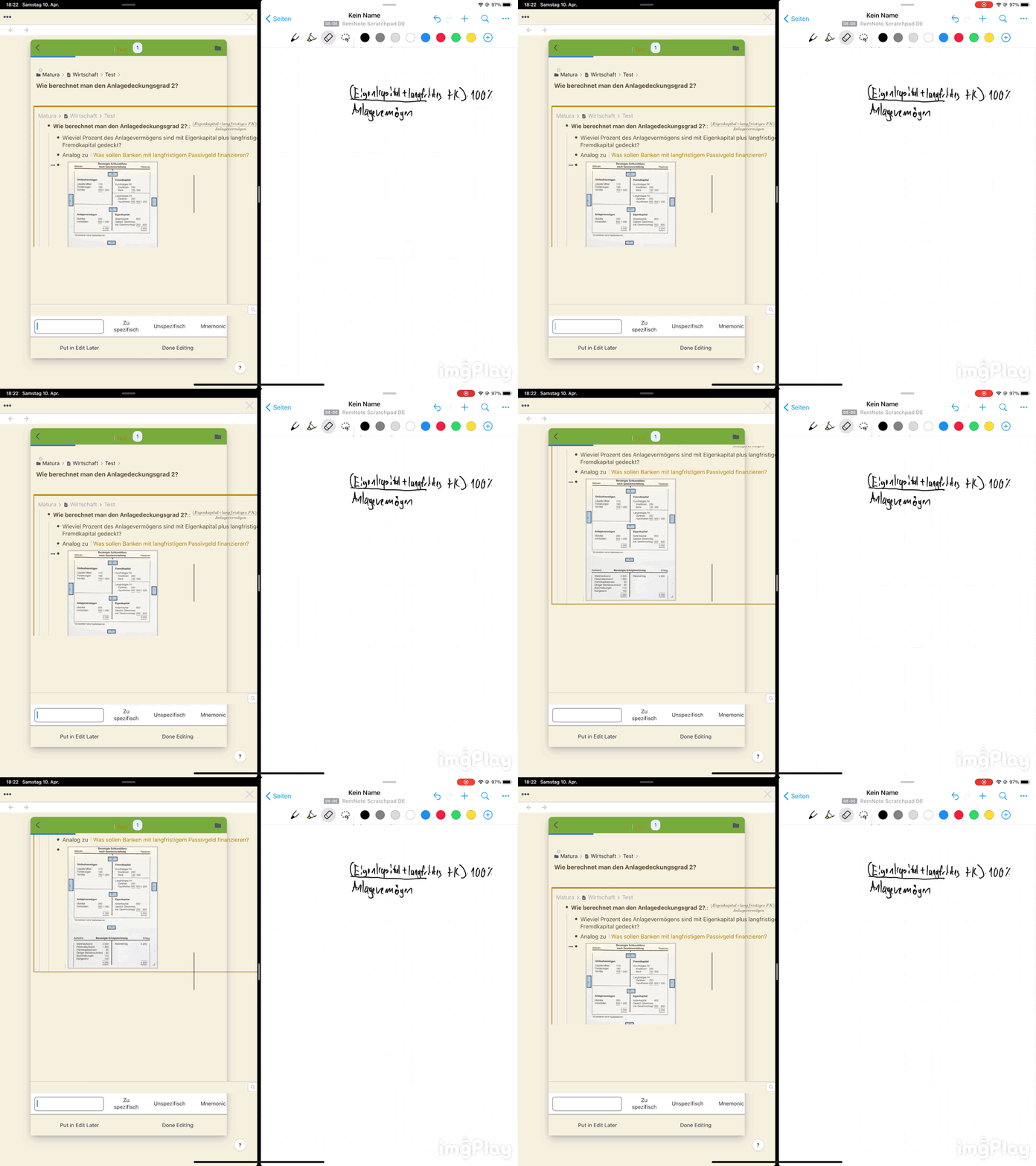
Could we make the queue panel fullscreen or much large when we review the cards?
Because some rem I made is somewhat long (many paragram). The small panel is very unconvenient to read.
This Custom CSS makes the Queue fullscreen:
.Queue {
  bottom: 0 !important;
  width: 100% !important;
  height: 100% !important;
  max-width: unset !important;
  max-height: unset !important;
  border-radius: 0;
}
Note that you can also resize the Queue by dragging its edges/corners.
5 Likes
It’s not possible to make it fullscreen, yet. You should, however, be able to enlarge it to the larger size of the 2 sizes available by clicking this button, ![]() , at the top right in the queue.
, at the top right in the queue.
I noticed and used the enlarge button. It is still small for me.
Hope you can make it larger.
Going to be using this too  Thank you, Hannes!
Thanks. It is cool. 
sidebar gets ahead, is there any way to solve this? thank you
Updated the CSS snippet above for maximized queue.
As of v1.4 you can resize the Queue to your preferred size.
1 Like

