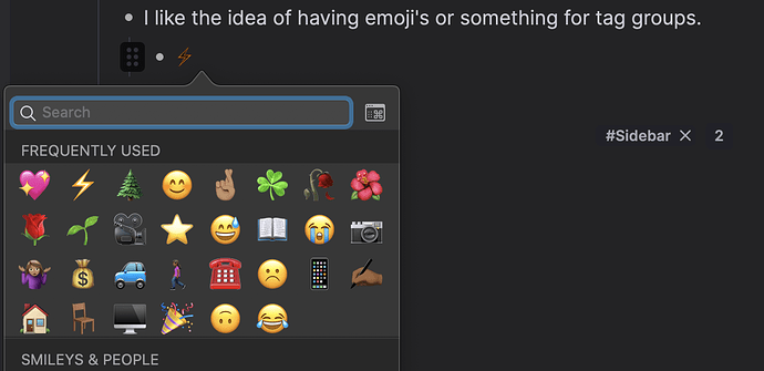
I use dark mode since it’s easier on the eyes but when I go to add emoji’s they look super weird in dark mode. In the case of the lightning bolt it’s so dark its hard to see that I am even using an emoji at all…
As you can see in this example the emoji in RemNote vs what it is supposed to look like via the Mac emoji selector.
I just want my emoji’s to look correct.

