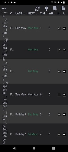
Please improve the Cards table

I can’t troubleshoot card duplication because the card table is useless without a giant screen.


Further to this, please improve the sort functions and allow column resizing. Use symbols as headers or don’t adjust column width to the header size.

Elsewhere, I commented that I had a work around for card duplication, but the issue seems to recur each time I switch apps.

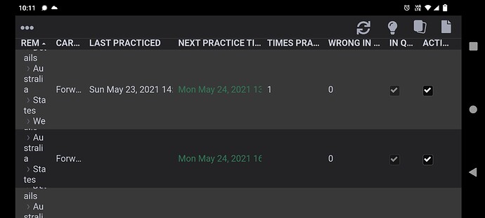
I agree, the cards section is not at all polished. There is also a recent feature request for a proper, functional card browser, filter

1 Like

Thank you.
I tried looking, but couldn’t find any references to the cards page.

Cards page is mentioned as a hyperlink in the ‘Implementation’ section (bottom most) of that feature request. The overall theme is to improve cards feature (or something similar) to have better access to cards.