Hi
I just had a first look on the beta server. Wow, this is an amazing update. I really like the new clean UI.
The tabs above seperating the various sources? I love it. It gives me a good overview.
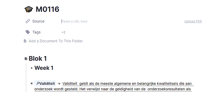
I noticed that on a document that has PDF uploaded, the pdf’s are not visual at the top (sources), but if I click on a rem that is linked to that pdf it shows up as normal. So it still works, it’s just that you don’t see the names of the linked pdf’ anymore on the top of the document (sources).
I’m just a novice, non technical user, and the new interface is more intuitive. I can’t comment on technical issues (yet).
Bravo to the RemNote team. and the update is just in time for the new academic year 

