Ability to freely arrange and connect windowed panes on a canvas

Essentially bridging the gap between the current tiling windowed panes and the graph view.

See it implemented as an extension to Roam.

A similar approach is attempted by Napkin.
Scrintal seems to be built around this idea.

A more involved application that also requires queries would enable creating a discourse graph, as seen in this roam plugin.

THIS! Thank you so much for posting this; especially the Roam extension looks exactly like what I have been dearly missing this past few weeks.

To explain: During the last few weeks, I put RemNote to the test and tried to write a draft for a paper from my various notes. The workflow goes and - with windowed panes - looks roughly like this:

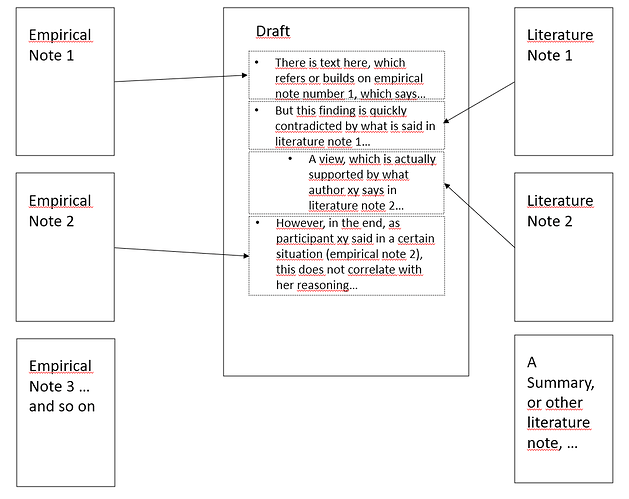
empirical data → draft ← literature note

Various documents hold empirical data and various documents hold my literature notes. Both are ‘assembled’ in the draft.

Although far from perfect, the introduction of windowed panes has been a massive improvement for me. What I’ve missed so far, though, is seeing (visually) the connections between individual notes and the draft. What I’m envisaging is something like this, to actually have it on my screen:

I could emulate this behaviour to some extent with RemNote’s link function (and windowed panes, as mentioned). Links between individual notes and their ‘place’ in the draft are preserved to some extent, which allows me to infer from my draft to the original notes (the exact wording). Unlike references, which need an extra alias for this, the text in one note does not have to be the same as the text where the link points to (in this case, a specific paragraph of the draft). However, ‘hijacking’ links for this can only be a workaround and does not allow me to see the connections as I’m writing.

What you are proposing, my friend, would allow me to visually see the connections between my notes. I really like the idea. Yes, “The ability to freely arrange and connect windowed panes on a canvas” is what we need. :slight_smile:

2 Likes

For now, you can create a couple different rem with (search) portals to your different categories of notes (see Guide: How To Build A Sidebar ) and use those with windowed panes.

Another request was the Andy Matuschak-inspired accordion, as discussed in the older FR about the number of panes.

1 Like

Thank you, @UMNiK, for the two links. The Guide (How to build a Sidebar) helps. I was doing something like that already, but honestly, hannesfrank got it better structured. :slight_smile:

About Andy Matushak-inspired accordion: his website is very nice, I think. It is obvious why his project is an inspiration for many. What I like best, though, is not his (evergreen) notes - but his technical solution for a great number of panes opened simultaneously. His website looks and feels very clean, providing a lot of visual clarity. Also: That a new window (containing the note on whose link you clicked) opens automatically on the side of the ‘old’ one is a genius move. I like it more than, say, the Andy’s-mode-Plugin over at Obsidian. This plugin does not automatically give you one note next to the other, all in a horizontally scrollable window. That’s what makes it, I think.

However, what you are suggesting goes one step further and brings it all to a new level. Working in an above-described way on a freely movable and arrangeable canvas feels like a superpower. (And is, by the way, also what makes writing programs like Scrivener so powerful - this program’s capability for freely arranging Zettel - containing the content/text - on a canvas is so far unmatched. Which is why it is so popular; at least amongst writers.)

So, whatever, and whatever the use case: let me repeat: I wholeheartedly support your suggestion and idea because it really bridges the gap between notes and the graph view - and that is just-oh-so-nice. After all, it is worth remembering that people like Luhmann not only wrote lots of notes but spread them out on their table if they wanted to write something - which is, after all, a canvas.

1 Like

Another example for freeform positioning of markdown cards is https://heptabase.com.

Moved to the new platform