Hello,
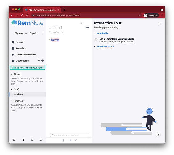
Initially, I’m not sure if this is the correct term for this. It’s not that big of a deal, really, but I was just wondering why there’s a difference in the design(?) of the references.
How a sample reference would look like on my account:
How it looks like in incognito
I hope I don’t sound like I’m complaining.
I like how both are, but it would be nice to have mine updated to the new one on incognito.
I also think it keeps the interface consistent throughout.
Thanks for your time reading!

