Hi Everyone,
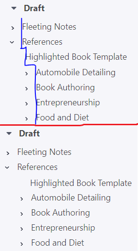
In my opinion, the indent level of an item should directly correlate to its “level” in the outline/tree, and should not vary based on whether it contains children.
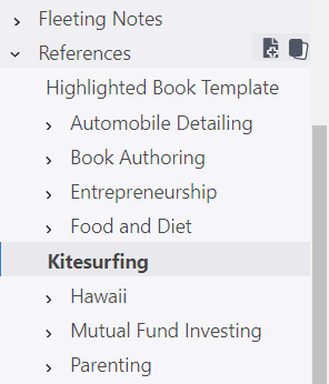
In the included image, in the top portion, you can see how Remnote presents the “Fleeting Notes” and “References” at the same level – the “Highlighted Book Template”, “Automobile Detailing” and other items below it are all at the same level, but the indentation level doesn’t make this obvious - it appears that “Automobile Detailing” is a child of the “Highlighted Book Template.” Below the red line I did a quick mockup of how I believe this should appear to be more visually accurate of the hierarchy:
Thanks,
Russell
(Windows 10 Pro, Google Chrome 85.0.4183.121)


