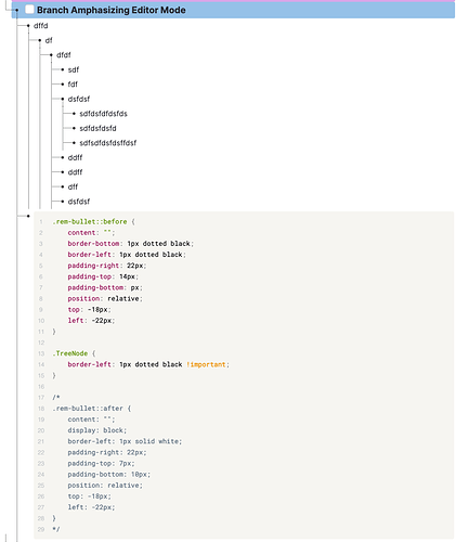
.rem-bullet::before {
	content: "";
	border-bottom: 1px dotted black;
	border-left: 1px dotted black;
	padding-right: 22px;
	padding-top: 14px;
	padding-bottom: px;
	position: relative;
	z-index: -1;
	top: -18px;
	left: -22px;
}

.TreeNode {
	border-left: 1px dashed black !important;
}
Wow… amazing… I love these path…
If you encounter something to improve, please let me know! 
Hum… After few minutes of using this code…
I think you should add z-index: -1; to .rem-bullet::before
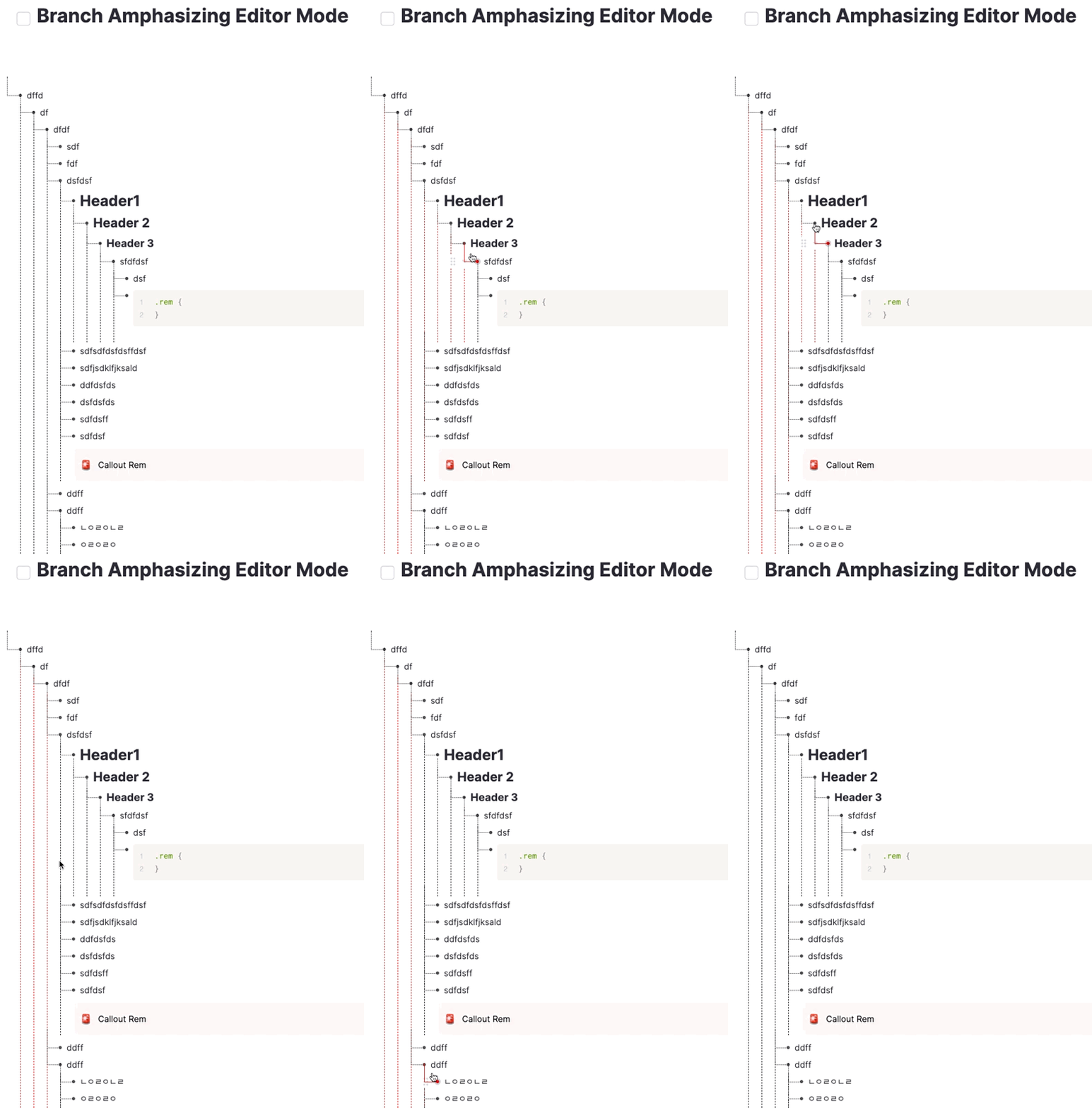
With your original code, without the z-index, the path is higher than the buttons and it causes the problem: I put the cursor over the upper rem but the lower rem’s node appears…
After I added z-index

Thanks for letting me know! Of course the nodes should be under the button.
hello!
first thank you for this implementation  I tried it, not thinking much of it, then I realized it’s awesome and actually useful IMO
Being that this appears everywhere in remnote, any little detail of implementation (and mini bugs) gets repeated thousands of time.
Below, what I regularly find, as a mini bug (the dotted lines are sometimes replaced with solid lines). I think it’s a bug at least:

Also it would be nice to have a solid line only for the rem on focus:

Thank you so much for this 
@_yb According to your suggestion, I tried to make the Hover effect but it failed because of the exact same reason why css table can’t be made with current structure.
I couldn’t handle it.
umm here was the imperfect one.
so I only updated the fixed version of the odd overlap in a treenode you pointed out.

Well, that’s perfectly fine 
Thank you so much for providing us with these snippets!
I think at some point, the remnote team should offer credits for the most upvoted CSS snippets; they can change so much in the use of remnote!


