“Allow us to change the default startup page(other than Queue, for which you can remind us using notifications if we’re in any other startup page) in desktop app(because we cannot bookmark & start from there like in a browser).”
For students/those that need to learn something, it makes sense to show it. Kind of forces learning (and learning efficiently) on them, as they may revert to inefficient practices or completely skip it otherwise. Then again, it may just be an annoying thing to wait on and then skip anyway, since that’s painless and there’s a lack of discipline.
For those that want to learn or to capture thoughts but aren’t interested in any use of the queue (even for “suggest a topic to research further/make video on/etc.” uses), since there’s no real pressure or need, starting from a menu page would work nicely.
I somewhat use RemNote for both scenarios, albeit there’s no definitive time limit on the need to learn part… boy do I skip that queue every single annoying time and actually avoid adding unrelated notes since queue control is limited.
- Some subjects can and maybe should go in the off-line local knowledge bases, but there may be people that organise notes differently or need online access to multiple subjects so they can’t just chuck things in local bases.
- May be less skipping if one had more control and easier control over the pesky thing as well (“Always add/don’t add to queue unless I specify it" -per rem/document/folder” setting would solve lots of headaches.
Queue + Menu Hybrid start-up page (both web and app, preferably):
I’m trying to come up with a hybrid queue+menu page idea (so queue shows if you got something in there or doesn’t show up, say, at the top of the menu page, but the menu page doesn’t change much otherwise) albeit I’m unsure how the layout would look like ATM and unsure if such a combination is possible. Plus, how deep would the navigation levels be? Here are some examples:
-
Shallow Navigation:
Pretty much the current Navigation Bar we have but maybe pruned a bit, no drop-downs or irrelevant to navigation functions (multi-page, statistics, log-in, etc). So:
-Centralised Queue,
-Documents,
-Pinned,
-Draft,
-Finished,
-Settings. -
Middle-ground level of navigation:
Centralised Queue -as it is now- embed at the top of the page.
Underneath: Queue (linking to a list of Flashcards, hierarchy organisation), Pinned, Trash Bin, Account, Settings,
Then some columns containing organization like this:
Category Name (Top-level Rem)
-Test me! (Queue from that category only)
-Last worked (on page in that category)
-Drafts (in that category)
-Finished (in that category)
^ Would be a good starter go-to IMO. But can that even be coded? Don’t think Finished and Drafts and whatnot answer to a main category yet anyway (They should IMO).
- Deeper Navigation:
- They may realise less is more so one may be able to have access to a deeper level of navigation. People tend to go crazy categorising AKA it’s gonna be a kilometric sausage of links if the navigation levels go too deep, but allows the most customisation.
Centralised Queue -as it is now- embed at the top of the page.
Underneath: Queue (linking to a list of Flashcards, hierarchy organisation), Pinned, Trash Bin, Account, Settings,
Dynamic-length Columns (2 or 3 going down) underneath.:
-Column: Psychology - Year 1, 1st Semester, Year 1, 2nd Semester, Year 2, 1st Semester etc (instead of each year having all the subjects and their lecture names listed etc)
-Column: D&D - Character Sheet, FAQ Rules, Campaign Log, Treasury, etc.
-Column: Design - Fundamentals, Graphic Design, Product Design, Typography, Print Specifications, Drawing Fundamentals, etc.)
^ This kinda resembles Notion’s Homepages people make, now that I look at it.
Not sure how helpful this wall of text is  definitely went broader than your question, sorry. Not a programmer, so viability in that regard…No idea.
Definitely needed.
At least have the an option to keep the app the way it was when I closed, with whatever I had open (like browsers do).
As of the latest update, both the desktop and browser apps should now default to loading the last page that you visited. Is this behavior not working for you?
Cool!
But I just closed and reopened, and I got the queue. (Desktop, Windows)
Tried twice. Same thing.
I would also like to be able to specify a start up page in RemNote, or be able to designate a “home” page.
The reason is that I’d like to make a page that is my “home base” for navigating RemNote. Initially, I thought using the sidebar could be my quick RemNote navigation. However, the more I use it, the more I find myself gravitating to certain key places and tasks, and my sidebar has gotten too large/complex to function that way.
Since (based on what I see from hannesfrank) it looks like one could use CSS to build a nicely formatted “landing page” or “home base”, I’d like to make myself a document that conveniently sets out what I usually want to see first, and be able to return to it easily.
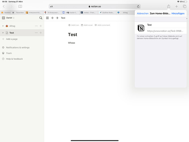
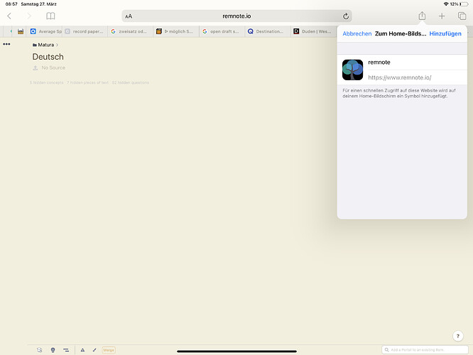
How come even the pwa doesn’t allow us to set a starting page? In Notion for example that works just fine. Does it have to do with notion being online only?
Whereas in RemNote that’s not possible
Edit: Found the answer. it Seems like only the page you save gets «pwa’d», the rest gets open in the browser, which is not desired for a pwa. I thought this could be a quick workaround for a default starting page but guess not, it has to be a built in feature then.
Whenever I change to a KB (Desktop), I am shown my queue.
I’d like to have the option to just pick up where I left off (ie., instead of the Queue, I want to see the Rems/panels I had open, in the state they were last).
Is that possible?
When I enter the app the first place it takes me is to the queue but personally I don’t like that [because I am taking prep for two different stuffs and I don’t want to get mixed cards in the queue] it would be helpful if it let me go the document page when I open the desktop app.
Similar previous request:
Here is a silly solution that I use (assuming you don’t log out of RemNote every time)
- Go to the document you want to use as homepage.
- Get its URL from the browser’s address bar
- Create a bookmark using that URL.
- Use that bookmark to open RemNote every time
That’s a good solution for web.
In my case I use the desktop app…
Thanks for the tip, i am just trying the desktop app but this is a big problem (same with the fact that you can’t find the URL for a page on the desktop app). I don’t understand why the three-dots menu can’t include a link to the URL.
I tried exporting but it didn’t give me a link either - just took me there (within the desktop app).
(As of RemNote 1.1) this feature has been Implemented.
 If your Web App doesn’t show the last opened page, check the URL of your Bookmark and make sure it only says https://remnote.io/, without anything after the
 /. 
Hi Martin,
That behaviour isn’t working for me - I use the Windows desktop app, and, regardless of which page I last viewed, RemNote opens to:
" 404 - Page Not Found
This page has been forgotten."
I’ve tried uninstalling/reinstalling and I don’t know what to try next…
Hi, I know anki card is the key feature of remnote, a lot of people come for this. But also a lot of people use it as a pure note taking app. For those people like me, every time I want to take a note I have to do at least an extra click.
So could you give an option to make daily document as the default open page?
Thank you for the great app.


