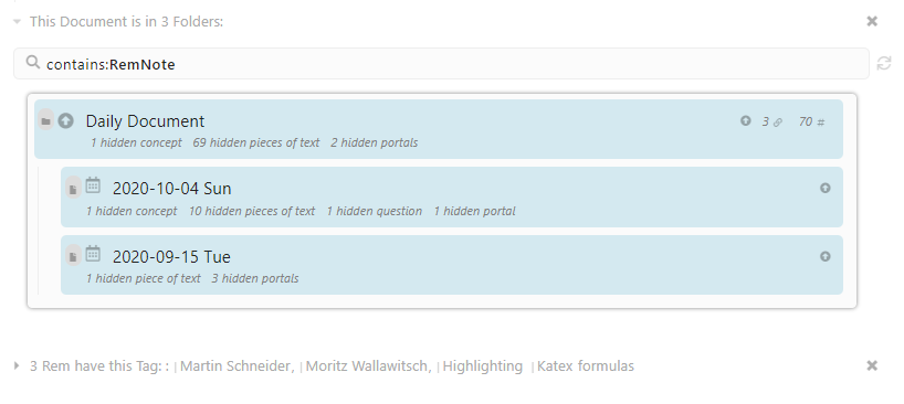
Changing the references window style

A little more polished or round-cornered reference window would really look more elegant and simple.

This image above is the current window. It is really square. Everything in the newer updates is more round on the corner, maybe this would go really good with it.

Apart from improving the official design this is also possible with Custom CSS.

See for example this theme by Eva Thomas which styles portals pretty unobstrusive: https://github.com/ethomasv/RemNoteTheme

1 Like

Granted that it can be done by using CSS, but the problem is when updates start to roll out, the CSS script has to be updated to, previously when I tried this and Remnote UI updates were received, the CSS got messed up. That’s why this should be done in the official UI itself.

Yes, Custom CSS breaking is always a problem and it can happen to any snippet. But Eva did an amazing job maintaining and fixing stuff if it breaks.

I think the question is what is bad enough that it has to be fixed in the official style and what is subjective or personal preference. (I personally was not that annoyed by the portal style, but of cause it can be improved.)