I’ve been avoiding the mobile(smartphone) version for a very long time now because I simply didn’t want to bother with its many bugs and limitations anymore. I did try it from time to time to see if it got any better and at the moment it limits my usual workflow too much. Today I got an idea though how to fix some of my problems and that is to use the desktop version of the browser combined with the pwa. By default the pwa has the mobile version of RemNote, however if you open RemNote in safari, click on the aA symbol in the top right corner, website settings and then turn on “Request Desktop Website”, you can now use the desktop version of the pwa, which solves almost all the issues I had. There are still minor inconveniences that I’m facing and I’m wondering if these could be fixed with CSS.
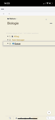
One issue is that my toolbar sometimes has white spots: When I start or restart RemNote, it will look like this
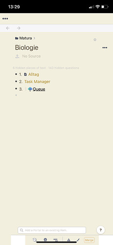
but if I switch to another document, the toolbar suddenly looks like this
This is the CSS snippet I’m currently using for the bottom toolbar. Could this be causing the problem?
I’d also like to move the sidebar upwards a bit because of that stupid homebar. Would it be possible for that to also only apply to mobile and not to tablets? Wouldn’t be a big deal if it also applied to the tablet but yeah.
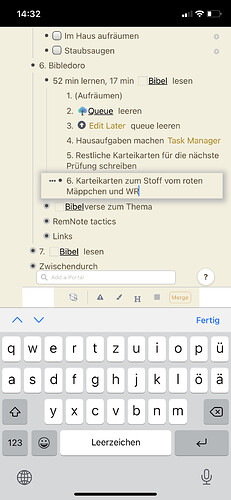
The last issue is this here Toolbar hidden behind keyboard on mobile safari · Issue #918 · remnoteio/remnote-issues · GitHub At the bottom he links to a github page that has a CSS snippet. Sometimes it does actually fix the issue
but mostly it doesn’t


