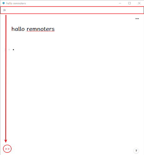
When making the remnote window 1/2 screen, there will be an additional top bar on top.
Is there any way to put this top bar in the bottom left corner like the help button in the bottom right corner?
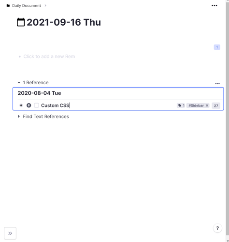
Something like this Custom CSS:
.document-sidebar--collapsed--horizontal {
  width: 40px !important;
  height: 40px !important;
  position: absolute;
  bottom: 16px;
  left: 16px;
  z-index: 10;
  border: 1px solid #c8c8c8;
  border-radius: 4px;
  background: white;
}
.document-sidebar--collapsed--horizontal > div > div {
  left: 0 !important;
  height: 32px !important;
  width: 32px !important;
}
The difficulty here is to make sure that it does not overlap any content (which is not the case for this simple solution. We are still discussing where to put it where it doesn’t do this. Maybe we’ll push the document breadcrumbs or document title a bit to the right and place it left of it? Not sure. Space on narrow screens is limited.
thanks so much, hannesfrank. It much helpful. I try to imagine if place it left of the document breaadcrumbs, it looks a little strange, haha. but I believe remnote team will find a better way to solve it. cheers
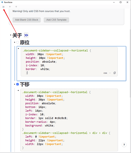
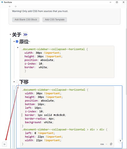
Here are two CSS base on frank’s code (perhaps someone need it ?):
- original
.document-sidebar--collapsed--horizontal {
  width: 30px !important;
  height: 30px !important;
  position: absolute;
  z-index: 10;
  border:  white;
  }
- lower
That’s entirely Frank’s code, just making the button smaller.
.document-sidebar--collapsed--horizontal {
  width: 30px !important;
  height: 30px !important;
  position: absolute;
  bottom: 16px;
  left: 16px;
  z-index: 10;
  border: 1px solid #c8c8c8;
  border-radius: 4px;
  background: white;
}
.document-sidebar--collapsed--horizontal > div > div {
  left: 0 !important;
  height: 22px !important;
  width: 22px !important;
}


