[Custom CSS] Toggle codeblocks in a subtree

Continuing the discussion from :christmas_tree: Advent Calendar: Every day a new Custom CSS Snippet:

I propose the following discovery logic for CSS code blocks on the Custom CSS:

  • Do a (DFS) tree traversal starting from Custom CSS
    • If you visit an unchecked todo, ignore this subtree.
    • If you find a (not unchecked todo) CSS code block, add it.

I like that Custom CSS blocks without a todo checkbox (in a not unchecked subtree) are enabled as well.

Workaround: Currently the best you can do is move a subtree in and out of Custom CSS. E.g. temporarily transfer it to a Disabled Custom CSS document.

Sidenote: Since checked todo boxes strike text we might need some extra styling disabling this behavior on Custom CSS. I think, if required, this can be done with Custom CSS (and a data-document-tag) by the user themselves.

Surely this is more related to the todo tag’s behaviour than the current (hacked together) custom CSS solution? At the moment every todo “lives” inside the rem it was applied to, without regard for parent-child hierarchy (actually, there seems to be some regard - new rem created in a todo via enter are todos). This is nice for pulling them by that todo tag, but I personally find having the outliner more valuable for adding and linking subtasks, so I store the todos in the pinned powerup todo. Profiles for sets of checked or unchecked todos would be great, but I don’t see how they could ever be implemented with the above limitations.

I think I don’t quite understand what you are trying to tell me. :thinking:

A todo is a tag which means it is not living as a part of a rem. It means that Todo is the type of that rem. This is combined with the template mechanic (Todo has the slot Status which can have either the value [[Unfinished]] or [[Finished]]). Furthermore Todo is turned into a power up. A power up can define extra display style (hide slots like Highlight, Todo or add buttons like Edit Later) and special interactions (do something on keyboard shortcuts). But at the end of the day it is just a rem with a slot.

There is just one conceptual trick (or inconsistency if you want): Since the Status slot is hidden, searching for a status value will show you the parents of the [[Un/Finished]] reference aka the #Todo itself.

I think the Todo implementation is quite clean. At most a bit too simple since support for more states like ongoing and canceled would be nice.

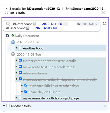
Therefore I don’t think this limitation is the implementation of the todo, but the lack of more powerful search queries. But there is already a lot possible. Like showing all todos of the week (in daily documents)/a project/etc. Here an example of only 2 days (or projects/profiles/etc):

So from that perspective I think the original behavior of todos (display a checkbox, Ctrl + Enter, … as described above) does not matter too much in the Custom CSS context. Here an (un)checked code blocks is just interpreted based on the value of the Status slot to be disabled or not (which is the special extra logic of the ancestor Custom CSS power up rem). I find this actually a clever way to reuse the data of an otherwise well working feature of RemNote.

I merely propose interpreting the data in a different way in the context of the Custom CSS power up, not changing the behavior of todo itself.

1 Like

Obviously, your knowledge of the actual inner workings of this is far greater than mine. My whole point was the current Custom CSS page is leveraging the current todo tag to handle all its configuration (aside from literally editing the css code blocks, obviously). And since the current todo implementation doesn’t check or uncheck children, that seemed like the obvious bottleneck for changing CSS enabled or disabled state in bulk.

From your example with a search portal, however, it may be possible to hack around this by strategically storing snippets under different rem that serve as categories (for example, functionality for columns, cosmetic for icons), then creating a search portal for category and todo tag. I’m afraid I have given up on the search portals as soon as I saw how limited they are, but that seems like the best solution in the interim before actual queries arrive.

How about … no?

Ah, now I get your point! Sorry, I’m sometimes a bit slow.

What I meant with “interpretation of the data” is that we should not change how a todo works on Custom CSS (e.g. that it should also toggle all children as well), but that blocks are just considered (or interpreted) as enabled if they don’t have an unchecked Todo as an ancestor somewhere on the path to Custom CSS (the root of the hiearchy/tree). No extra behavior, just that interpretation of the data.

Makes sense!

I didn’t even know the to-do powerup had this behaviour for nested to-do’s - ie. allowing to check/uncheck a parent without affecting children.

I’ve been putting off using to-dos in Remnote. Without a more robust search/filtering system (allowing to filter by importance/project etc.), my to-do list would become unmanageable.

It does not have this behavior and it should not have it either!

What do you mean!
Maybe I explained it poorly.

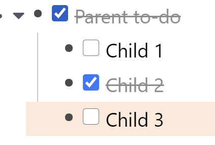
Look: if I check/uncheck the Parent, the Children are unnafected
image

Well… What do you mean?

The current behavior of Todo is that parent todo and child todo are independent. It makes intuitive sense and it should stay that way. Your comment implied that there is or should be some kind of nesting logic which nobody said there is (to my understanding) and which there is not and there should not be in the future.

(Funny how I proposed a tiny change to the Custom CSS logic that could be compressed into a single sentence given the mental models of a computer science background and it turned into a full blown dicussion about a completely unrelated topic with misunderstandings and all xD)

1 Like

No worries.

Sorry for the misunderstanding.

1 Like

One more thought:
I keep wishing code blocks allowed folding (especially for long code block). Though that wouldn’t make sense, considering we don’t have this for any other Rem type (though one could argue this might be a useful feature, but I digress).

Being able to have code structured in (and being able to enable/disable them via) subtrees would help with that too. Big chunks of code could then be nested and folded.

PS: slightly related to this discussion:
I just realized you can actually have plain text before a code block in a Rem. To me it’s useful (more practical than having a description as a comment within CSS).


However the way to achieve this seems inconsistent (I need to create a new Rem, type something, and only then add a /code block). If I add the /code block first, I can’t add plain text before it.

1 Like

Hype! https://github.com/remnoteio/remnote-issues/issues/328#issuecomment-747142856

I really hope it makes it through in a bugfix update!

Edit: It is released now!

We can paste trees like this now where you can enable different options (like roomy spacing or compact), fold away the code nicely and also disable a style as whole (which results in a nicely crossed of heading).

- 
- # Color EVERYTHING
  - [ ] green
    ```css
    * {
      color: blue;
    }
    ```
  - [x] blue
    ```css
    * {
      color: blue;
    }
    ```
3 Likes