disclaimer
am new in CSS so you may face a couple of bugs and also I got inspiration from other themes

am new in CSS so you may face a couple of bugs and also I got inspiration from other themes

when using ‘Add Alias’, it shows white font on white background 
and also ‘Split or Merge Cloze’

Oh sorry bro I am new in Css I will fix it ASAP
Thanks for making this nice dark theme.
I had two issues which I will mention below
Thanks for the feedback I will fix this ASAP
Fixed all bugs except the thinking trial it was very buggy
Thanks for the rapid fixes. Now it looks much better now. 
If you are interested, you can try out some good theme (palettes) of TiddlyWiki as shown in this file. Not all are good. But I really like some of these palettes.I am trying to make some of them work with remnote. Since I am not a programmer, it takes a lot of time to do it.
I will take a look at it 
this looks awesome!! can’t wait to try it out
Thanks, but the /h3 is quite bigger then /h2 it’s kinda confusing 
but nice work
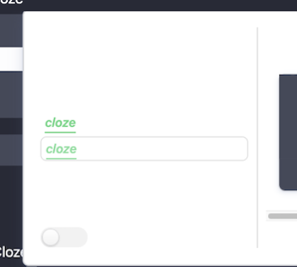
Love this theme! Is there any way to disable the indentation that happens to the beginning of the line when selecting and working in a rem? Also, is there a way to make the cloze underline closer to the cloze term, as it runs into the next line’s text sometimes.