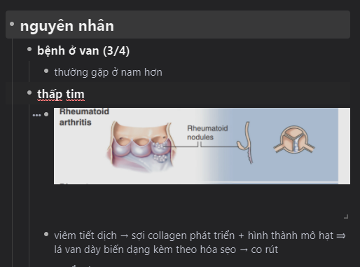
When i’m hovering over an image it sort of adds space between the image and the text under it. It kind of annoyed me.The problem seems to be more pronounced when i’m editting in mutiple panels or using too much parents . Anyone have the same problem ? and how can i solve it ? (i’m using the desktop app and i’ve disabled all my custom CSS)
p/s: sorry for my bad English


