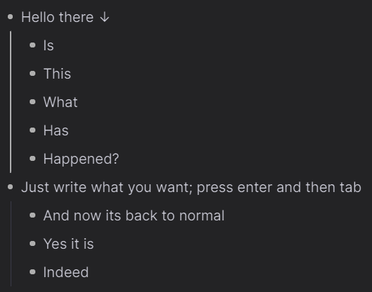
Since latest big update one of my Rems has a big down arrow. Clicking it shows it’s something related to cards. I don’t use/want cards. How do I disable this?

This particular Rem has numbered items as children.

Since latest big update one of my Rems has a big down arrow. Clicking it shows it’s something related to cards. I don’t use/want cards. How do I disable this?

This particular Rem has numbered items as children.
Try using the code below in the custom CSS power-up rem
.last_node_down_arrow:after {
content: "  ";
}
(removed " ↓ " from content)
Thanks! Yeah, I figured this could be solved via CSS.
Unfortunately custom CSS isn’t well supported though. Devs change class/element names without letting users know, and without offering tools to update the scripts. I used to have a huge custom CSS I slowly built, and most of it broke since the last update. Will not invest my time on this anymore.
Regardless, the biggest issue for me here is them imposing such a specific functionality.
So i think that you make general notes in remnote but due to the new update what you wrote have become list rems (follow the picture for guidance)

Or if you want to remove the cards in the present configuration, just click the down arrow and switch of the toggle of “enable cards” at bottom right
yes, the arrow will show but the points under the bigger point won’t count as rems now
Ah ok thanks.
What I want is for the arrow not to show.
I guess I could do it with CSS, but it’s weird that the cards UI would be imposed like that…
Yeah the arrow would be kinda irritating; the only way i can think of removing the arrow would be remaking those cards which of course would take hell of a time; there may be some other way which i may be unaware of but you would have to wait for some expert to reply; welcome