Flashcard response icons suggestions

I don’t understand why the flashcard response icons are arranged in a square, with very similar icons and text which make them difficult to distinguish.

Suggestions:

  1. Arrange the response icons in a line, so they form a visual continuum / scale from worst recall on the left to best recall on the right.
  2. Color code the response icons (e.g., red for worst recall, green for best)
  3. Distinguish the faces better. Currently, two of them (the non-smiling and frowning faces) are nearly identical.

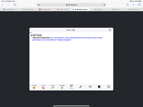
I’m kinda late but you could use the CSS Snippet at the bottom as a workaround. Go to Settings>Interface>Add Custom CSS>Add Blank CSS Block and paste the code into the block. If you don’t like the emojis, replace them with others. Also for your first suggestion, you can click on expand in the top right corner of your flashcard and the response buttons should look like this:

.spacedRepetition .queue__response-button–big[data-tip*="(1/4)"]> img {
display: none;
}
.spacedRepetition .queue__response-button–big[data-tip*="(2/4)"]> img {
display: none;
}
.spacedRepetition .queue__response-button–big[data-tip*="(3/4)"]> img {
display: none;
}
.spacedRepetition .queue__response-button–big[data-tip*="(4/4)"]> img {
display: none;
}
.spacedRepetition .queue__response-button–big[data-tip*="(1/4)"]:after {
content: “:skull_and_crossbones:”;
}
.spacedRepetition .queue__response-button–big[data-tip*="(2/4)"]:after {
content: “:jigsaw:”;
}
.spacedRepetition .queue__response-button–big[data-tip*="(3/4)"]:after {
content: “:brain:”;
}
.spacedRepetition .queue__response-button–big[data-tip*="(4/4)"]:after {
content: “:nerd_face:”;
}

2 Likes