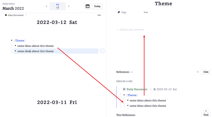
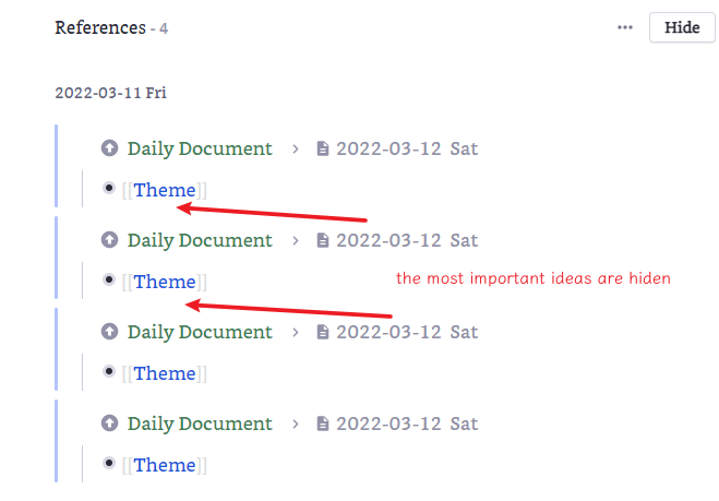
Since there was no option I like presented, I’ll just type up my suggestions here.
The current triangles to the left of the portals are just fine, naturally following regular rem. I assume the problem is that the entire text label is interactive and the three dots menu is forced to be on the different line, but I would just move the three dots to the left of the arrow, again by analogy with regular rem. Definitely don’t break the across-the-app convention of “controls to the left of rem” for this single element.
As far as expanding hidden children, the entire system around that is so mysterious at the moment as to make the specifics meaningless - I’m fairly certain 99% of people don’t hide rem manually, preferring to fold, and get surprised whenever that text pops up. I would return the old behaviour of showing the number of hidden children directly under the parent rem rather than stuffing it at the bottom and using only the fatter bullet with a downward triangle on the parent as an indicator that not everything was unfolded.
Definitely nice to see more often openly soliciting feedback before pushing new changes.


