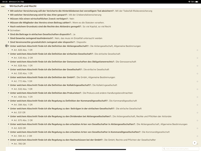
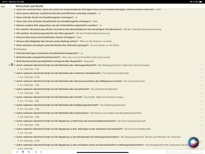
Not sure if that’s also a problem on desktop but when you use full width on mobile devices the triple dots of parent top level rems are not accessible because of the sidebar trigger area
There’s a css fix provided by Hannes:
#document {
padding-left: 40px;
width: calc(100% - 70px);
}
and its result:
but the triple dots should always be accessible by default and not through CSS


