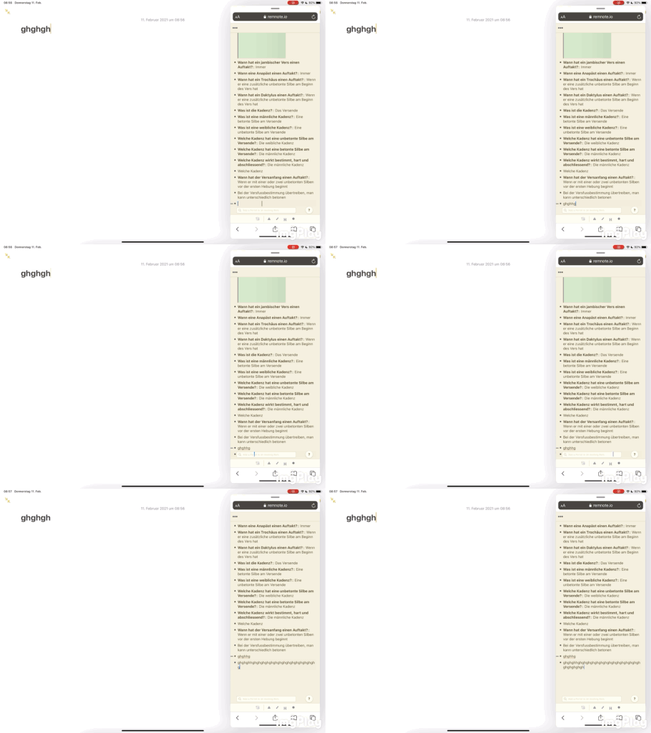
As you can see, the portal search box and the question mark cover the text I’m writing. Maybe have them squeezed into the toolbar or change the automatic scroll to prevent this during splitscreen.


As you can see, the portal search box and the question mark cover the text I’m writing. Maybe have them squeezed into the toolbar or change the automatic scroll to prevent this during splitscreen.