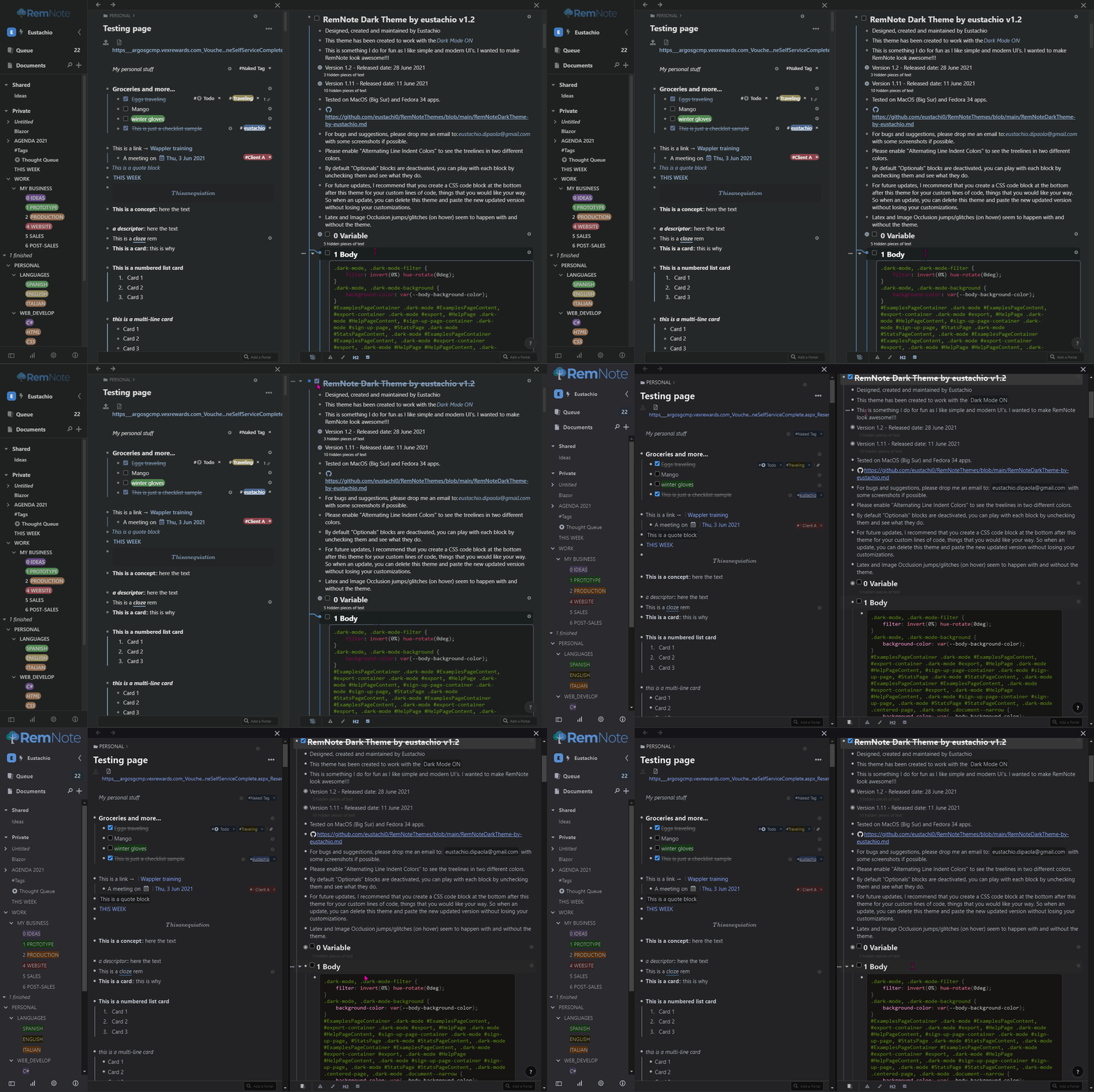
@Eustachio Thanks for all of your hard work. Contributing to you, RemNote is both functional and aesthetically pleasing now.
Thank you, I’m glad you like the theme and that it’s useful to you. RemNote is great!
Hi, loved your light theme and now your dark theme! Makes RemNote much more appealing to use for sure. Thank you for making it!
One thing I noticed is that in the windowed panes, when viewing uploaded pdfs, the background is still white rather than dark (as in the original RemNote dark mode). I’m on macOS Big Sur using the desktop app. Is there a way to fix this?
Hi @itsamy you are welcome, thanks a lot for your feedback.
Yes, Pdf’s can be dark, this is actually on my list to include this option and image occlusion to be dark. I particularly prefer my pdf’s and images to keep their original colors  , so I will make them optional.
Cheers,
Eustachio
@Eustachio, love your dark mode and especially the hover states of many elements. It’s a class above what is currently available.
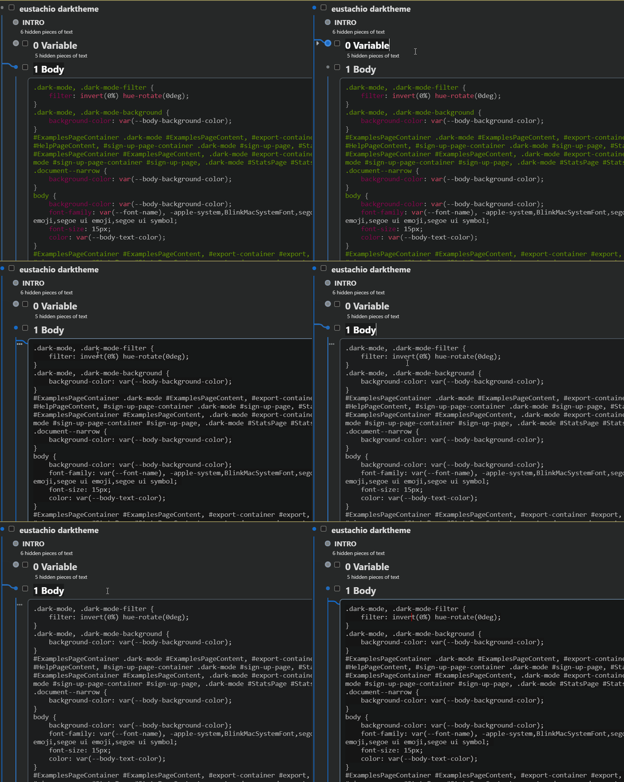
I wonder if you have come across this bug in your mac desktop test with Big Sur? I get this black layover type block over the headers of the bottom portals. I deactivate all other CSS except for this so I don’t think that is an issue.
Hi @marcothesis thank you very much for your feedback  and for reporting this issue.
I haven’t come across with that issue on MacOS, I will check this and let you know a fix.
Cheers,
Eustachio
@Eustachio I know I sometimes prefer the original colours as well, so making the background optionally dark sounds like a great idea.
New theme update v1.2
- Optional dark (inverted) PDFs
- Optional dark (inverted) Image Occlusion
- Fixed some right-click menus and ‘Quick Add’ white backgrounds
@marcothesis I have updated the theme, I have included some changes that might fix this issue, but unfortunately I can’t guarantee that as I haven’t seen this issue on my MacOS hence I haven’t been able to identify the element that is causing that bug, so I am guessing on this one. I hope it works. I will keep this issue on my list.
@Eustachio Thanks for making the effort to fix this! Whatever you did, it now looks great for me. Cheers. 
Thanks Eustachio. Tested the 1.2 version and seems to work fine under Xubuntu Linux. Just changed the body font-family to “roboto condensed” (that is installed in my system) that I liked more.
body {
background-color: var(–body-background-color);
font-family: var(–font-name), “roboto condensed”;
font-size: 15px;
color: var(–body-text-color);
}
Hey @ferossan, thanks a lot for your feedback.I appreciate it. I’m glad to hear that it is working well on Linux.
Roboto is a nice font, btw you could also change the font by changing the variable I created within the CSS block 0. Variables, and under General customisation, there is this variable called --font name: myfont; if you replace myfont with the name of the font you like it should work too.
Cheers!
Oh! I see. Thanks!
Any way to change the font size on the body? Changing font-size: 15px; to 18px does not work for the body.
Cheers.
@ferossan To do that, you can copy the code below and paste it in a new CSS Block. (These are RemNote’s default values)
/*All paragraphs*/
.rem-text {
font-size: 15px;
}

/*H1 Headers*/
.rem-header--1 {
font-size: 22px;
}

/*H2 Headers*/
.rem-header--2 {
font-size: 20px;
}

/*H3 Headers*/
.rem-header--3 {
font-size: 17px;
}
Fantástico! Muchísimas gracias!!! 
Siempre a la orden. Cheers
@Eustachio
Hey, as everybody else, I find your aesthetic for remnote quite cool 
I have 3 remarks/questions to ask you about
-
I have an issue with the display of code blocks, and it depends on the mouse position and focus:
-
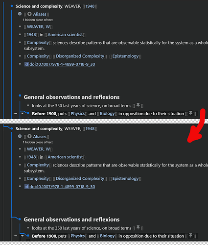
I really like your design, and the branch aesthetic in particular.
I would like to have the branching appear only for the branch in focus, and map back to the “chain of parenthood”. The other branch might be greyed out or non-apparent even.
How would you go about that?
-
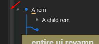
I like working in wide-mode (meaning with unconstrained width). This is not related to your design, but looking at your code, I figured you might have an idea. Otherwise, I’ll add a feature request for this.
When in wide mode, the “…” icon, left to the bullet point in focus is pushed further left when there is a child to this rem, making clicking on “…” impossible.
Do you have an idea on a remedy?
Thanks 
I also might add that in the example shown in the pictures, all other CSS block have been deactivated: there is no conflict.
Hi @_yb thanks for your feedback and for reporting these bugs.
Answers:
-
Code blocks, please someone correct me if I am wrong, but I think this is a RemNote issue, I have the same problem when the code blocks get too many lines of code. So I use vs code to edit the code blocks instead. Maybe @hannesfrank could help us with this. Cheers
-
This is how originally the branches should look
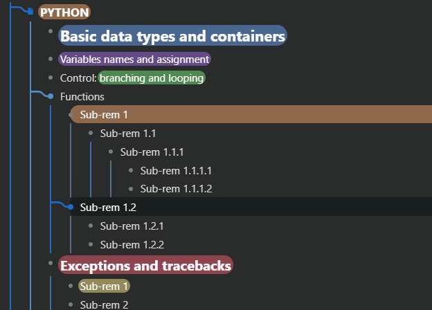
For what I can see in your screenshots, these parent branches when in focus are not showing, are they? And for the suggestion of making the lines grey like you show in the screenshot, I tried to do that before and I could not do it with only CSS, maybe something to do in the future. -
Here the fix, if you go to 1 Body
replace this code:
/*----- this makes the 3 dots visible when in multiple window mode -----*/
#multiple-windows .multiple-windows__document .document--narrow {
    padding-left: 42px;
    margin-top: -10px;
    padding-right: 25px;
}
#document {
    width: calc(100% - 65px);
}
/*----------------------------------------------*/
and replace it with this:
/*----- this makes the 3 dots visible when in multiple window and full width mode -----*/
#multiple-windows .multiple-windows__document {
    padding-left: 27px!important;
    padding-right: 20px!important;
}
.pane {
    padding-right: 47px;
}
/*----------------------------------------------*/


 . Cheers