New RemNote Dark Theme by eustachio

Hi All,
Here the link to copy the CSS code of the New RemNote Dark Theme GitHub
It is a markdown file, you just need to copy and paste on RemNote.
I have only tested it on Windows 10, I believe that it should work on MacOS and Linux.

Reddit Post

I hope you like it and please let me know if any issues.
Cheers,
Eustachio


Installation


Optionals


Preview

28 Likes

This is great! The curved “hierarchy lines” look especially cool.

7 Likes

Thanks for your feedback. I’m happy that you like the curved hierarchy lines, I called them branches :smiley:.
Please, let me know if any issues.
Cheers

1 Like

DOPE!!
I’ve been waiting a long time for this, you’re a genius!

1 Like

Muchas Gracias Renzo for your feedback. I’m happy that you like it :relaxed:.
Cheers!
Eustachio

Report: White Toolbar corners. All other CSS is deactivated.

Hi Gabriela, thanks for reporting this.
Have you activated the dark theme mode in the settings? please let me know
Cheers,
Eustachio

1 Like

That does fix the issue. :sweat_smile: Usually, dark mode themes would break when that’s turned on, so theme creators usually say to leave that off. I assumed that’d be the case here as well, my bad. :face_with_hand_over_mouth:


Have I mentioned how beautiful the colours for the Links, Todos and Blue & Purple Highlights are?
Didn’t expect for it to go from a Light to a Dark theme but you won’t hear any complaints from me.


Reports:
Extra space around email. Colour and spacing fixed on click:


There may some other paragraphs that shift around or hover or click (can’t remember), similar to the email behaviour. Will post them when I reencounter them, noticed them when I copied your code.

Also,
Image Occlusions are flickering unless the cursor is clicked into the Rem that holds them:


Feedback:
I can tinker with the following myself, but just pointing out:
I love the subtlety (size, round corners, colour), but I’d bump up the colour of the Hierarchical Editor drag-able scrollbar bit.
The Sidebar one is visible enough against the slightly darker Sidebar background but the monitor angles & size, and large documents (=> smaller drag-bit) do make the Hierarchical Editor one invisible at times. It does brighten up when hovered on, but finding it is a bit difficult. Could be my screen calibration, set-up and glasses interfering as well tho.


The blue line is from my monitor, ignore that. The drag bit is positioned lower than the middle of the image.

Also,
The Help Menu hover highlight is White while the Sidebar hover highlight is Grey/Blue (depending on the monitor & angle I look at). Is that intended? Both versions look good, is a question of adherence to consistency.
image
image

2 Likes

Hi Gabriela, no worries at all :grinning:
Regarding the colours, you didn’t mention that before, I am very happy that you like the colours in fact I played a lot with this until I found colours that I thought looked pretty, so this is a very nice feedback. Thank you!!! :blush:

Reports:
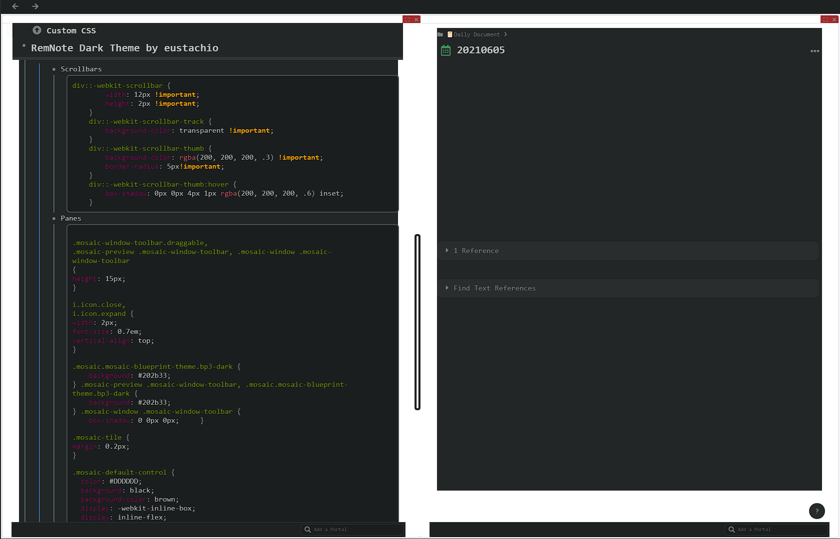
Extra space around my email when you paste the code, I noticed on your screenshot that the text of my email is white and when you click on it and it is in focus it changes to the bluish colour, it should be bluish all the time. This is a quote element, can you please check if this happens with other quotes. I will have a look at this.

Image Occlusion, I am working on a new code block to cover this RemNote feature, it is something I haven’t used yet, I will cover/fix this soon.

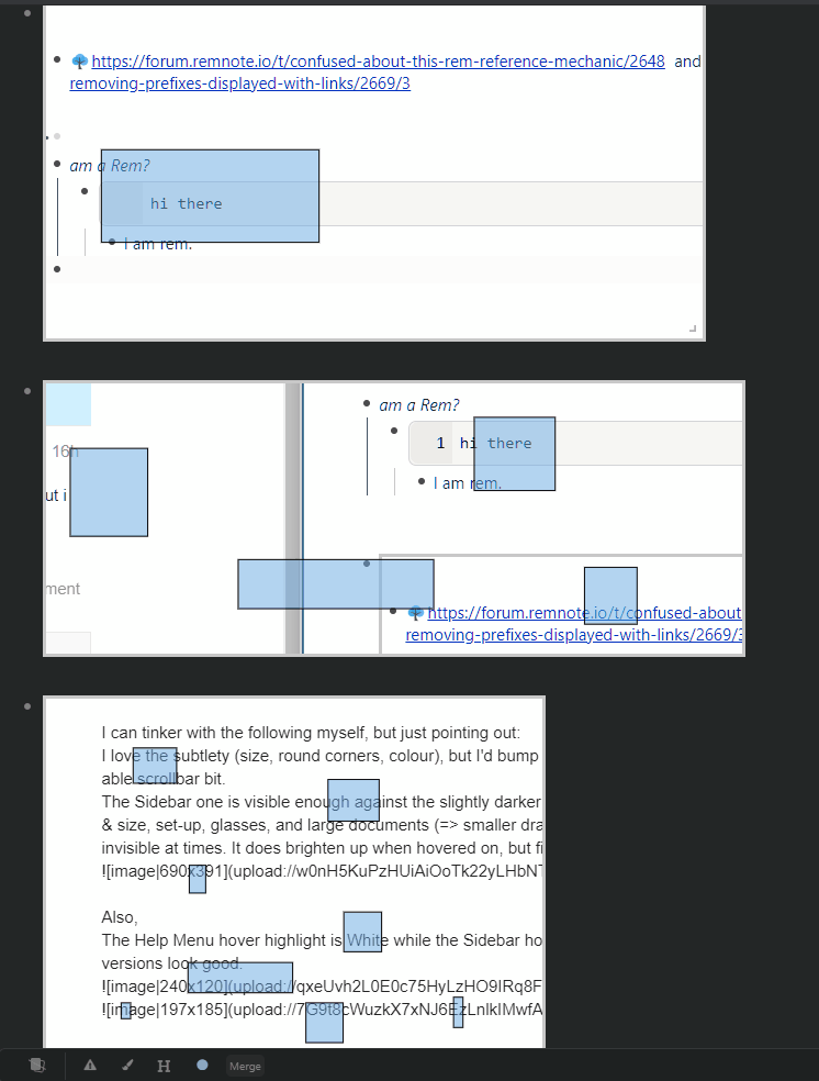
Scrollbar, I have been fixing some small bugs that @Renzo_A Renzo reported earlier today. I have changed the scrollbar to a much simpler, wider and more visible version. I also find the current (very thin) scrollbar difficult to see, click and drag :sweat_smile:

The help menu hover is an inconsistency, it’s meant to be all dark, I will fix this.

I have always been a light theme person, but by creating this dark theme I have found that it is (IMO) more comfortable.

Thank you Gabriela for reporting this. Again, I really appreciate your feedback, it helps my debugging better!!!

I will be trying this theme on MacOS and Linux soon too.

I also got an update on RemNote for Windows today, so I am looking for changes if there are any. I am having some issues with checkboxes, I can’t check or uncheck them, I deactivated the theme and the app still has the issue.

Cheers,
Eustachio

2 Likes
1 Like

Hi hannesfrank,
It’s okay, thanks for sending this.

I will try the fix, I am using ctrl + enter at the moment, I’m sure it will be fixed soon.

Cheers,
Eustachio

1 Like

**Currently trying the dark theme on MacOS Big Sur **

** Currently fixing some bugs **

** Quick reminder to turn on the Dark Mode in the settings **

3 Likes

So far, I love the theme! Great job @Eustachio!

Is there a way to change the background/border of the windowed panes to be a dark color to match this theme? I looked at the Windowed Panes in Depth post by @hannesfrank and tried to modify some of the CSS that he posted (along with some of the CSS that @ognsya posted in that thread) to change the color, but was unsuccessful.

Does anyone know how to do this? Is this impossible to do with the mosaic based panes? I know nothing about CSS, so any help is appreciated :slight_smile: .

Below is a picture of what I had tried so far. I tried to change the colors/background-colors, but it didn’t seem to change anything. Also, I tried to change the “.mosaic.mosaic-blueprint-theme” in the “Panes” block that I made to “.mosaic.mosaic-blueprint-theme.bp3-dark” to match the dark theme on the demo mosaic website here, but that also didn’t work.

1 Like

Hi @Remember
Thanks for your feedback, I’m glad you like the dark theme :relaxed:.
I will have a look at what you would like to do and find a solution for you. Please, bear with me on this.

Cheers,
Eustachio

Hi @Remember,

here is my solution to the problem:

.mosaic-window-body {
	background: var(--body-background-color)!important;
}

.mosaic {
	background: var(--blackout-background-color)!important
}

.mosaic-window-toolbar.draggable,
.mosaic-preview .mosaic-window-toolbar, .mosaic-window .mosaic-window-toolbar {
	background-color: var(--body-background-color)!important;
}

.mosaic.mosaic-blueprint-theme .mosaic-preview .mosaic-window-toolbar.draggable:hover, .mosaic.mosaic-blueprint-theme .mosaic-window .mosaic-window-toolbar.draggable:hover
{
	background: var(--selected-background-color)!important;
}

.mosaic-default-control {
  color: var(--button-color)!important;
  background: none;
  border: none;
  cursor: pointer;
}
5 Likes

Brilliant!
I have researched about this feature Windowed Panes in Depth, I didn’t know about it :astonished:. Thank you very much for the fix, I will include your code in the next update.
Cheers
Eustachio

3 Likes
  • Version 1.1 - Released date: 10 June 2021
    • More visible scrollbars
    • No Quote text jumps
    • Help menu hover now matches the dark theme
    • Highlight text color margin/padding improvements
    • Show proper card types on bottom bar
    • No white background on bottom bar
    • No white top border on narrowed bottom bar
    • New Windowed panes code block - Thanks to Henrik. This fixes the white body background when this lab feature Windowed Panes is ON.
  • Tested on MacOS (Big Sur) and Fedora 34 apps.
  • Thanks you all for reporting bugs.
6 Likes

This is so good!!!

One bug - My documents screen suddenly got a lot of Top Level “Todo” docs - can you please fix this? :pray:

Hi @awreccan, can you please share a screenshot pointing out that for me? This will help me to understand the issue.
Cheers,
Eustachio

I think I have found the issue, the markdown to be copied from GitHub was broken, sorry about this. There is a new update v.1.11 of the dark theme available which fixes this.

3 Likes