Hi @Jpfresco thank you for your feedback.
Unifying the light and dark themes is on my list.
Cheers!
Eustachio

Hi @Jpfresco thank you for your feedback.
Unifying the light and dark themes is on my list.
Cheers!
Eustachio
Yes that is a work around. But I can’t find the Eustachio light theme anywhere, where is it?
This is the original post on Reddit, the way it is setup is quite different.
I haven’t updated it but I started weeks ago working on it, I will bring the branches to the light theme and making it more consistent with the dark theme.
Hello,
I’ve noticed recently a weird behaviour, which I can’t tell if it’s related to this Dark Theme or not. Have a look. I don’t think this was there before : a strange icon in the background + some black lines.
When I deactivate the Eustachio theme : the lines of the box are not visible anymore, but I can’t tell for the icon because there is a grey overlay.
Also, this in multiwindow : white rectangles appear (on the same spot as the black lines in the GIF above)
Hi, I do not know what that is tbh, I haven’t seen that. I will look into it.
Cheers,
Eustachio
No need, I found the issue! thanks
I want to thank you @Eustachio for your theme!  It’s tided me over well until the redesign of the UI lands. I look forward to the theme looking even prettier afterwards.
Hi, you’re welcome, I’m happy that you like the theme. Thank you for your feedback.
I will do my best to keep the theme always up to date for sure.
For those who have asked me about where to contribute with some funds/donations, I have uploaded a button on the GitHub page. Any donation will be much appreciated.
Cheers,
Eustachio
it doesnt work it break my remnote
Hi, can you please elaborate? Perhaps some screenshots, it will help me to understand your issue and fix it.

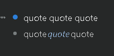
Hello Eustachio. Your theme is fantastic. But…When I select the “quote” option the letters are together. I would like to give a little more space between them for better reading. I looked inside the CSS code, but I didn’t find the option to change it myself. In the image above, the first one is without the option checked, the second one shows when the quote option is selected.
Hi, thanks for your feedback. I will have a look at this issue very soon.
Cheers,
Eustachio
Hi All,
Quick update!
I was in a short brake and then busy with some work. This week I will be releasing the version 1.3 of the theme 
What’s coming:
I will be also checking some other bugs.
Cheers,
Eustachio
Oh My. I cannot wait for this update! Again, thanks so much for your hard work.
Bravo!!! Great News!!
The version 1.3 of the theme is available now on GitHub 

Thanks to all of you for reporting bugs, and your support.
Cheers,
Eustachio
This issue has been fixed in the version 1.3 of the theme. Please let me know if it works for you.
Cheers
Great news, eustachio. You are better than the developers of the program for fixing bugs and innovations. I’m discouraged about studying here, but I’m going to move on with my 18,000 REMs.
The update 1.3 partially resolved the QUOTE format. But… Take a look when the text is bold and underlined.
Normal text

Bold and underline

The spacing between the letters is too wide. I will try to solve the problem here myself, but it would be a good fix for all users. Hugs and thank you for your effort and dedication.