Simple Toggle Expansion of Tagged Rem

I really dislike the way expanding the references section on a document causes a portal to appear which you then need to hit X to remove. It also creates a weird extra hanging bullet underneath and is just not very fun in general:

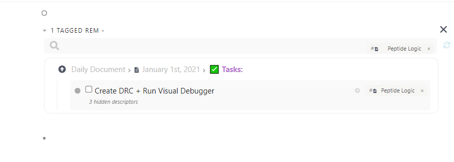
The ideal design would be that when you press the toggle, the RESULTS of the portal search show up (e.g. only this:

)

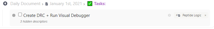
There shouldn’t be any extra bullet underneath or on top. Honestly, this visual change would make using the linked references so much more intuitive and simple. See Roam’s implementation if you want more inspiration.

Hmm, I can disagree, when you want to find connections to your document, you do it with (something close to) a portal. The idea is to have that portal as a rem inside your document. What is there to dislike? Just saying

is pretty vague :laughing:
The grey bullet under the portal-like box is intended if you want to add rem under the box. Which is very logical when trying to, but not limited to, build something like a dashboard where you want to see tagged rem. :man_shrugging:
What’s wrong with that? We’re open to discussions though! :smile:

@Spondon It’s a UI/UX thing. When users press a toggle button (the little triangle on the left), they expect some content to appear under the toggle button. They generally don’t expect for the entire toggle to move upward into their document. If users want a portal within the document, they can create that themselves pretty easily.

The design language is also a bit confusing here, as you have a toggle on the left and an X button on the right. Pressing the toggle again doesn’t undo moving the reference into the document, it only collapses it. You have to press a separate X button on the right for the portal to go back down to the bottom.

A more concise list of references that is easily toggleable without interrupting your actual document (and maybe something that is even toggled open by default at the bottom), would make using references and backlinks much more user friendly and efficient. This is the main reason why I find myself using backlinks significantly more in Roam Research than in Remnote (ease of access).

I hope that is more clear!

2 Likes

@Martin, Raunak made a good point. You might wanna implement the following.

So, here’s what could be done:
We can have the backlinks section in the bottom as usual. Arrow on the left, but now, there’s a plus on the right.
Pressing the arrow opens the list to show the backlinks (as you’d normally expect) but pressing the plus on the right adds it to the document (what happens currently when you press the arrow).

Is this better?

Absolutely, this seems relatively simple to implement and would be a big quality of life improvement for me! @Martin

Hey @raunakc!
This thing has actually been updated and now is a lot like how you want it. The cross is gone in the search portals fixed in a document.
It’s way more intuitive now. Hope you like it! :grin:

1 Like