It’s somewhat a small request, but I often find I want to refer back to my tag index document but don’t want to open it up in the two pane split screen as I’m always using one document and a PDF alongside. I’d love the ability to have a pop up feature for a document, similar to what some apps use for their keyboard commands. Having a tag index easily available helps me remember how I intended to organize content. Would love to hear how others organize tags!
Pop-ups sound great (must have when studying on the tablet albeit they get fiddly for me after a while)! We’d probably want them for everything once we get a taste for them. 
Functionality-wise, this can already be done with Search Portals/Portals and Rem References.
If you want to see everything, I’d go with a Search Portal/Portal. Make it in whichever pane you want, move it around, delete it when obsolete.
Considering everything is a Rem, you can use this for any Index or whatever purpose document/Rem.
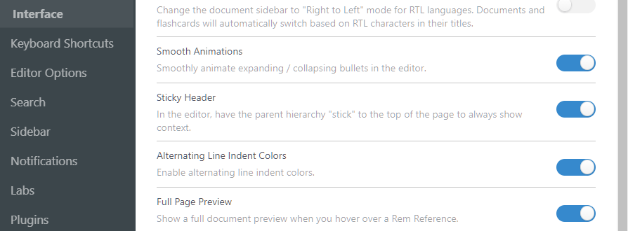
You can also use Rem References with Full Preview enabled if you want to only see a section of a document on the fly. Delete them when obsolete. Those display as a pop-up and are the easiest to make.
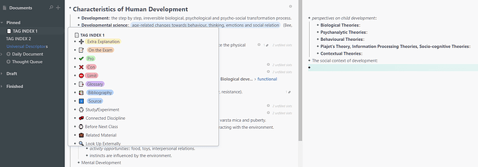
You can also put the Tag Index in the sidebar and just hover over if it’s concise enough for it to Preview most of itself.
This reminds me to sort out my tags, I just use the Tag Collection PowerUp and forget about them. 
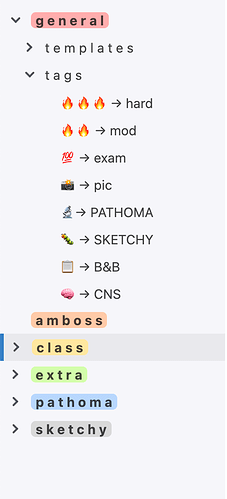
I don’t if it helps, but I have a rem called “priorities” in which all tags are stored. I type ##priorities, then tab, then scroll through my tags and select the one I want. Maybe I understood your request wrong 
Thanks for the great work around!
Still crossing my fingers for a pop up but I like the idea of using a tags sidebar document to quickly hover over in the mean time!!
That looks amazing! 
You can absolutely do it like that, especially if the Tag List isn’t that long and you want to see it without having to hover over it (or are someone that uses Tags more than Documents/Folders).
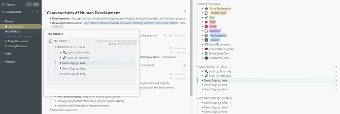
I initially meant it more like this, using Full Page Preview (has a display length limit), since you wanted Pop-up functionality. If the list is too long you could:
a. Use Portals to display other sections of the Tag Index in the Preview area of another Document (this keeps the main list together).
b. Split the Tag Index across multiple Documents (this looks better).
To also have a Main index:
c. Split/Portal the Tag Index across multiple Documents and Portal all of them into a Main Tag Index to keep track of all of them.
d. Split/Portal the Tag Index across multiple Documents and use the Tag Collection PowerUp if you want to see all of them. (you can Ctrl + P then type ##Tag to access it).
Demo - Document (if you go with b. all will look like this):
Demo - Portal (if you go with a. you will have one document that shows the above and the rest will show like this - unless you keep the main Document out of sight and use a Portal for all sections, to maintain consistency):
This descriptor dropdown from RedGregory can also be adapted to work with Tags or whatnot as well.
Wow!!! That looks really great! Such good ideas & great workaround for longer lists of tags. Since I usually have my two pane view in use (one for notes, and one for PDFs) I can’t have the tags up as well in a third pane but if the ability to split screen more than twice comes down the pipeline I will definitely switch to your method!!


