
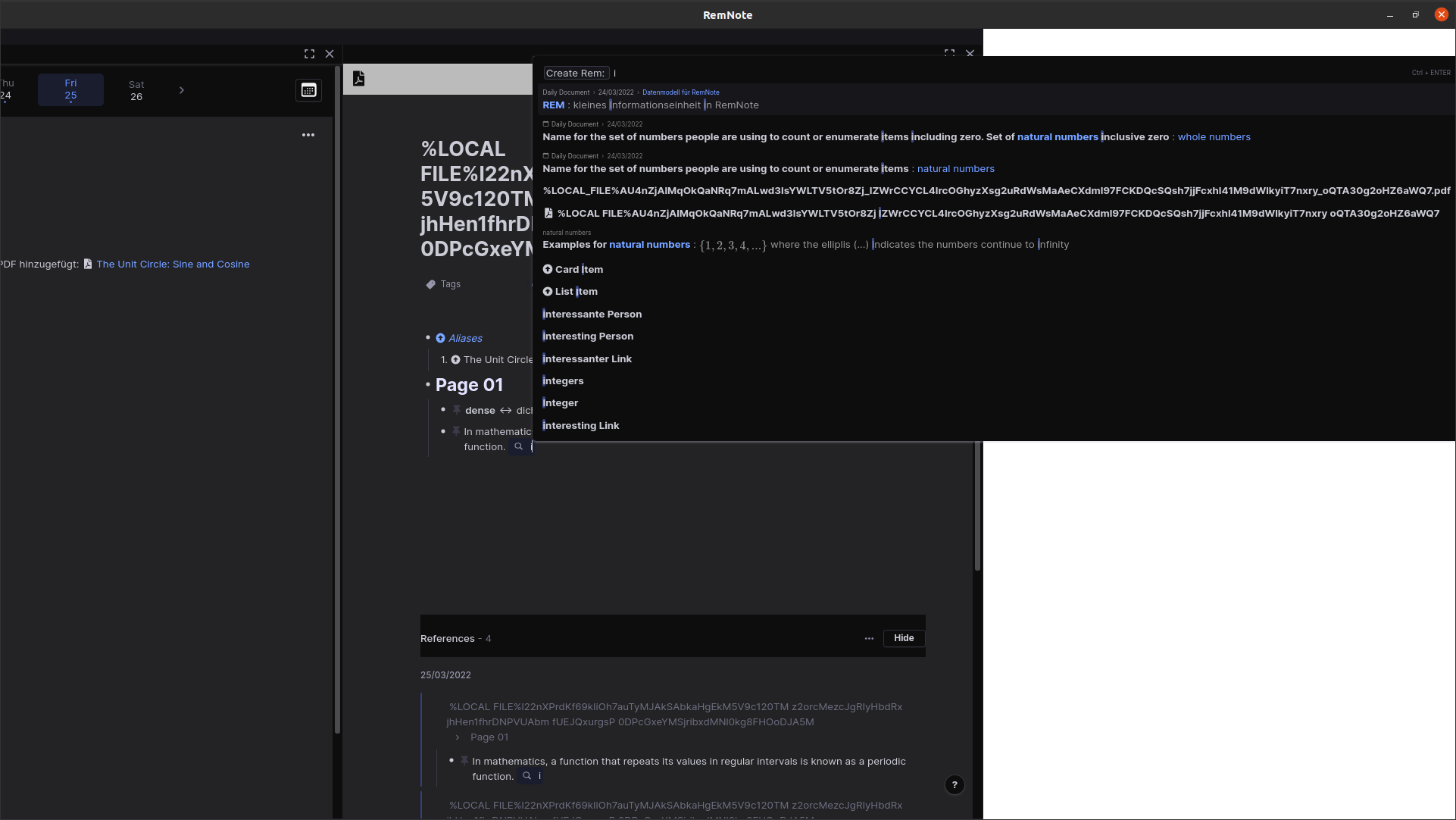
I have the following effect: when I want to set a tag, an additional white panel opens on the right side, which does not destroy the layout, but “pushes” everything to the left. See screenshot:
Steps for reproduction:
- AppImage for Ubuntu Version: 1.7.6
- Zoom: 80%
- load a PDF in RemNote and leave the long hash name. The long name of the PDF is the reason that later when inserting a tag, the selection menu that appears gets an “extra width”.
- Open a document and create a new REM. Tag the REM by typing # twice. The “Tag Search” opens.
- Type one (!) letter that appears at least once (!) in the hash name of the PDF. The search finds the “hash entry” and displays it in an over-wide drop-down menu. At that moment the white panel mentioned in the headline appears on the right, indenting everything to the left.
- If you now type further letters, the hash entry disappears again as a search result and with it the white panel on the right side. The display normalizes.
A first solution could be that the search only starts to list matches after three or four letters. This would relatively reliably prevent the hashes created during the PDF upload from showing up in the search result list. A better solution would be to have the width of the selection menu itself move to the left for extra-wide search results, so that it does not indent the panel below it.