
So i use rem references and the new link feature a lot. But in the pop up part it inverts the color image which makes it impossible to read that image
Here is how it looks in the light interface
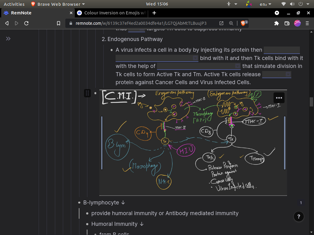
And here is the look in the rem it self
I earlier used to use dark reader extension rather that the dark interface in remnote, as I prefer a full dark interface rather than the pop up being white. But since to the recent update text is dark grey in the queue and the pop up which makes it impossible to read.
So it will be better if the color of the images aren’t inverted in the pop and it will also better to have a full dark interface option rather than a white pop up.