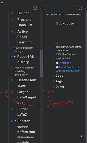
I assume this is due to having to accommodate the larger elements of the six dot menu and fatter arrows. Especially bad when using multiple vertical panes in a smallish vertical window, see image.
2 Likes
is that with the full page width option turned on under settings - interface?
Ironically, full page width makes it even worse. However, there is a snippet to ameliorate this somewhat - the 0px version of Less whitespace in the left margin.

