The goals: have as much usable information visible on the screen at the same time as possible and remove any information that is not needed or extraneous visual elements.
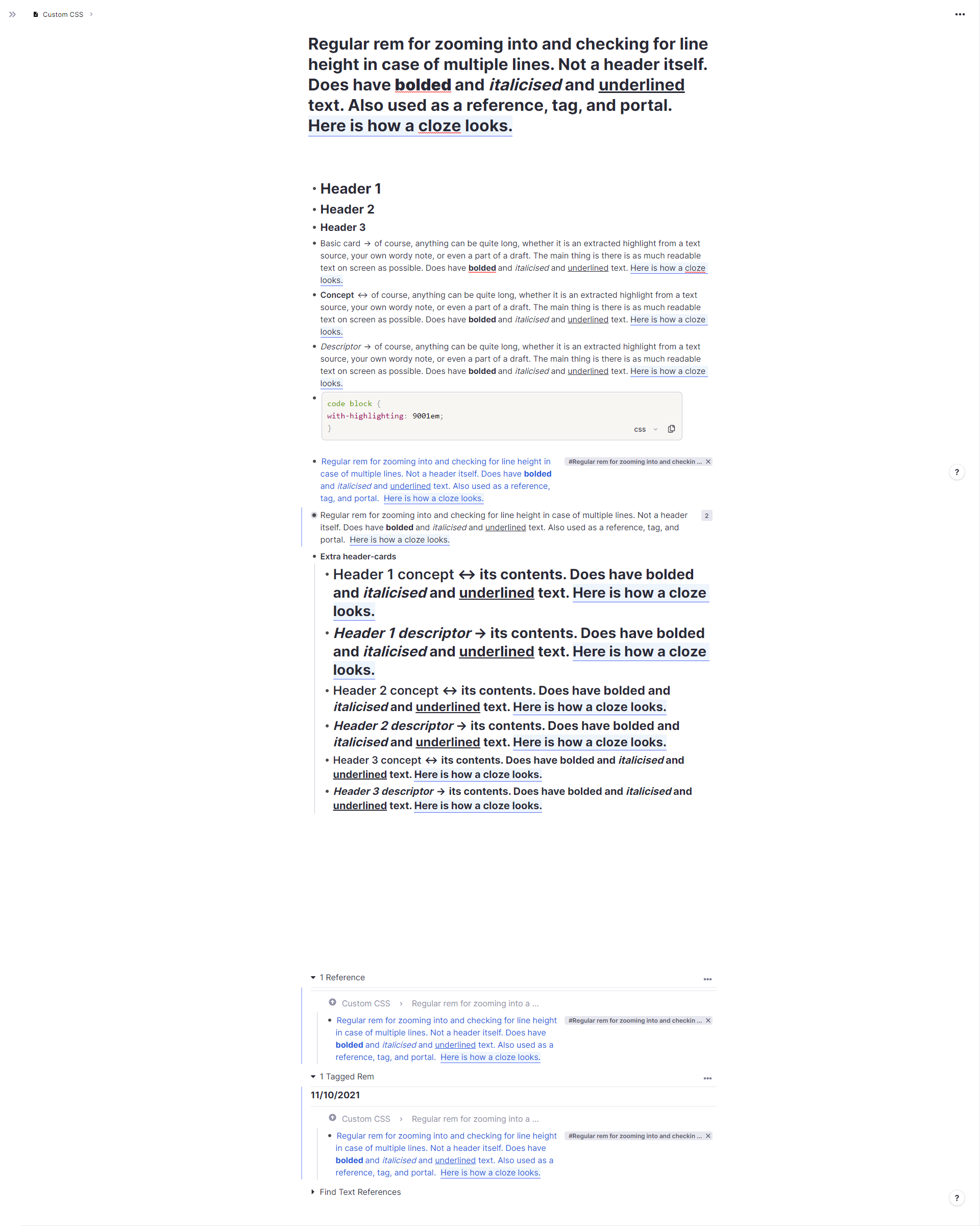
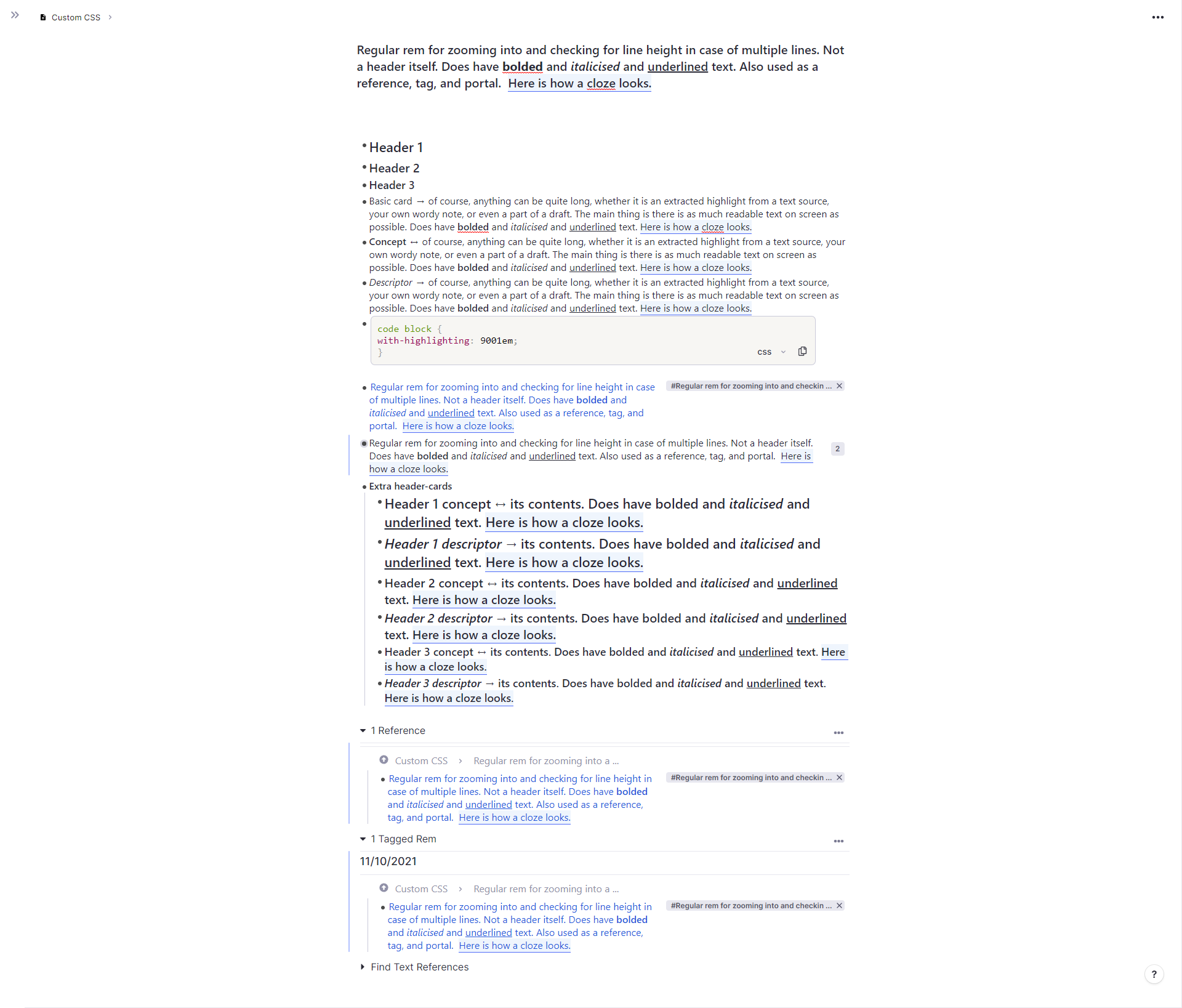
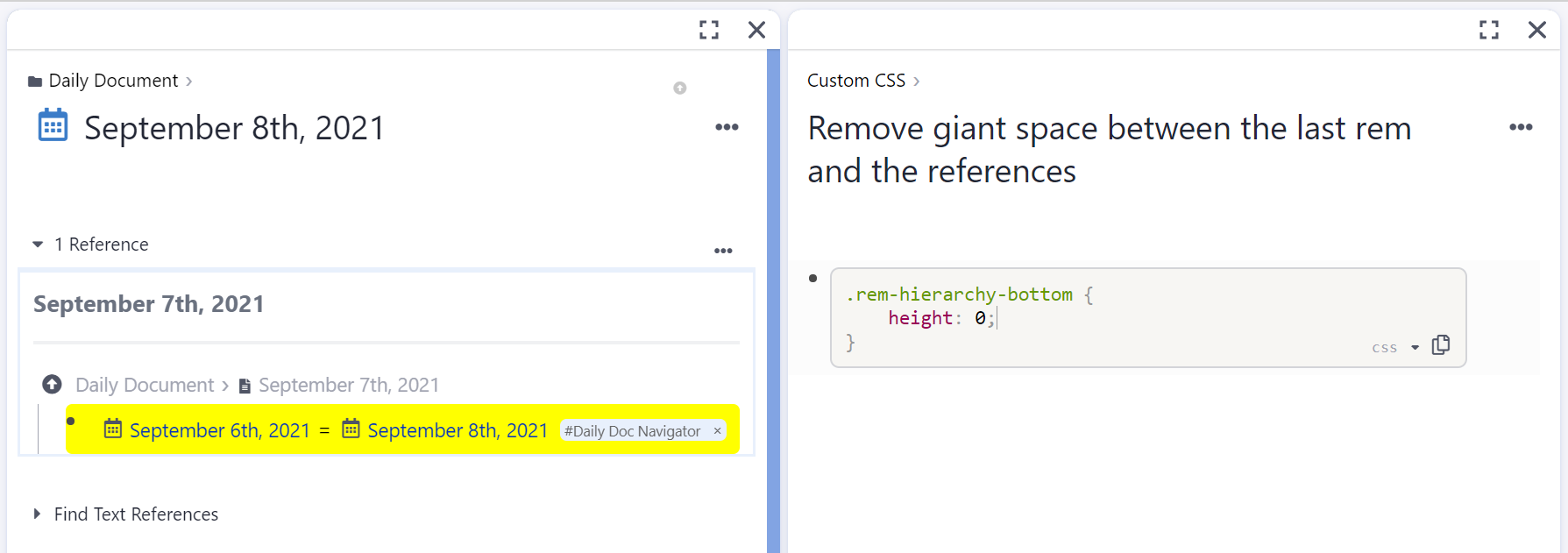
Large Image (open in new tab) comparison with the default 1.4 look after applying most snippets (as of 11 October 2021)
Before:
After:
User guide: either create individual blocks for each snippet or paste all your chosen ones into a single code block. Snippets that have * after their name have alternatives, pick and use one. Values may be edited to your preference, see the comments in the snippet for details.
Contributor guide: write in the snippet under the appropriate category, matching the formatting of others (name in a comment before the rule, default and other relevant values in comments to the right of the changed value if possible) and leaving a link to the original post if it exists. Ideally, add a before/after image comparison.
-
Requests:
-
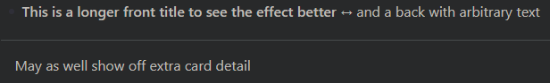
Reducing whitespace around or between elements
-
Making elements themselves smaller or less prominent
-
Making hidden elements more visible
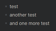
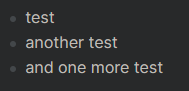
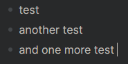
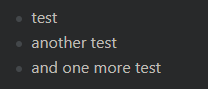
- Show the bullet for an empty Rem
- Show the down arrow all the time as Workflowy does
- Disable hide-until-:hover for “Show Source”
-
The snippets. Click to unfold or fold.
-
Removing elements
Remove the slash menu placeholder on new rem
By @M_Young, update for 1.8.52 by UMNiK
/* remove the slash menu placeholder on new rem */
.absolute.pointer-events-none.select-none.rn-clr-content-tertiary.left-0 {
	display: none;
}
Before and after:
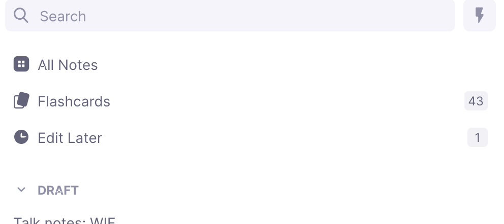
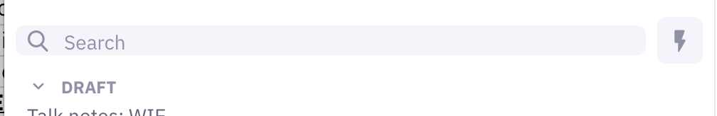
Hide the “Flashcards” and “Edit Later” in the Sidebar
/* Hide the “Flashcards” and “Edit Later” in the Sidebar  */
div.flex.items-center.mb-1.h-\[32px\].overflow-hidden.text-gray-60 {
	display: none;
}
Before:
After:
Hide "Today's Note" in the sidebar
/* Hide "Today's Note" in the sidebar  */
div[data-label="Today's Note"] {
	display: none;
}
Hide automatic search portals in hover preview
/* Hide automatic search portals in hover preview */
#document-hover-preview__popup .tree-node--automatic-search-portal-header,
#document-hover-preview__popup .portal-tree-node-box--no-margin-left,
#document-hover-preview__popup .portal-tree-node-box--enable-buttons,
#document-hover-preview__popup .hierarchy-editor__search-portal-section  {
	display: none;
}
Before:
After: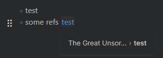
Declutter aliases - show them only when needed
By @liberated_potato and @hannesfrank
/* Declutter aliases - show them only when needed */
/* Hide the aliases container if it is inside a child */
.tree-node--children [data-rem-container-property~="aliases"] {
    display : none;
 }

/* Hide the aliases container if it is inside a reference context menu (the one you get when you hover over a rem reference) */
 .rn-popup__content [data-rem-container-property~="aliases"] {
    display : none;
 }
Remove the selected text popup toolbar
/* Remove the selected text popup toolbar */
.button-group {
	display: none;
}
Remove the count of multiline children in queue
/* Remove the count of multiline children in queue */
 #hierarchy-editor > div.pl-\[0px\].transition-none > div > div:nth-child(2) > div > div.tree-node--parent.flex-grow > span > div > div.rn-editor__rem__body__text.flex.box-border.rem-text.min-h-\[16\.67px\].text-base.leading-\[var\(--line-height\)\].font-inter.transition-fontsizebgcolor.duration-\[0\.05s\] > div > span {
	display: none;
}
Minimalistic theme with persistent focus mode
By domyyy. Will show elements when hovering over them.
/* Minimalistic theme with persistent focus mode */
.fade-on-hide-ui:not(:hover) {
	opacity: 0;
	transition: opacity 0.3s ease-in-out;
}

.rem-button__container:hover * {
	opacity: 1;
}

.rem-bullet__container {
	opacity: 0.05;
	transition: opacity 1s;
}

.remHierarchyTop {
	/*  */
	pointer-events: none;
}

.rem-hierarchy-bottom {
	pointer-events: none;
}

#hierarchy-editor .TreeNode {
	border-color: transparent;
	border-left-style: dashed;
	transition: border-color 1s;
}

/*
#hierarchy-editor .TreeNode:hover {
	border-color: #cacad9;
}
*/

#hierarchy-editor .TreeNode:hover .TreeNode {
	border-color: #cacad9;
	transition: border-color 0.3s;
}

#hierarchy-editor .TreeNode:hover .rem-bullet__container {
	opacity: 0.4;
	transition: opacity 0.3s;
}

rem-container--focused {

}

.multiple-windows__document::-webkit-scrollbar {
	width: 10px;
	height: 10px;
}

.multiple-windows__document::-webkit-scrollbar-thumb:window-inactive {
	background: none;
}

.multiple-windows__document::-webkit-scrollbar-thumb {
	background-color: #cccccc16;
	/*background-clip: content-box;*/
	min-width: 32px;
	min-height: 32px;
	border-radius: 5px;
}

.multiple-windows__document::-webkit-scrollbar-thumb:hover {
	background-color: #cccccc70;
	transition: 1s;
}

/*
.popup-menu {
	filter: invert(90.2%) hue-rotate(180deg);
}
*/

.dark-mode .pdfViewer.removePageBorders {
	/* color: #e6e6e8; */
	filter: invert(9.8%);
}

/*
.dark-mode .pdfViewer.removePageBorders.PdfHighlighter__highlight-layer {
	filter: invert(100%) hue-rotate(180deg);
} */

.PdfHighlighter .pdfViewer {
	background-color: transparent;
}

/* tiled windows */
/*
#multiple-windows .multiple-windows__document, .tile__document::-webkit-scrollbar {
	width: 10px;
	height: 10px;
}

#multiple-windows .multiple-windows__document, .tile__document::-webkit-scrollbar-thumb {
	background-color: #cccccc40;
	min-width: 32px;
	min-height: 32px;
	border-radius: 5px;
}

#multiple-windows .multiple-windows__document, .tile__document::-webkit-scrollbar-thumb:hover {
	background-color: #cccccc70;
	transition: 1s;
}

#content .mosaic-window-toolbar.draggable {
	box-shadow: none !important;

}

.mosaic-window-controls {
	opacity: 0;
}

.mosaic-window-toolbar:hover .mosaic-window-controls {
	opacity: 1;
}

.mosaic.mosaic-blueprint-theme .mosaic-preview .mosaic-window-toolbar, .mosaic.mosaic-blueprint-theme .mosaic-window .mosaic-window-toolbar: {
	border: none;
	box-shadow: none;
}

.mosaic-tile {
	--tw-border-opacity: 0;
}
*/
/* end */

.PdfHighlighter::-webkit-scrollbar {
	width: 10px;
	height: 10px;
}

.PdfHighlighter::-webkit-scrollbar-thumb {
	background-color: #cccccc40;
	/*background-clip: content-box;*/
	min-width: 32px;
	min-height: 32px;
	border-radius: 5px;
}

.PdfHighlighter::-webkit-scrollbar-thumb:hover {
	background-color: #cccccc70;
	transition: 1s;
}

.navigation-bar {
	border-radius: 5px;
}

.pdf-viewer__header {
	border-radius: 5px;
	opacity: 0;
	transition: opacity 0.3s ease-in-out;
}

.pdf-viewer__header:hover {
	transition: opacity 0.3s ease-in-out;
	opacity: 1;
}
Remove the placeholder space between title and rem below
/* Remove the placeholder space between title and rem below */ .rn-add-rem-button--top { display: none; } -
Reducing whitespace around or between elements
Less whitespace in the left margin
By @MAB941009 with a fix by @TaQuangKhoi
/* less whitespace in the left margin */
.document--ltr {
	padding-left: 0px; /* 48px is the default, 0px will push the six dot menu halfway past the edge if the rem has an arrow, 32.5px will just reduce the margin */
}
.document-sidebar--collapsed--vertical {
	height: 5%; /* removes unused vertical sidebar hover area when used with windowed panes */
}
Tighter sidebar
/* tighter sidebar */
#document-sidebar div {
	padding-top: 1px; /* 0px for an even more severe effect */
	padding-bottom: 1px; /* 0px for an even more severe effect */
}
Compact leading
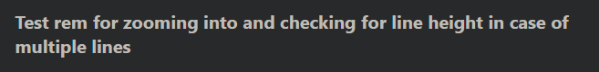
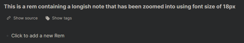
By Martin (increased 16>18 and comment by UMNiK).
/* Compact leading */
body {
	--rn-line-height: 18px; /* 16px is the default text size */
}
Before:
After:
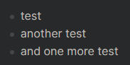
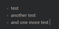
Less space between rem's bullet and text
/* less space between rem's bullet and text */
.hierarchy-editor--ltr .rem-text {
	padding-left: 20px; /* 24px is the default */
}
Before:
After: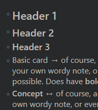
Shorten space before rem reference portals
By @TaQuangKhoi, updated by UMNiK
/* Shorten space before rem reference portals */
.rn-add-rem-button {
	height: 2rem; /* Default is 15rem*/
}
After:
-
Making elements themselves smaller or less prominent
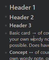
Smaller and less bold headers
Headers selectors and other styling examples by @hannesfrank
/* smaller and less bold headers */
.rem-text.rem-header--1 {
	font-size: 22px; /* regular text size is 16px */
	font-family: Segoe UI; /* Inter is the default */
	font-weight: 500; /* 700 is the default */
}

.rem-text.rem-header--2 {

	font-size: 20px; /* regular text size is 16px */
	font-family: Segoe UI; /* Inter is the default */
	font-weight: 500; /* 700 is the default */
}

.rem-text.rem-header--3 {
	font-size: 18px; /* regular text size is 16px */
	font-family: Segoe UI; /* Inter is the default */
	font-weight: 500; /* 700 is the default */
}
Before:
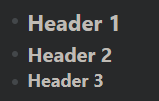
After:–
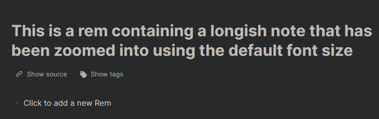
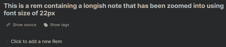
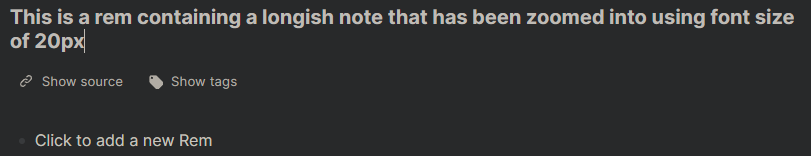
Smaller zoomed in rem title
/* smaller zoomed in rem title */
.document-title{
	font-size: 20px;
	--line-height: normal;
}
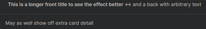
Less bold document title
/* less bold document title */
.font-bold {
	font-weight: 500; /* 700 is the default*/
}
Before:
After: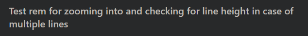
Less bold bold text in document title
/* less bold bold text in document title */
.document-title .bold {
	font-weight: 700; /* default is 850 */
}
Before:
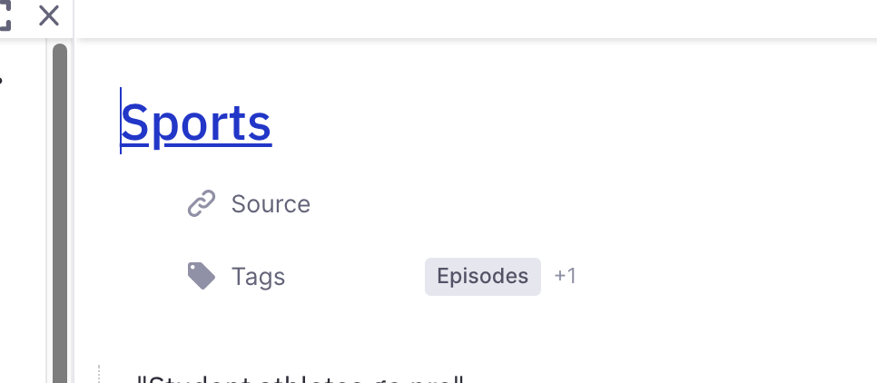
After:Smaller source and tags fields
#DropToOpenAsDocument > div > *:not(#DocumentTitle) {
  zoom: 80%;
}
Smaller and more condensed font
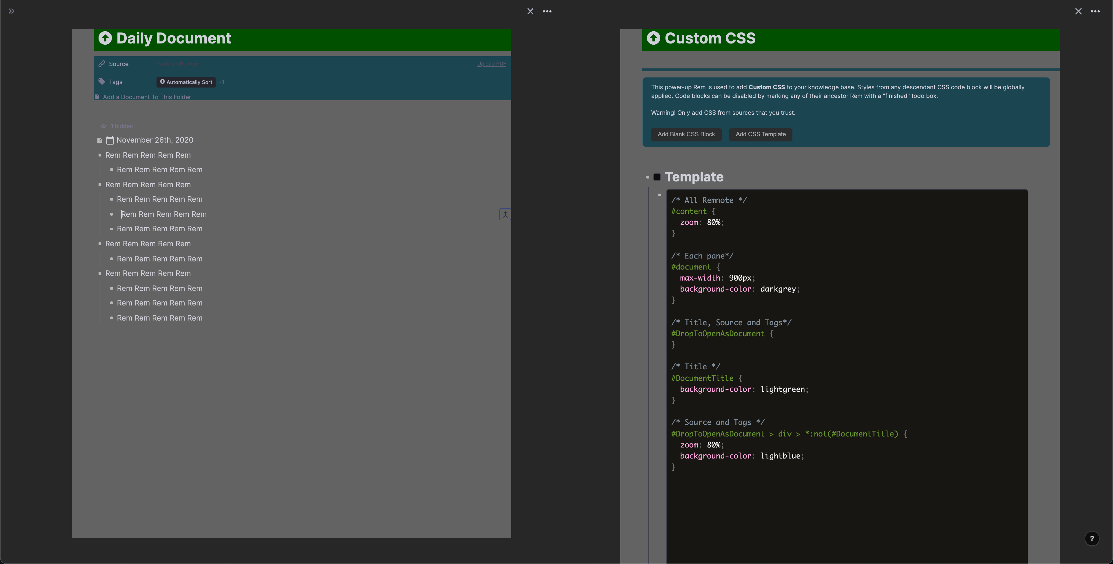
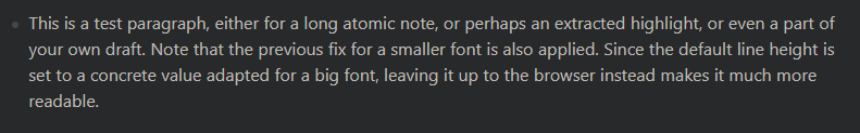
/* smaller and more condensed font */
.rem-text { /* regular notes */
	font-family: "Segoe UI",Roboto,Helvetica,Arial,sans-serif,"Apple Color Emoji","Segoe UI Emoji","Segoe UI Symbol"; /* "Inter",-apple-system,BlinkMacSystemFont,"Segoe UI",Roboto,Helvetica,Arial,sans-serif,"Apple Color Emoji","Segoe UI Emoji","Segoe UI Symbol"; is the default */
	/*overriding font-size here will also override it in the zoomed in rem, default is 16px*/
}
.font-inter { /* queue */
	font-family: "Segoe UI", -apple-system, BlinkMacSystemFont, Roboto, Helvetica, sans-serif; /* Inter, -apple-system, BlinkMacSystemFont, Roboto, Helvetica, sans-serif; is the default */
}
Before:
After:-
Set the concept bold
/* set the concept bold */
.concept_rem_type{
	font-weight: 600; /* default is 600  */
}
Set the text bold to be as bold as the default concept bold
/* set the text bold to be as bold as the default concept bold */ .bold { font-weight: 600; /* default is 700 */ } -
Making hidden elements more visible
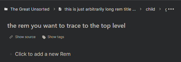
Add a scrollbar to show all breadcrumbs if needed*
by @Browneyedsoul Use this or “Multi Line Breadcrumbs”
/* add a scrollbar to show all breadcrumbs if needed */
.document-header-top-bar > div {
   overflow-x: auto;
}
Before:
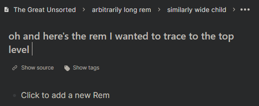
After: https://i.imgur.com/xpsBlIe.mp4Multi Line Breadcrumbs*
by @Browneyedsoul Use this or “Add a scrollbar to show all breadcrumbs if needed”
/* Multi Line Breadcrumbs */
.document-header-top-bar {
	height: fit-content;
}
.document-header-top-bar > div > div {
	flex-wrap: wrap;
	overflow-wrap: normal;
}
.document-header-top-bar .flex-nowrap {flex-wrap: wrap;}
.document-header-top-bar .flex {display: inline;}
Before:
After:--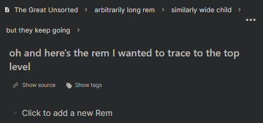
Show indent line in the sidebar
by @Euan_Ong Comparison pictures in the topic.
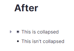
	#document-sidebar .accordion.ui.fluid {
		background:
			linear-gradient(#cacad9 0 0) 17px,
			linear-gradient(#cacad9 0 0) 43px,
			linear-gradient(#cacad9 0 0) 69px,
			linear-gradient(#cacad9 0 0) 95px,
			linear-gradient(#cacad9 0 0) 121px,
			linear-gradient(#cacad9 0 0) 147px,
			linear-gradient(#cacad9 0 0) 173px,
			linear-gradient(#cacad9 0 0) 199px,
			linear-gradient(#cacad9 0 0) 225px,
			linear-gradient(#cacad9 0 0) 251px,
			linear-gradient(#cacad9 0 0) 277px,
			linear-gradient(#cacad9 0 0) 303px,
			linear-gradient(#cacad9 0 0) 329px,
			linear-gradient(#cacad9 0 0) 355px,
			linear-gradient(#cacad9 0 0) 381px,
			linear-gradient(#cacad9 0 0) 407px;
		background-size: 1px 100%;
		background-repeat: no-repeat;
	}

	#document-sidebar .title.p-2 {
		background: white;
	}

	#document-sidebar .p-2:not(:hover) {
		background: white;
	}
Always visible toggle button for collapsed rem
by Jakob
Have to change rgb color codes for Dark Mode./* Always visible toggle button for collapsed rem */ .rem-button__container:has(.rem-bullet--hidden-children):before { position: absolute; pointer-events: none; left: 26px; width: 20px; height: 20px; transform: rotate(-90deg); content: url("data:image/svg+xml,%3Csvg xmlns='http://www.w3.org/2000/svg' fill='rgb(145, 145, 168)' viewBox='0 0 20 20' data-icon='toggle' class='inline-block group-hover:text-gray-40 dark:group-hover:text-gray-80 transition fill-current text-gray-15 dark:text-gray-50 rotate-0' style='width: 20px; min-width: 20px; height: 20px; min-height: 20px;'%3E%3Cpath d='M5.79515 9.25169L9.10157 12.5581C9.59944 13.056 10.4037 13.056 10.9016 12.5581L14.208 9.25169C15.0123 8.44742 14.4378 7.06869 13.3016 7.06869H6.68878C5.5526 7.06869 4.99089 8.44742 5.79515 9.25169Z'%3E%3C/path%3E%3C/svg%3E"); } svg[data-icon=toggle] { color: rgb(145, 145, 168); }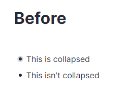
 )
)
 Leaner Bullets