UI: Hidden menu appears too quickly

Not a bug, per se, bug quite an inconveniance.

Proposal: Add a delay before collapsed menu opens or limit the width of the event trigger area so that one can operate rem controls more easily.

More detail: If you hide the left side panel and than try to open a rem via arrow or change rem cards to show (forward only, backward only, …) then for me there is 50/50 chance that the menu will appear because I move the mouse for a second too much left. Perhaps I am clumsy (IMHO not really) but it’s really irritating.

It may be a newer interface mishap actually. Kept arguing with it as well. :woman_facepalming:

No need for the delay. Just fix the hitboxes for the navigation sidebar and hierarchical pop-up - does it have a name?- (no triggering unless we poke them specifically) & fix the position of the space we write in and its controls if need be (the writing zone + controls can be moved right slightly, if necessary).

For the sidebar, just give it a slightly shorter trigger, it should be fine. The pop-up lines and nodes thing can have a small button hover trigger up near the … menu button, no need for it to hang over. The buttons and hitboxes for the … and X node thing can be reduced to the size of the < > arrows found in the App.
Consistency also helps visually image

Issue examples:
If you come up from a bit under the Rem, you have more chances to not trigger things ATM, but in some situations, stuff simply overlaps and you can’t scroll the issue away…
image
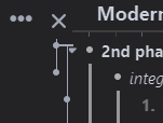
Sometimes we get an arrow, instead of triggering the pop-up, albeit we aren’t usually that lucky:
image
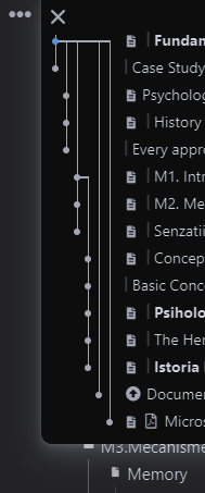
Pretty sure that folder’s (M3 Mechanism) arrow isn’t anywhere near the common sense trigger point, yet the pop-up triggers even at that significant distance from the top of the page:
image

Yeah, it is a little annoying when the menu panel keeps showing up when I just want to toggle my bullets.
I think the triggering range of the menu panel is too wide. If the panel only show up when I put the mouse on the extremely edge then it will be fine.

You could use this CSS snippet provided by Hannes to reduce accidental activations of the sidebar

#document {
padding-left: 40px;
width: calc(100% - 70px);
}

In my experience at least this made me never accidentally activate the sidebar again.

1 Like

Thank you for pointing this out, this will be handled as a part of the UI/UX redesign.

It’s 7 months later and this has not been fixed - this CSS should be added as default, not as an option! Without it usability of the app is compromised. Would be great to fix it ASAP

2 Likes