Ah, an oversight then. Still, might be worth telling the team to remove the unused stuff to avoid it causing problems in edge cases like this one.
[Wiki] CSS snippets to make things more compact and information dense and/or less visually obtrusive
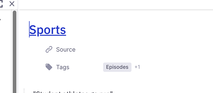
Is there a way to reduce this space? (Between title and Source and Tags). Also, what is the :hover for the “Show Source”? I never know where to click, so I have to wave the mouse around. It’s one thing I would like visible, if possible. Thanks!
Updated the OP with a new snippet for space between a bullet and its rem text and made it into an actual wiki. Contributors welcome!
same concern here because I’m printing my notes on notebook paper and that’s a lot of space wasted 
I tried to update this wiki in the Requests section, and to add a section “Make elements more prominent”. I hope I didn’t mess up anything! I might suggest renaming this page to be more general, "CSS snippets to adjust compactness and minimalness: 
Edited the edits, renamed the topic. Please don’t add stuff that doesn’t have to do with the goals: Hannes’ kanban is an additional feature.
No problem! Sorry about that!
This is really useful! Just wondering if you know how to reduce the minimum size an image can be resized to? Line height doesn’t have any effect.
Is there a way to hide the “Flashcards” and “Edit Later” in the Sidebar? I never need those things and that’s prime real estate for me.
div.flex.items-center.mb-1.h-\[32px\].overflow-hidden.text-gray-60 {
	display : none;
}Thanks so much Achyut! Worked so perfectly! I will add it to the wiki.
Hi, @UMNiK ! I changed the Header 2 with this code, but it seems to affect the way these documents are displayed when zoomed in (as titles, I think). Is there a way to make these changes not affect the document title format? I hope I’m being clear. Thanks!
Sure, here you go.
/* smaller and less bold headers, except for when they are zoomed into */
.rem-text.rem-header--1:not(.document-title) {
	font-size: 22px; /* regular text size is 16px */
	font-family: Segoe UI; /* Inter is the default */
	font-weight: 500; /* 700 is the default */
}

.rem-text.rem-header--2:not(.document-title) {

	font-size: 20px; /* regular text size is 16px */
	font-family: Segoe UI; /* Inter is the default */
	font-weight: 500; /* 700 is the default */
}

.rem-text.rem-header--3:not(.document-title) {
	font-size: 18px; /* regular text size is 16px */
	font-family: Segoe UI; /* Inter is the default */
	font-weight: 500; /* 700 is the default */
}
Excelent, thanks! Worked perfectly 
The hide alias code doesn’t seem to work in the latest update
This css seems to not work anymore in some of the recent updates. Does anyone know the proper updated css to remove UI items like “Type / for commands”
How about the updated version in the OP?
Thank you! Sorry I did not noticed the updated code above, thanks for linking it!

