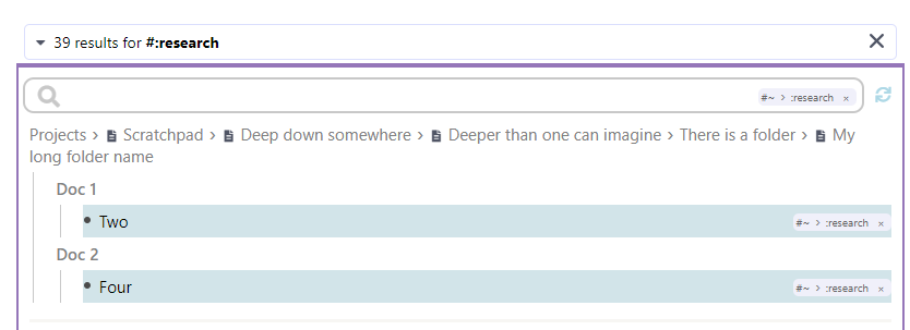
Just sharing my setup while we wait for something along the lines of Transparent Portals aka Lightweight Transclusion (Portal Simplifications)
If you think portals have too much noise in them, use this CSS snippet to reduce the font size and color (or hide) the hierarchy of portal items. As you can guess, uncomment /*display : none;*/ to hide the hierarchy completely.
    /* Hide the hierarchy of each rem in portals */
    .rem-container--not-included-in-document-scope > .rem-text{
        color : silver; /* change hierarchy color */
    	font-size: 10px; /* change hierarchy font size */
        /*display : none;*/ /* uncomment this to hide the hierarchy */
    }
This changes the portals from this
to this
Disclaimer: I’m not a CSS expert


