Transparent Portals aka Lightweight Transclusion aka Workyflowy Mirrors (Portal Simplifications)

RFC: I don’t know if my suggestion is a good idea or if there is a rationale behind the current system that I just don’t understand. Comments are greatly appreciated.

  • I’m not sure if I’d like transparent portals in addition to normal portals or if normal portals should be changed into transparent portals. Are there good use cases (things you have in your workflow) which require the current system and which are not possible with transparent portals?
  • I have not used other software and it seems to me that how I describe it is just like other apps like Roam do it. Is that true?

I came across this while tinkering a bit with the markup and realizing that portals do not fit as nicely between other rem such that one has to treat them as a special case.

I’d like to have more transparent portals that behave just like any other rem which I describe in the following.

Anatomy of a (normal) Portal

Portals are RemNote’s way to transclude bullet points (transclude = transparently include = editable copy).

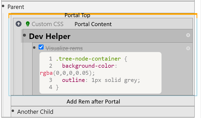
A portal consists of three parts:

  • Portal Top: This is just a handler to select the portal and display the three dots menu of the portal which is mainly just to turn the portal into an embedded queue.
  • Portal Content: A view into another document/top-level rem.
    • Usually you want to portal in one/some child(ren) of this while having its/their ancestors hidden. In the example above the portaled target rem is Dev Helper.
    • You see that the target rem is actually indented one level further than its intended sibling Another Child outside the portal.
    • The hidden parents are displayed as breadcrumbs.
    • You can look around in this document, unhide siblings and parents and optionally when you are done /Hide parents & siblings again.
  • Add Rem after Portal: A clickable space to add a new rem. The idea is that you can’t add a rem if you press enter in the portal, because it adds a bullet point there.

Note:

  • A single portal can even host multiple rem, but I still don’t know how to do that reliably. (And with transparent portals it does not matter if they are separate or not because they would look just like a list of normal rem. Update: I just discovered that a the Ctrl + S (Add a portal) is actually supposed to add a rem to a portal if a portal is focused. I was just pretty confused. I even made this issue: Inconsistent Portal UX.

Transparent Portals

A transparent portal just a single transcluded bullet point.

  • The design should be very discreet: (Challenge: Find something that works for portals inside portals.)
    • add a light background color
    • color/shape the bullet point
    • color the indent guide
    • (I think roam underlines. I don’t like that)
  • On focus/hover you see the breadcrumb from where the bullet point is transcluded. This is hidden otherwise.
  • You can add children to the transcluded bullet point which are added to the transcluded document like expected.
  • If you outdent a transcluded child it is removed from the transcluded document and added to the current document. And vice versa (indent adds to transcluded document).
  • Moving the transcluded bullet point is moving the portal. It does not change the transcluded document.

Implementation

IDK if everything checks out, I’m just brainstorming:

  • The transcluded bullet point gets in addition to its normal parent a list of transclusionParents.
  • The parent of the transcluded bullet point has just the original _id of the transcluded bullet point in its list of (visible) children.
  • That the bullet point is transcluded is given by the
  • Transcluded bullet points get a single CSS class on its .tree-node-container. This should be sufficent to style accordingly.

Alternatively: Suggested Changes to the Normal Portal

(Again: If there are valid use cases for normal portals then they should stay in RemNote - maybe with a few improvements - and transparent portals can be implemented additionally.)

  • Remove the Portal Top? (You need a top the portal consists of multiple rem.)
  • Dedent the target one further level? (Does not really work, does it?)
  • Remove the “Add Rem after Portal”. Usually the whitespace strange to have and I don’t want to tough the mouse anyway.
    • Maybe let the user decide to remove with Custom CSS.
    • Add a keyboard shortcut (ctrl + alt + enter) to enter out of the portal. This also applies to code blocks.

Hmm, I think I want transparent portals in addition to normal portals?

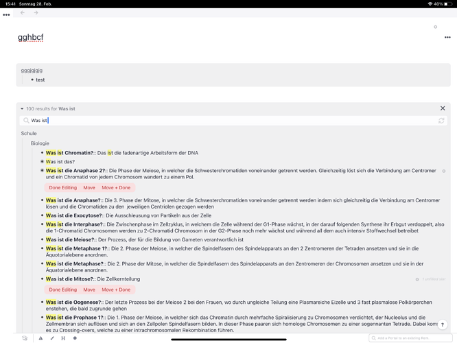
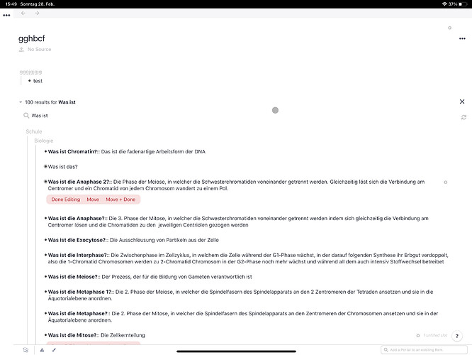
It would be amazing to have a simplified version of portals. Now they take up so much space and sometimes have a lot visual distraction information (especially search portals). I think a more subtle information that it’s a portal could be sufficient.
No more information and space in the vertical for example, instead just add some visual on the left or right.
Or no visual at all, just if you hover over a portal, you see that it’s a portal, otherwise it looks as all other REMs.
Just some random additional thoughts that I had, when I read your text. So yes, upvote for the total or optional portal simplification.

8 Likes

(I had already voted on this awhile ago. Just thought it would be a good idea to clarify one thing)

@hannesfrank does your post apply to Search Portals as well?

If so, maybe add the word “search” in the title (or somewhere in your post), to make this clear.

@erikhaze mentions that in their comment, but would be good to get more visibility.

1 Like

No, I would not equate Portals (aka Transclusion) with Search Portals (aka Queries).

I use portals often to include a single bullet point (and it’s subtree) while search portals usually generate a list of bullet points which can not be placed transparently at the position of a single bullet point anyway (because the HTML has to have a single top level element).

2 Likes

Gotcha! I’ll create a new request for this then.

1 Like

Like this:

5 Likes

Are there any updates to simplifying the portal interface? I’ve tried searching through the forum but haven’t found any - thank you!

You could use custom CSS. For that go to settings>interface>add custom css>add blank css block and then paste your css snippet. Here are some suggestions: The first one’s from a user called eustachio. Click on this link RemNote There you will find css code for a portal that looks like this

Another css snippet, the one I actually use, is this one from a user named JoshKoiro. It looks like this


It’s the reference section of the source code that you can copy paste into a blank css block:

.rem.portal-rem--blue.portalRem {
        background-color: transparent!important;
        border: none!important;
        box-shadow: none!important;
    }

    #hierarchy-editor .portal-rem .portal-rem-top { 
        border-top: 2px solid transparent;
        background-color:transparent;
    }

    #hierarchy-editor .portal-rem .portal-rem-top:hover { 
        cursor: pointer;
    }
    
    #hierarchy-editor .portal-rem--selected, 
    #hierarchy-editor .portal-rem--selected .portal-rem-top { 
        border-color: transparent!important;
        box-shadow: 0px 9px 0px 0.5px var(--secondary-background-c);
    }

    #hierarchy-editor .hierarchy-editor__after-portal, 
    #hierarchy-editor .hierarchy-editor__after_portal--blue { 
        border: none;
        
    }

    #show-embedded-search-button {  
        padding: 4px;
        margin-right: 0;
        margin-top: 4px;
        margin-left: -6px;
        border: none;
        color: var(--font-background-c);
    }

    #show-embedded-search-button i.caret.down.icon {  
        opacity: 0.5;
    }  
    
    #hierarchy-editor .portal-rem {  
        border: none;
    }
        
    #hierarchy-editor .portal-rem--blue {  
        border-color: transparent;
    }
    
    #hierarchy-editor .portal-rem-top--embedded-search-top {  
        border-top-style: none !important;
    }

    i.refresh.icon {  
        opacity: 0.5;
        margin-top: 0.2em;
    }

    i.refresh.icon:hover {  
        opacity: 0.85;
    }
 
    .embeddedSearch {  
        border-radius: 0.4em;
        border: 1px solid var(--border-c);
        text-decoration: none;
        padding: 5px 5px 5px 10px;
        color: var(--font-c);
        letter-spacing: var(--semiwide-font-spacing);
        background-color: rgba(255,255,255,0);
        margin-left: 9px;
        margin-bottom: 8px;
    }

    .remInEmbeddedSearch {
        border-color: var(--secondary-background-c);
        background-color: var(--secondary-background-c);
    }

    .rem.isSearchResult {
        color:var(--font-c);
    }

    #hierarchy-editor .search-portal-tree-node {
        border:none;
        border-radius: 0px;
        background-color: transparent;
        margin-left: 5px;
        margin-right: 25px;

    }

    #hierarchy-editor .rem-container__top-level-spacer .rem-container__top-level-spacer__inner {
        display: none;
    }

    #hierarchy-editor .rem-container__top-level-spacer {
        display: none;
    }

    #Hierarchy-editor .HierarchyEditorAfterPortal {
        border: 1px solid var(--border-c) !important;
        box-shadow: none;
        border-radius: 5px;
        background-color: var(--main-background-c);
    }

    #hierarchy-editor .portal-rem--embedded-search { 
        background-color: transparent!important;
        border: none!important;
        box-shadow: none!important;
    }

    #hierarchy-editor .rem-container--not-included-in-document-scope, 
    #hierarchy-editor .notIncludedInDocumentScope .notIncludedAncestorClickable {
        text-decoration: none;
        color: #bbb;
    }

    #hierarchy-editor .rem-container--not-included-in-document-scope .join-arrow { 
        font-size: 17px;
        color: grey;
    }

    #hierarchy-editor .isSearchResult {
        background-color: rgba(0,0,0,0);
        padding: 5px 5px 5px 0px;
        border-radius: 5px;
        margin: 0px 7px 7px 0px; 
    }

    .isSearchResult .rem-bullet__container { 
        margin-left: 4px;
        padding-top: 0.35em;
    }
    
    .isSearchResult .rem-bullet__container i { 
        margin-left: 3px;
        padding-top: 0.6em;
    }
    
    .search-portal-tree-node  > .tree-node-container { 
        border-left: 1px solid transparent !important;
        border-radius: 4px;
        padding: 5px;
        margin-bottom: 10px;
        margin-top: 5px;
    }

    .searchKeywordHighlight {
        background-color: transparent;
    }
 
    #hierarchy-editor .portal-tree-node {
        --background-color: var(--secondary-background-c);
        background-color:rgba(0,0,0,0);
        letter-spacing: var(--semiwide-font-spacing);
        border-top-color: var(--secondary-background-c) !important;
        border-top-width:2px;
        border-right:none!important;
        border-bottom-color: var(--secondary-background-c) !important;
        border-left: 1px solid transparent !important;
        border-left:none!important;
        --box-shadow: 0px 0px 4px 0px rgba(0, 0, 0, .5);
        border-radius: 3px;
    }

    .import-all-contents-button__container {
        margin-top: 8px;
    }

    .ImportAllContentsButton {
        opacity: 0.5;
    }

    .ImportAllContentsButton:hover {
        color: grey;
        opacity: 0.8;
        font-weight: var(--focus-font-weight);
    }

    #hierarchy-editor .remChildren .ImportAllContentsButton {
        float: none;
        text-align: right;
    }
6 Likes

cool CSS.
it really need a plugin system with css snippet repository so that user can easily customize it.

2 Likes

definitely on the roadmap (soon) :wink:

4 Likes

Amazing!! Love both of those options and have added the second one which works perfectly. Much appreciated!

1 Like

I’m also looking for a cleaner portal like this. By utilizing a lot of portal your documents doesn’t look very clean, which make bidirectional linking less efficient.

I think it would look really nice if it was like the one in notion.

1 Like