So . . . some observations for you:
- Front page
- Your front page is pretty good, as a newcomer I immediately saw “note-taking”, yeah that’s what I want and was interested enough to keep reading.
- Next thoughts: “ah, clearly aimed at education. Not really what I want, but okay, let’s keep going.”
- “Great, a live demo!” That’s great!
- “Hmm. Guest mode? I thought I was in a live demo?!”
- Still, a good way to explore the features.
. Actually I really like the live demo. That’s a great way to demo the product. - View Knowledge Graph
. “The Graph View is a Pro Feature”
… Wow, you really blew an opportunity to show me something cool.
… Moving on.
- Welcome to RemNote
- Good job explaining Rem
- Spaced Repetition Flashcards
. Interesting, but since I’m not interested in flashcards, that’s sort of telling me this product isn’t for me. - The six-dot thing
. Is there a keyboard shortcut?
. Sometimes the six-dot thing has some choices, sometimes others . . . okay context-sensitive, fine.
… “Turn into embedded queue”?
… “Delete Portal”?
… Moving on. - “You can see the cards generated from any Rem by clicking on the Rem”
. Not at all clear what you mean – I clicked, nothing happened
… Now I’m unsure what a Rem is. It says “It’s a bullet point”. I thought you meant as in “a single idea”. … Maybe you mean the actual bullet point. No . . . that zooms in and I lose my context.
. “then hovering over the cards icon in the toolbar at the bottom of the screen”
… Never saw a toolbar. Is it me? Is the software buggy? Don’t know. I’m a little confused at this point.
… Moving on. - Editor features.
. Rich text, images, and more, good.
. Looks like lots of nice stuff.
… Ooo, tag feature looks good.
… I wonder if tags are universal to an acct? To a document?
. “Format your notes/”
… Gak! What is the point of that slash? Typo I guess. - Okay, the slash is a command entry point, good…
- Okay, make a test account
- dl the Windows app
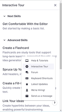
- Interface seems reasonable. I like getting the interactive tour on the right.
- Can I get the Help on the right?
. No, alas, the help takes me away from my document.
. …and my document takes me away from Help. - Back to my doc
. Let’s import some data.
… Hard fail.
… What you want me to give you a zip file? Can’t you just take the file I have?
… Cut and paste
… Wow. Everything pasted into one note/rem, whatever it is.
… So, I’ve tried Import from Dynalist, import markdown, import with copy/paste.
… All failed.
- Forum
- I really hate the create-a-separate-acct for the forum thing. It’s confusing. No doubt it has something to do with your underlying software. I’ve encountered that before.
- Glad to see you have an active community.
- Conclusion
- You’ve got some real potential.
- I’m not looking for a flash card app. Flash cards seem to be central to your app.
- Your interface is at times clever.
– I like the focused access to lots of commands. - At times it’s really clunky.
- The import failure makes it a “hard no” for me. I just don’t have time to fool around with your software to get it to work for me. There are too many competing tools, and I need to spend time on my actual project, not fooling around with your software.
- I think maybe Rem is really an academic tool?
. Maybe that’s your niche.
. There are plenty of note-takers and outliners, many with similar feature sets.
. I’m not familiar with the flashcard space, so maybe you aren’t that special there.
. Amongst the many many notes/outline apps I’ve looked at, your outline/flashcard approach seems like a good place to be.
- Recommendations
- Fix the import pronto.
. Import and export needs to be a first-class feature, imho.
. Paste should really work, whether it’s markdown, text indented with tabs, opml, whatever. - Keep clarifying your interface.
. I don’t know that it needs to be simpler, but it needs to be more coherent. - Keep clarifying your help.
- Last words
- I consider my time to be valuable. I don’t have a lot of it, and I have a lot to do.
- I’ve spent at least an hour providing you with feedback. Maybe it isn’t helpful, but I hope it is.
- Even though I’m not continuing using the product, that I am willing to take the time means this random user on the internet thinks you’ve got potential.
- Keep up the good work.
- I’ll probably come back in awhile and see how it’s going.


