Please place (or link to) your graph-view feature requests here!
We’re aiming for a complete 1.2 release in a few weeks, with an updated graph view, a range of user-suggested improvements, and a lot of fixes and polish.

Please place (or link to) your graph-view feature requests here!
We’re aiming for a complete 1.2 release in a few weeks, with an updated graph view, a range of user-suggested improvements, and a lot of fixes and polish.
Not exactly a feature request, but rather a question: how come the dark mode for just the graph view is different? Do you intend to port it to the rest of the app?
Some CSS-like settings to style the appearance of the graph:
Obsidian does it like this: https://publish.obsidian.md/help/Plugins/Graph+view
I think you are already aware of this: https://publish.obsidian.md/semantic-obsidian/Neo4j+graph+visualizations
Make the graph view less demanding on the desktop app:
Could the graph view be optimized to run more efficiently? When I ran the graph view on my PC, I noticed that a “lot” of system resources were used. More specifically, I have an 8 core CPU and the graph view was regularly taking up ~50% of the integrated graphics resources (on the CPU) and ~15% of the CPU resources.
This might make the graph view tough to run on some devices, and a battery drain on all. My CPU isn’t weak (it’s a Ryzen 7 4800H), and it was still running like this.
Other than this concern, I think that the graph view is great!
Also, should this be reported as a bug?
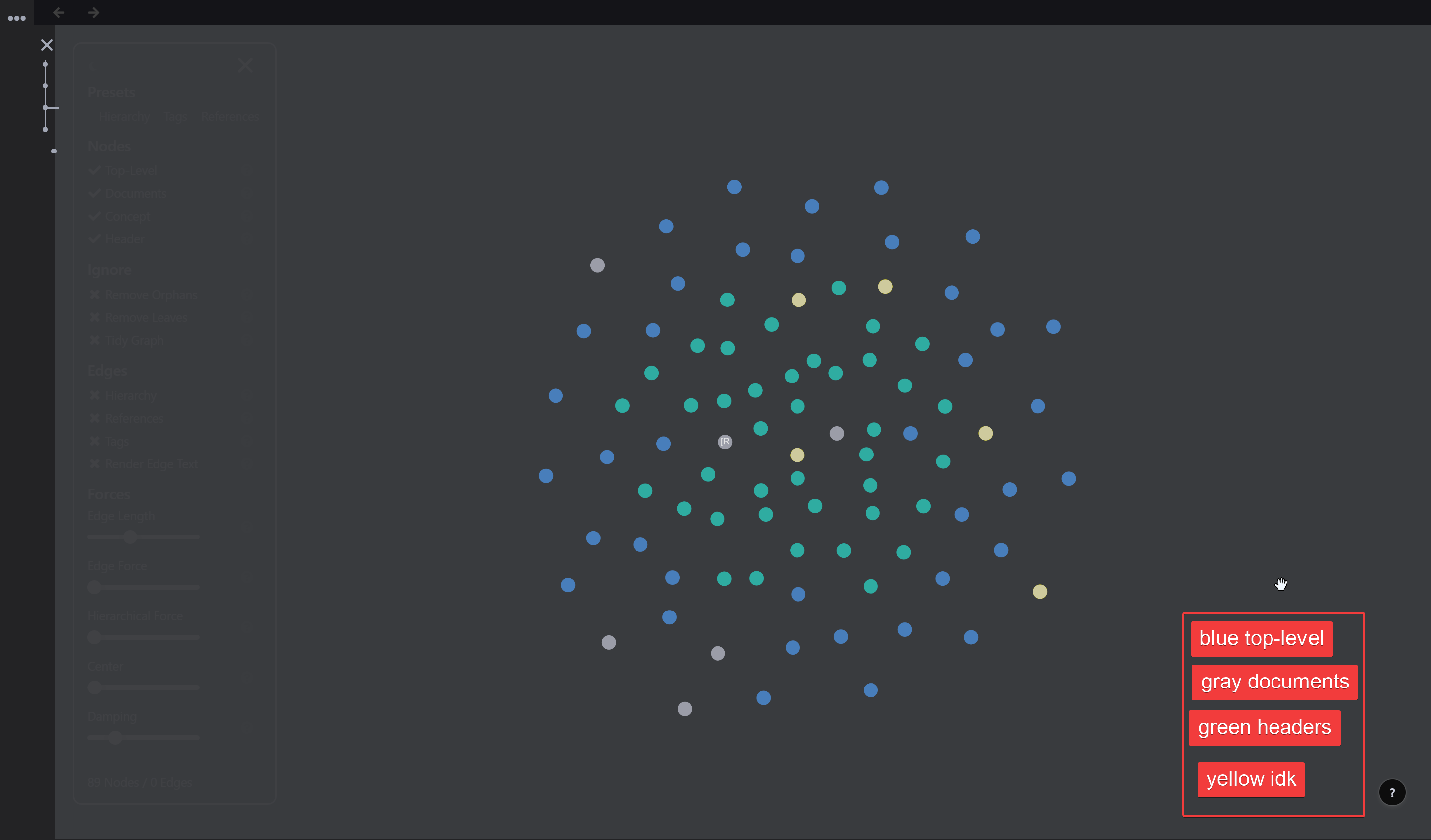
umm, could the graph have some colors based on the level of practice done on the document, meaning to say, something like all the nodes that are not practiced being gray and the onces that are at 100% remembered state, being yellow,
I hope thats clear
Great Idea! I think we will integrate this into the graph-viewer controls.
I’d like to use the graph view for mindmapping. For that it would be helpful if we can pin the rem where new nodes are created in like it is already possible in the editor.
Infinite screen on phone - embodied learning
Example:: similar to this
Explaination:: Your phone only shows part of your knowledge map(Similar to the real map in the pic), and as you move your body, more concepts are revealed. In that way, knowledge is embodied in someway. (embodied learning ;D)
Filter out universal discriptor, daily document or anything unrelated
Problem: I found universal discriptors have biggest clusters in my graph. And that’s not what I want. I want to see real concepts be the center of a cluster. Daily documents also disrupts the graph in the same way.
Suggestion: Maybe offer inclusion/exclusion function.
Using different shades of the same color to visualize according to your own data
Explaination:: if I want to see all the newest papers I’ve just read, then I can search a universal discriptor ~Year(I made that in my system). Using that, I can show all the papers according to the year. The newer, the more obvious.
Example: https://www.connectedpapers.com/.
Haha, with support for Oculus Quest!
Haha, that would be cool! Maybe supporting phone first so that most of the people can use it.
Network of Latexes
Explaination:: As I’m learning math, many important concepts are written in Latex. So, it would be nice to see the network of latexes. So I can see how different formulas are connected.
Multi-player network building
Explanation:: Having other people discussing with you often helps to brainstorm. Thus, Inviting people to use your Rems to build a graph together can potentially spark ideas.
I have a few requests to make :
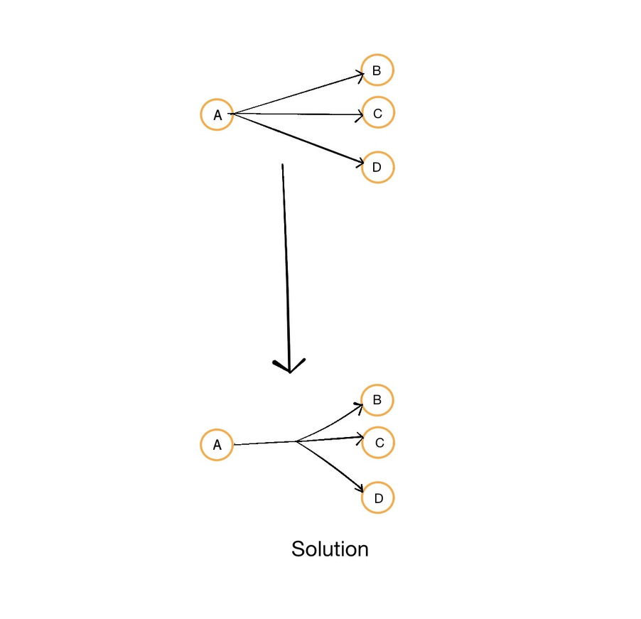
Current scenario : when a descriptor/edge has more than one reference in it, it is simply shown as a multitude of duplicate edges like this :
Solution proposed:
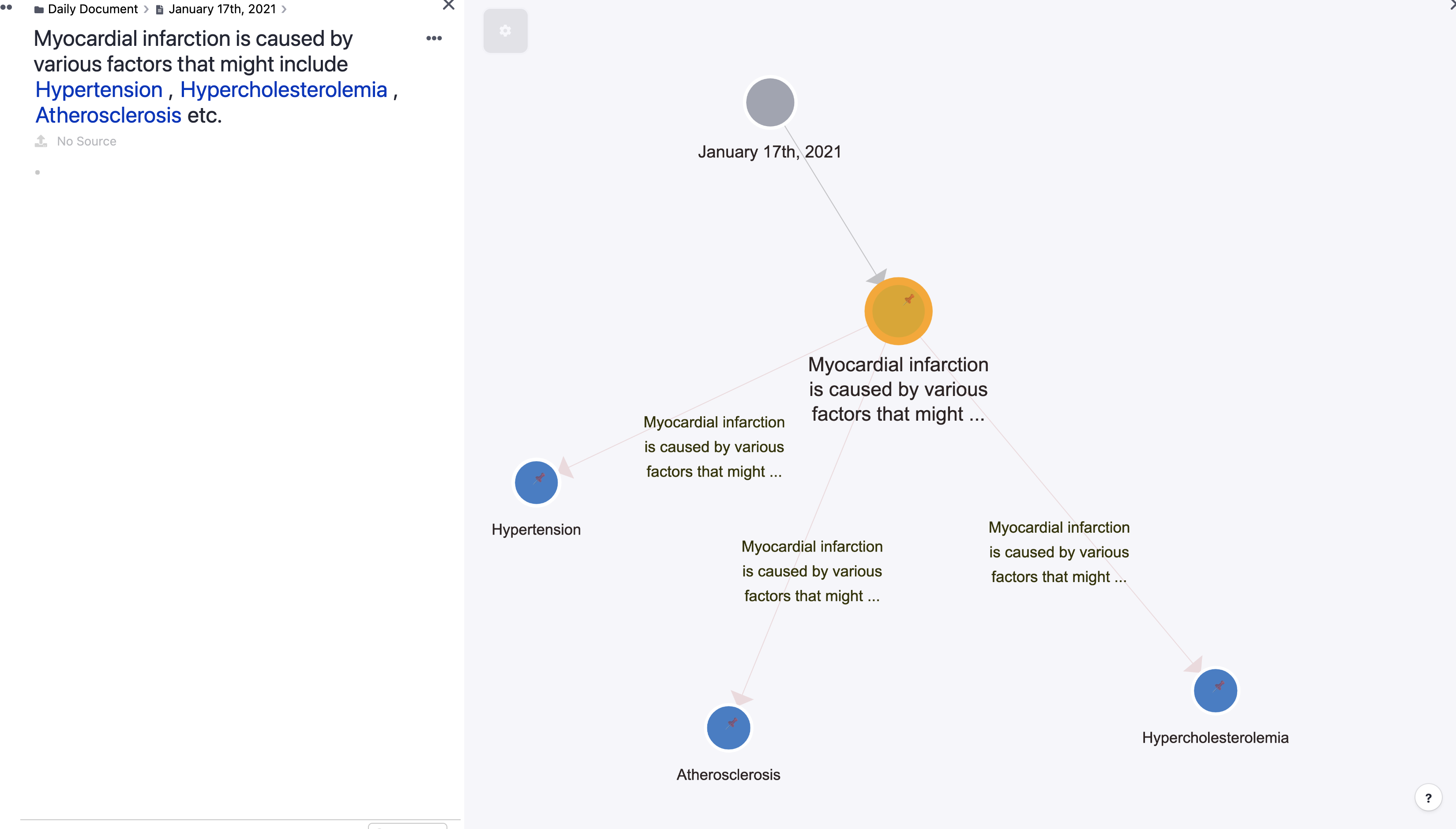
Current scenario : When a rem contains references within itself (instead of the neat connection via a descriptor) the edge is just a duplicate of the rem content itself, ignoring the text of the reference. This is kind of pointless as the same is shown in the node and only thus adds on to the noise overall
Solution proposed: Hide edges for such cases, while showing when there is value (using descriptors)
Suggestion:: Create a function to group entries together and be able to add names to them.
Creating children of a rem directly in the graph view was asked in todays community call again. Looks like it is supported now 
To do this you would simply indent? Then from there it would create children via the graph mode?