New RemNote Dark Theme by eustachio

Hi, I have upload a new file with css code to keep the look of the new portals.
Please, delete the content of the 03 Portal block code and paste this new code:

@import url(“https://eustachi0.github.io/RemNoteThemes/CSS/03_Portals_Original.css”);

Please let me if it works and what you think.
Cheers,
Eustachio

3 Likes

thanks again Eustachio! amazing theme. just to comment about the darker theme. I have template slots that become unreadable when the darker theme is applied. in the dark theme, they are readable.

2 Likes

Thank you for that quick fix :smiley:

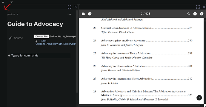
There’s one more thing I notice. It’s the pane I arrowed red, it isn’t fully hidden, thus it makes the window panes kinda unreadable

1 Like

You’re welcome! Thanks
I think the problem was with color highlighted references not picking the right color background.
It should be fixed now. You might need to restart the app.
Please let me know.
Cheers

1 Like

I have made the bar to auto-hide. Please try it and let me know if it works.
Cheers

1 Like

Wow, thanks man, that was fast. Looks good.
I don’t know if it will cause a problem somewhere along the way, but for now I have uncommented the following part in your code so that the breadcrumbs container has rounded edges and follows your design language.

/* breadcrumbs container level /
/
border: 2px solid var(–portal-focused-breadcrumb-background-color) !important; /
/
border-bottom-style: none !important;
border-radius: var(–portal-border-radius) !important;
border-bottom-left-radius: 0px !important;
border-bottom-right-radius: 0px !important; */

Btw, where do you prefer feedback? Here, github or the email you suggest?

2 Likes

I agree. The simplicity of the RemNote portal makes a frictionless workflow, both functionally and aesthetically pleasing.

1 Like

This post has been the most used for feedback, although you could send me an email, or a private message here in the forum.

Regarding the portals, how/where did you uncommented those lines? Just curious

1 Like

Hi Jerry, thanks for your feedback.
In a few days the theme will have the option to select between portals original look or theme look :blush:, if you have anymore feedback and suggestions, please let me know.
Cheers

2 Likes

Hi, that problem has been fixed.

I’ve discovered one more problem. When I paste the rem reference from PDF highlight, it fluctuates and does not all align in one pane. Hope you get my idea through the gif.

Can you please disable the block 19 Show the hamburger? and let me know if that fixed the left margin. Maybe this block is no longer needed.

Oh, I just copied and then pasted the whole function (including the mentioned code) below the @import and then just removed the comment syntax (the /* and */) around the part I posted. Made the breadcrumbs container look like this:

2 Likes

Hi,

Sry I’ve been away for days. I disabled the block 19, but the problem remains

2 Likes

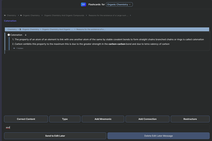
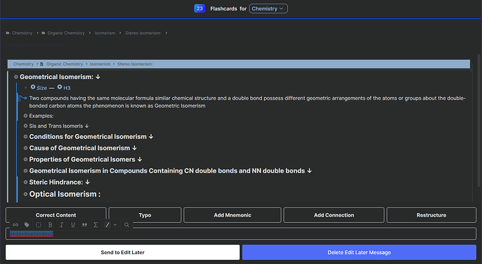
Great theme. If you look at the image attached below. You can see that the comment section in the edit now section of the card is basically unviewable. Is there any way I can change to code to make it look more visible? Where do I change the CSS code to make it look like that?

Thanks for your feedback and reporting this bug.
I have synced some changes today that fix this bug.

Please, let me know if it works.
Cheers,
Eustachio

4 Likes


Works! thanks a lot mate, Cheers

2 Likes

Now, I’m looking forward to the Light Theme! :smiley:

4 Likes

I will investigate this issue further and let you know.
Cheers

1 Like

Hi Eustachio, I have been using RemNote’s inbuilt dark mode and with the new UI it’s quite good as well. The only thing I really miss from your theme is the colourful branches! Is there a combination of checkboxes I can select to get the branches working but nothing else?

Hi Eustachio, I have a popup every time I copy a card, I don’t know how to close it, I have to click on the blank space with the mouse to close it, if I copy more than one card, it will be a pain to close it with the mouse each time,Just like the picture below. do you have a solution?
Thanks for your help.