Notion like Callout Rem(Block)

1st

[data-rem-container-tags~="callout"] {
    background-color: var(--callout-background-color, rgb(254, 247, 247));	
    padding: 15px 20px;
}

2nd Hide Bullet

[data-rem-container-tags~="callout"] .rem-bullet__container {
  visibility: hidden;
}
17 Likes

It looks like this, thank you for your contribution :slight_smile:

3 Likes

:grin:
If you feel the callout tag cluttered, you can hide them too simply by adding this snippet

[data-rem-container-tags~="callout"] .rem:not(:focus-within) .hierarchy-editor__tag-bar {
   display: none;
}
2 Likes

Loved it! I made three of them, with different colors: blue for comment, orange for pending and red for alert. Works great :slight_smile:

Awesome! I wonder if we could get a version of this going that includes the light-bulb symbol to draw your eye as well - ex. with some :before css wizardry.

4 Likes

I’m wondering this too. I know next to nothing about CSS, so I don’t know if this is possible, but maybe emoji that RemNote already recognizes as rem can be repurposed as the tag instead of “callout.”

That is, maybe this CSS can be triggered by :bulb: or :point_right:t2: instead of #callout?

1 Like

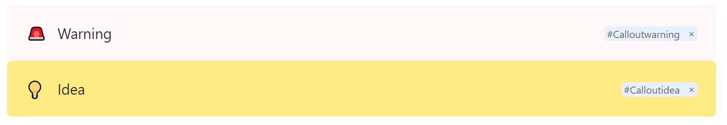
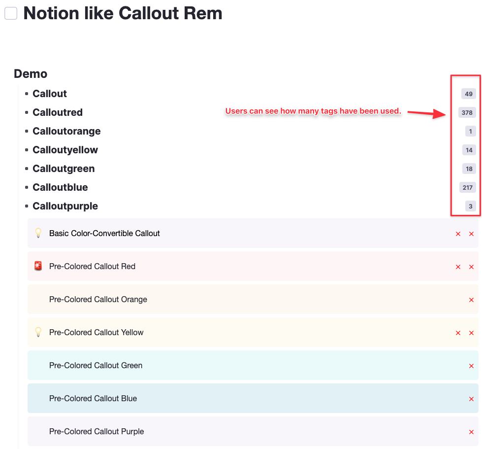
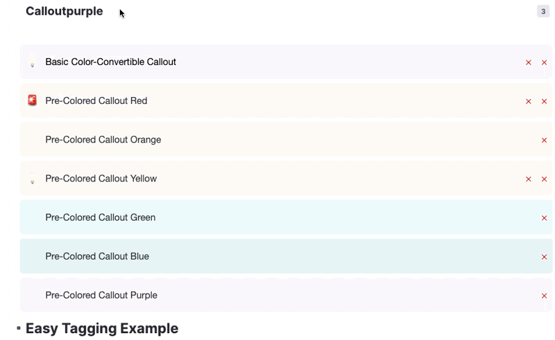
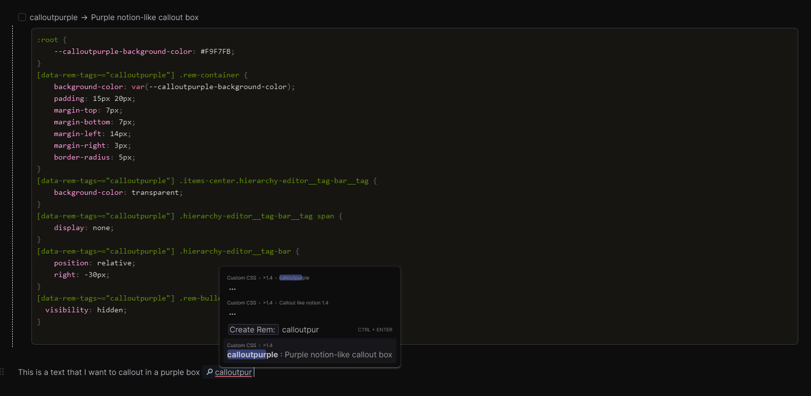
Here is a snipped, that addresses Martin’s suggestion:
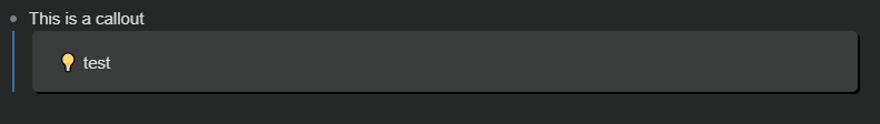
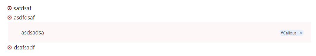
Callout with :bulb: use tag: calloutidea

[data-rem-container-tags~="calloutidea"] {
    background-color: var(--callout-background-color, #fdea80);	
    padding: 15px 20px;
    border-radius: 5px;
}

/* text formatting*/
[data-rem-container-tags~="calloutidea"] .rem-text {
	position: relative;
	left: 20px;
	font-size: initial; /* change font-size; e.g., large, x-large*/
}

/* new rem bullet icon*/
[data-rem-container-tags~="calloutidea"] .rem-bullet__container ::before {
  content: "💡";
  visibility: visible;
  position: relative;
  font-size: large; /* change symbol size here */
  bottom: 7px;
  
}
[data-rem-container-tags~="calloutidea"] .rem-bullet__container{
  visibility: hidden;
}

Callout with :rotating_light: use tag: calloutwarning

[data-rem-container-tags~="calloutwarning"] {
    background-color: var(--callout-background-color, rgb(254, 247, 247));	
    padding: 15px 20px;
    border-radius: 5px;
}

/* text formatting */
[data-rem-container-tags~="calloutwarning"] .rem-text {
	position: relative;
	left: 20px;
	font-size: initial; /*change font-size; e.g., large, x-large */
}

/* rem bullet icon*/
[data-rem-container-tags~="calloutwarning"] .rem-bullet__container ::before {
  content: "🚨";
  font-size: large; /* change symbol size here */
  visibility: visible;
  position: relative;
  bottom: 7px;
}

/* hide old rem bullet*/
[data-rem-container-tags~="calloutwarning"] .rem-bullet__container{

  visibility: hidden;
}
15 Likes

Sorry I’m new to RemNote but I don’t fully understand like how to get it in motion, may you please help me? :sweat_smile:

Follow this actions then you could make it.

  1. Ctrl(⌘) + P → Custom CSS

  2. Click Add Black CSS Block

  3. Then Codeblock for CSS code will pop up

  4. Paste the CSS code

  5. Go back to the black page and make callout Tag to a rem

Thank you! The problem was I a custom CSS Dark Mode on at the time

This is a version compatible with dark theme from @Eustachio and 3d portal from @abdelalah_alhrbi

/* use the tag callout */
[data-rem-container-tags~="callout"] {
background-color: var(--callout-background-color, rgb(58, 60, 60));	
border-radius: 5px; 
padding: 15px 20px;
box-shadow: 2px 2px rgba(0, 0, 0); 
}

[data-rem-container-tags~="callout"] .rem:not(:focus-within) .hierarchy-editor__tag-bar {
display: none;
}

  
[data-rem-container-tags~="callout"] .rem-bullet__container ::before {

content: "💡";
visibility: visible;
position: relative;
font-size: medium; /* change symbol size here */
bottom: 9px;
right: 5px;
}

I’ve also altered the 3d portal to have opposite expression than callout and original… for some reason it makes more sense for me to have a portal as a hole in wich you look into :sweat_smile:

to do that, just add inset after box-shadow: in original code here : 3D portal + references CSS snippets

4 Likes

I followed all the steps but it doesn’t work, is it because of the recent massive update? :thinking:

@Barbara97 Yup, you can see the latest update in this page.

3 Likes

By the way, I don’t know if it’s feasible, but I think it would be great to add one thing to your implementation.

When one tries to tag calloutred for example. The first time a user wants to use it, he needs to create a random reference to a parent-less rem that is created on the spot and called calloutred.

Wouldn’t it be more in the spirit of remnote, to make your CSS in snippet like this:

[  ] calloutred :: provides red version of notion like feature callout 
    here your css snippet for the red box

that way we also have

  • a view as how many and where are those callouts in the entire KB
  • this callout tags do not reference a random text, but actually the snippet used
  • to me at least, it feels more user-friendly to have the ## dialogue box providing response with the correct orthography etc.

When one tries to tag calloutred for example. The first time a user wants to use it, he needs to create a random reference to parent-less rem that is created on the spot and called calloutred.

→ No, you don’t always have to make those parent-less rems first for making callout tagged rem
Definitely, At first, Users would make callout, calloutred things first like you said. This is a matter of how users are friendly to RemNote so I didn’t want to interfere with it because, In the end, users can get used to it.

Frankly, I don’t type in the ##dialogue for tagging because it always takes time to search my entire KB so it ruins my workflow. I’m using 3rd party text expander app (Keyboard Maestro, SnippetsLab, etc.). if you copy tags, ##KkEh3JaaBfo56XJj9 like things are in your clipboard. you can make those things paste automatically through a shortcut or typing some string.


I couldn’t figure out what it means

[  ] calloutred :: provides red version of notion like feature callout 
    here your css snippet for the red box

Could you share some screenshots or images to make understanding easy?

Cheers,

1 Like

:slight_smile:
Ok, I’ll try to be more clear. This is what I had in mind :

The only thing that implementation could add to yours actually are:

  • a more granular control on boxes to chose (not sure it’s useful)
  • a more user-friendly out of the box experience, as instead of having to figure out what are the tags they should use (with the correct writing etc), from reading your code; your css structure already provides the name tags. Not much more.

I agree with you that remnote users should know how to use this by themselves.

Oh, I got it, a good suggestion. It would be nice for those who love to see popup and details in it
Did you mean this?

it can be accomplished by using >/ which makes a disabled flashcard. Isn’t it a simple solution?

If you can’t make the decision of what color is fit for certain circumstances, then you can just make a “callout” tag and then change the color whatever you want.

I think the current dark mode is not so good so um… actually is weird haha. I don’t know how users can use Colored-Callout in the darkmode even the Notion is too
RemNote is now a very complex UI,UX so It could be very difficult for Teams to change the Color one by one.

Umm… I think you better check the latest version. Many changes were made and there are also many comments in the code already Yeah you know.

  • a more granular control on boxes to chose (not sure it’s useful)
    → Honestly Segmentating the CSS code is not meaningful :stuck_out_tongue:
2 Likes

Yep, agree with you, more granularity can mean more clutter, and not more usefulness :sweat_smile:

the implementation you show is what I had in mind :+1:
thank you for this

2 Likes