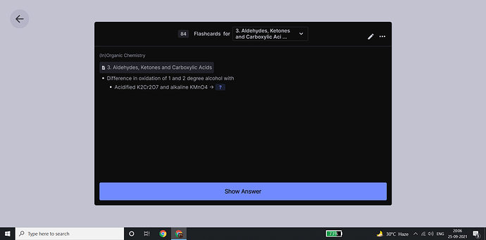
This white backlight is killing my eyes because i dont like to waste electricity on lighting (in my room) when i am memorizing stuff; please make a proper dark mode rather than a colour inverter; i know that takes time but atleast revert the background to what it was like before
and why doesn’t this forum have a dark mode?
go to preferences > interface > theme > choose dark
thnx a lot; it looks worse than before with an excessively warm tone but the white background is now dark blue and thats all i need for now; thnx a lot
Make sure RemNote’s native dark mode is turned off and Dark reader is set to Dynamic mode, then play around with its contrast settings.
yeah i tweaked stuff a bit and its okayish now; thnx again
Also the colors in the pdfs when using dark mode are inverted so the picture become really awkward to look at when im studying uploaded pdfs. 
This got me so excited but it turns out to cause problems in more often-used features. With this, the auto search menu when I select a word or type [[ has black-on-black text.
Forum search is your friend.

