RemNote 1.4 Redesign Miscellaneous Questions

I hope I’m posting this in the correct space. I don’t know if these are bugs necessarily or intended changes. I looked through the update change log, but these points didn’t seem covered.

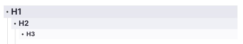
  1. Header 1 used to have a gray background which was a nice visual delineation, but it’s not there anymore? If this was purposefully removed could it be added back in or more highlight colors be added in?

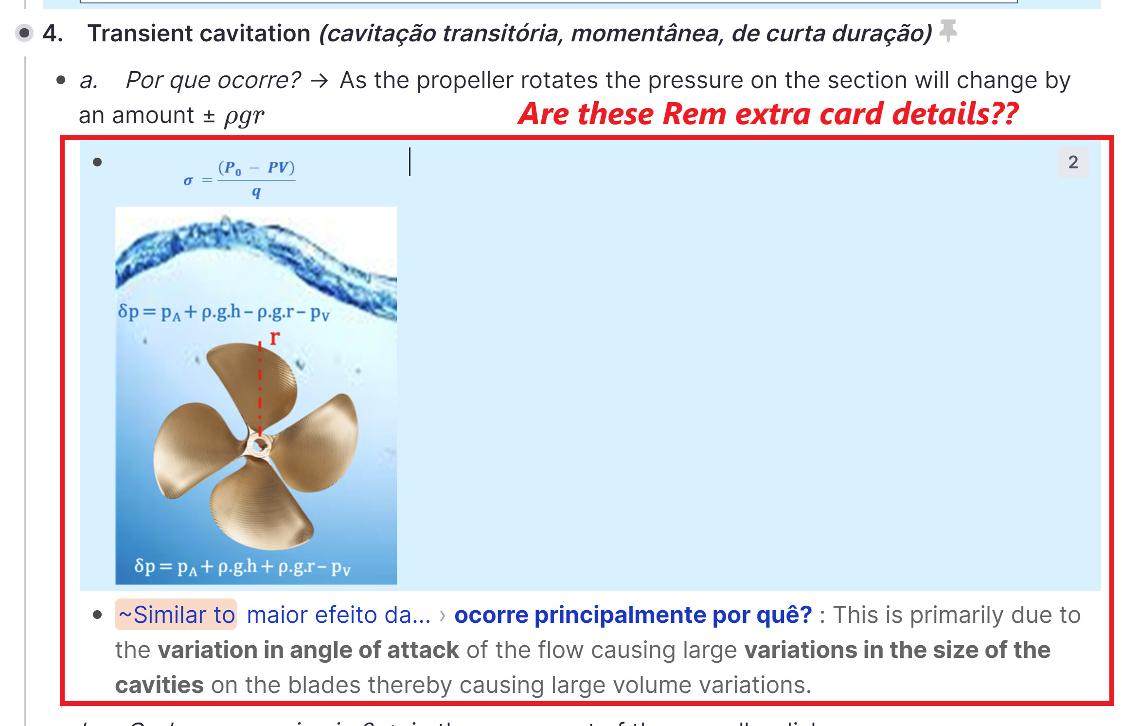
  2. There is no preview for the sidebar panel anymore?

  3. Is there a way to display how many hidden concepts or hidden texts there are anymore?They were a nice way to preview child rem with a click. Was this removed or just hidden under some command? Also, it seems like a lot of the tagging/power up information was removed in general?

Thank you in advance if anyone has any comments! :slight_smile:

2 Likes
  1. It was removed to create a cleaner UI. You can make them yourself for H1 or all headers even with Custom CSS:
.rem-header--1 { background-color: #e7e7ef; }
.rem-header--2 { background-color: #efeff6; }
.rem-header--3 { background-color: #fafafd; }

  1. No. Again with the intention to make the UI more calm. We are considering adding various hover previews back via a setting or similar though.

  2. They are removed too for now (clean UI etc.). Note that there is a difference now between toggled (no indicator) and hidden (still has indicator):
    image
    We only show non-formatting power ups like Suspend Cards now. Formatting powerups like Highlight, Todo, Header etc. are hidden since they are indicated clearly already.

1 Like

Thank you so much for the reply! Overall, the redesign is incredible, and I understand the desired aesthetic.

Addressing point three, that was why I was concerned, but I see I was mistaken. I thought the highlight/color tag, well power-up, was completely removed not just hidden.

I sort specific material by color, and I used the navigation in the highlight power-up a lot to compile information. With the tag available on the highlighted rem, I was always able to navigate to the specific parent color rem and then print out all of that specific colored material. That said, however, I’ve found the highlight power-up rem again, and everything is intact so no problem. I can continue working and organizing as I was.

I look forward to RemNote’s continued success:) Thank you once again for the info!

3 Likes

I enjoyed the Preview in the Sidebar. Sometimes I didn’t even need to click the doc, because I found what I wanted to know. I hope that comes back.

Also, if the goal is a calm UI, there are other things I would adjust first, such as the temporary UI text that might be unneeded after a person works with Remnote for a while, for example the “Type / for commands” and the “Multiple Rems in Trash…” blue bar, which seems to need to be intentionally clicked to be closed, and the re-loading sidebar.

@hannesfrank and @Martin, I noted the “Extra Card Detail” power-up tag is hidden also. This look problematic. How would I know if I already tagged the Rem as an extra card detail? I am missing it a lot! Don’t you think this tag should be clearly shown?

3 Likes

Yes, this needs to be fixed.

Would you say we should just show this tag or would a different rem style make sense here? Can you think of any? In v1.3 I personally visualized them like this:

image

These are added to make RemNote as self explanatory and easy to learn as possible. My hope is that if someone knows RemNote for a while they are also aware of the possibility to customize the UI via Custom CSS and that more minimal, veteran user themes just hide this stuff. We want to offload this cosmetic stuff as much as possible to Custom CSS to simplify the settings complexity.

It should disappear if you continue typing or with Esc.

We also discussed making it less focus grabbing and also listed cases where it does not need to be shown (like when you only delete visible rem), but I think there is no final design yet we agreed on. Again, Custom CSS can fix that too. The most basic being

.deleted-rem-notice {
  color: gray !important;
  background-color: unset !important;
}

or even hide completely with

.deleted-rem-notice {
  display: none !important;
}
2 Likes

Works great! Thanks! There is a lot that can be customized in Remnote. I wonder if a diagram could be useful. I find it difficult to find the exact thing when using Developer Tools.

1 Like

A different style would be great. I liked your previous style (for v. 1.3). But as it will be a a detail, I would like something with a font sligthly smaller, maybe some background color, something indicating less focus, like this I used for the tag “example” in 1.3 (that by the way does not work anymore in 1.4!):

[data-rem-container-tags~="example"] {
    background-color: rgb(221,227,236);
    border-left: var(--quote-border-width) solid
        rgb(111,162,255);
    margin-left: calc(-6px - var(--quote-border-width));
    padding: 0px 6px;
    font-style: italic; 

    color: #0080ff;
}
[data-rem-tags~=example] .rem-text * {
	font-size: 17px !important;
}

/* Reset background on selection. */
.selected-rem [data-rem-container-tags~="example"],
[data-rem-container-tags~="example"].selected-rem {
    /* The default selection color is #cce2ff. I altered it slightly to have blockquotes still visible on selection. */
    background-color: #dce2ff;
}

This is just and idea! Thanks!

1 Like

Wait, my quote CSS looks almost the same! What a coincidence! :upside_down_face:

Your suggestion will be discussed internally.

data-rem-tags are still broken from the editor optimizations.

1 Like

Very probably I got it from you and just adapted somehow! Thanks.

1 Like

Going off the misc questions, have sticky headers also been removed? Even though it wasn’t always accurate, I found it super useful in terms of giving me context of what was going on in the document. I found it to be a super unique remnote feature.
Have breadcrumbs been discarded in favor of windowed panes? I really like both but I realized in the previous version the 2 features did not both work at the same time.

4 Likes

I often use the sticky headers to go to the top of document…

2 Likes

@alex_thinks @TaQuangKhoi Sticky headers are likely to come back in the future, but we removed them for now because they were too buggy.

We’ll are also considering just making the document title sticky which could be used to go to the top then.

What do you mean by breadcrumbs? I assume the Thinking Trail History? Same reason as for the Sticky Header: It is not yet included in our design and therefore removed but it will be brought back in the future.

6 Likes

Yep. That’s what I was asking about.
I use sticky headers to go to the top of sections and to see the context of where I was at. I also like putting links in headers/document titles so i have quick access to them.

3 Likes

I also miss stick headers.

4 Likes

After the auto-update of Desktop on MacOS, the list of documents in my Sidebar was there. Then they disappeared and in their place, I see “Updating your account: 0 / 10556” for a while now. I restarted and they are back. What is happening? What is “updating” in my local KB?

1 Like

Loving the new update! But is there any setting/ custom css to remove the “Type / for commands” that shows when starting a new rem? For me it’s distracting when I am writing notes and was wondering if there is an option to remove it. Thanks

I have been trying to use the updated RemNote on my Ipad pro 12.9 inch and it is slow and buggy. Do you have a general timeline of when an IpadOS or IOS app will be made for a smoother portable RemNote experience?

I had the same question – you can turn it off by putting this in your custom CSS:

.rich-text-editor-placeholder {
display: none;
}

3 Likes