This is a bit out there, but would be awesome
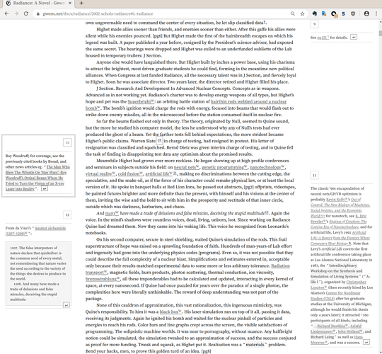
Actually we had something similar already with Custom CSS:
So this is definitely not out of reach. Keep an eye out on the  Advent Calendar: Every day a new Custom CSS Snippet, but I don’t want to promise too much.
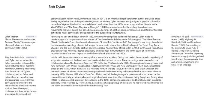
I was also thinking about margin notes. Did some tests with CSS and got decent results. But I couldn’t manage to make the margin notes “avoid” each other (ie., they might overlap). A workaround I did is to have 2 tags (left and right), but it still depends on the user manually doing it. Also, when view is narrow you can’t see it (but I figure this could be solved by @media queries)
Here’s how it looks.
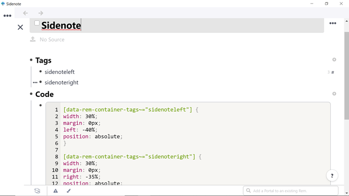
Here’s my (probably dreadful) code, if you want to play around with it!
[data-rem-container-tags~="sidenoteleft"] {
width: 30%;
margin: 0px;
left: -40%;
position: absolute;
}

[data-rem-container-tags~="sidenoteright"] {
width: 30%;
margin: 0px;
right: -35%;
position: absolute;
}Wow – thanks everyone. I really need to learn CSS
how can I get this sidenote please?
how can I use this custom css? I just add into my custom css page. however, when I tag my rem it disappears(just visually because I can search it) and there are no sidenotes…
I’m not really a coder so my CSS could have problems… It’s also quite old. Maybe some classes changed.
Two things that come to mind:
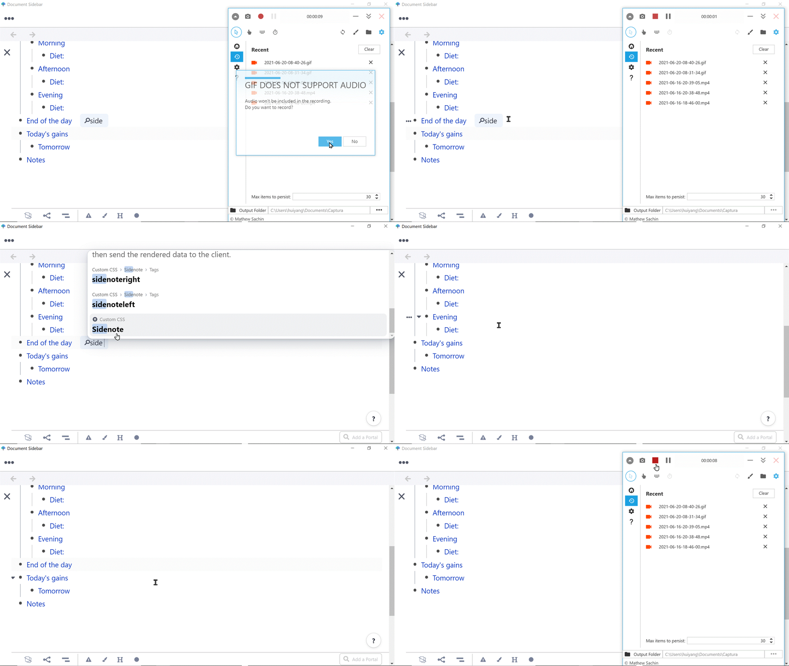
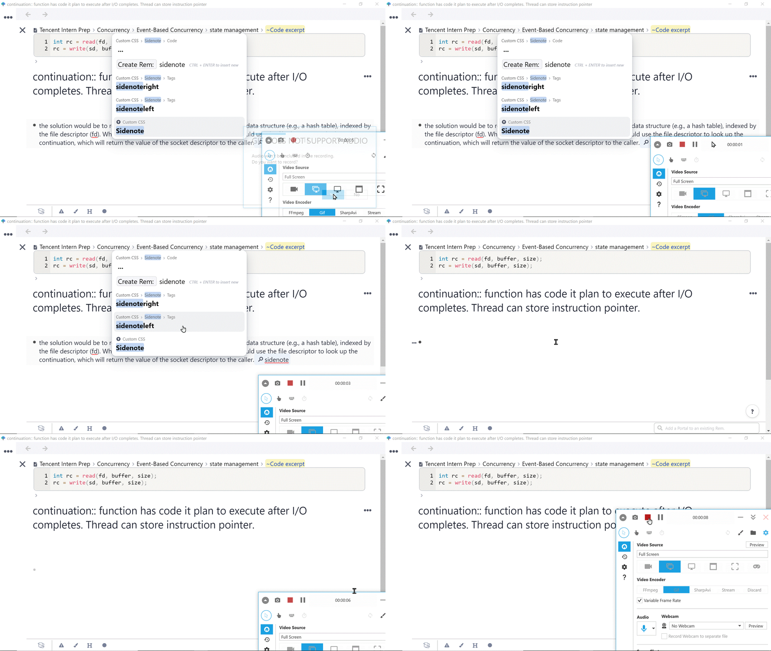
- What did you tag the Rems with? Should be #sidenoteleft and #sidenoteright
- Is your screen/panel narrow? It only really works well on wide screen/panel
wow, thanks for your reply. I do tag the rems with. And I think my panal is wide…too? can this work on your PC?
It doesn’t seem like you are tagging the Rem with the actual tags I mentioned in my original (and latest post).
You should not tag it with the name of the Rem containing the CSS.
You should tag it with the tag names mentioned within the code.
For left sidenote, it is:
Thus, you should tag your Rem with #sidenoteleft
Its not super intuitive, I know 
Sorry about my stupid operation and thanks for your detailed reply! However, I tried this but it still not work… 
No need to apologize! We’re happy to (try to) help!
Not sure what could be the problem thought.
You can try debugging it step by step.
For example, try swapping the code for this one:
[data-rem-container-tags~="sidenoteleft"] {
color: red;
}

[data-rem-container-tags~="sidenoteright"] {
color: blue;
}
If the tagged text becomes red and blue, it means the general code works. Then you can bring back the original code and play around with the values until it works for you.
wow, good idea! The general code did works! I think I know what’s the problem.
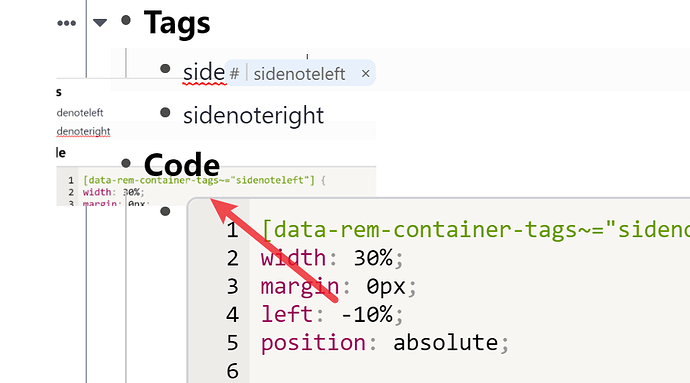
after add left: -10%, nothing changed and after add position, the picture disappers.
So the problem is it’s out of screen
 May be there is difference between the setting of other css? Really appreciated, I have learned how to debug css!
I actually planned to put it on the Library, but I don’t have time to maintain that much, sorry 
Here is the CSS for the collapsible sidenote without any guarantees:
[data-rem-container-tags~=sidenote] * {
  font-size: 12px;
}

[data-rem-container-tags~=sidenote] {
  position: absolute;
  width: 20px;
  height: 20px;
  top: -10px;
  right: -30px;
  border: 1px solid black;
  border-radius: 3px;
  box-shadow: 0px 1px 2px 1px rgba(0,0,0,0.2);
  filter: greyscale(70%);
  background: lightgrey;
  z-index: 50;  /* Display over other rems to make links clickable. */
}

[data-rem-container-tags~=sidenote]:not(:hover):not(:focus-within)::before {
  content: "📑";
}

[data-rem-container-tags~=sidenote]:not(:hover):not(:focus-within) > div {
  display: none;
}

[data-rem-container-tags~=sidenote]:hover,
[data-rem-container-tags~=sidenote]:focus-within {
  display: inline-block;
  width: 200px;
  height: fit-content;
}

/* Line indicator to show where the rem was positioned once.
[data-rem-container-tags~=sidenote]::before {
  content: "";
  width: 50px;
  position: absolute;
  border-top: 1px solid black;
  left: -50px;
}
Thanks! It works. And I think now I know what’s the problem is. we can not set minus pixel on APP at Desktop version, but we can do that on webpage! So After changing the pixel from right -30 to 0, I can see it…
Hello everyone! The notes on the right side work perfectly, but the ones on the left do not: if I set it to 0%, it overlaps the main text, and if I increase it even a little, the text does not appear. What I can do? Thank you!

