(I know I’m a week late  )
)
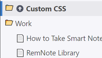
Custom CSS Advent Calendar
I’ll clean up and release a CSS Snippet each day until Christmas.
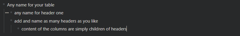
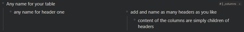
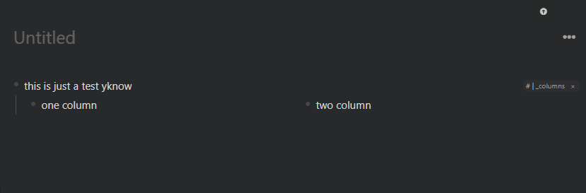
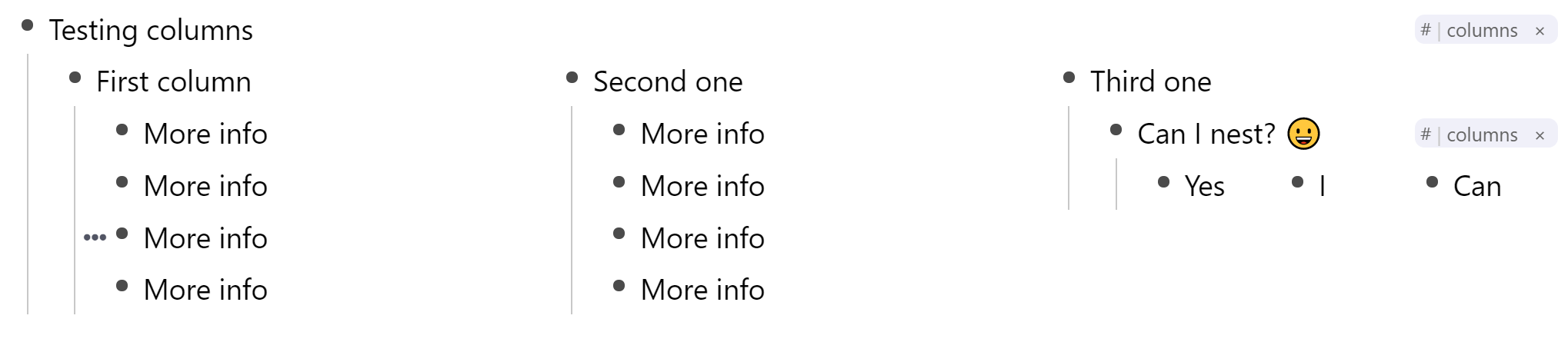
We got columns, tables, dividers and much more.
Day 26: 🎨 Link Tooltip
Link to the 
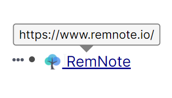
Useful in the Desktop app since you don’t have the bottom left link preview.
Thanks again to Martin for extending the markup pretty quickly to make this possible. 
I had not enough time to prepare the missing days here.
Day 19: 🎨 Print Helper
Day 18: 🎨 Active Recall Learning
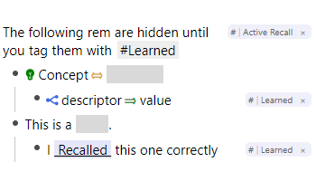
Basically an extension of Hiding Clozes for Practice (Youtube)
Check the README on the Homepage for usage instructions if you get stuck.

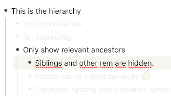
Day 16: 🎨 Super Zen Mode
This one is not meant 100% seriously, but there are some nice methods to make the current position
in the hierarchy more prominent: https://twitter.com/CatoMinor3/status/1338072468507029509
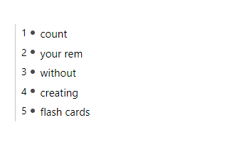
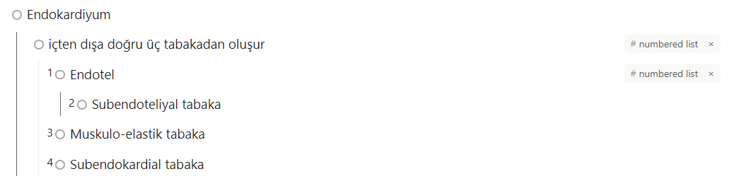
Day 15: 🎨 Numbered List
Not a 100% serious one, but it’s interesting what CSS can do.
Link to the
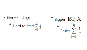
Day 14: 🎨 Bigger \LaTeX
Day 13: 🎨 tskn's Theme
One of the best themes for RemNote, designed by tskn, coded by Eva (evathomasv/RemNoteTheme), ported from Stylus to Custom CSS to be usable in the new Desktop app. I also fixed some search box issues.
Link to the
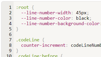
Day 12: 🎨 Codeblock Line Numbers
Happy Hanukkah, too 
Link to the
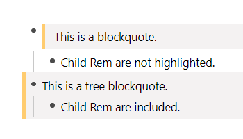
Day 11: 🎨 Blockquote
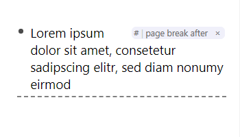
Day 10: 🎨 Divider
Link to the
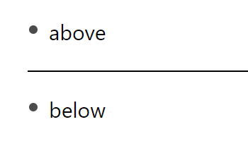
Note: This snippet has configuration options at the start (--divider-style: thinkness line-style color). Try changing it to your likeing. You can use anything from here: https://developer.mozilla.org/en-US/docs/Web/CSS/border
E.g. try this
--divider-style: 4mm ridge rgba(170, 50, 220, .6);


 : Have another tag
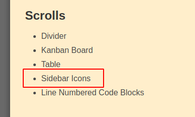


 Smart Rem
 . I have still about a dozen CSS snippets in the pipeline.