Portals, too much visual information

Hi! Every day I start inserting a search portal in my daily document searching for the unfinished Todos.
It’s nice but the portal itself brings a lot of visual information that is irrelevant. It’s distracting.
For example:

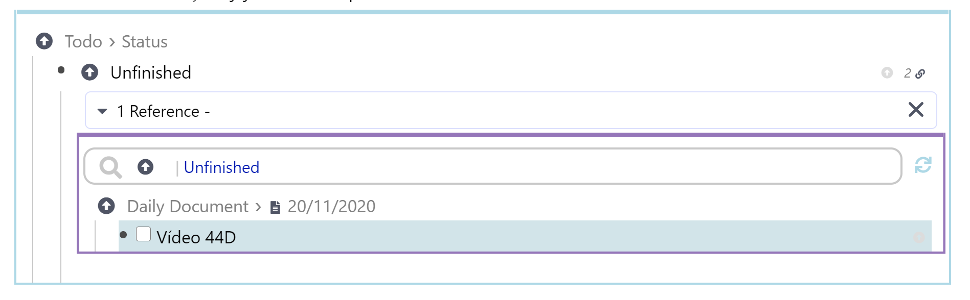
As a suggestion would be nice to have a minimalistic portal alternative. You could then choose between the full or mini portal.

What do you think?

Ha, same thing I was thinking of yesterday :smiley: : Transparent Portals aka Lightweight Transclusion (Portal Simplifications). You can add some CSS to hide a few elements of a portal if you want.

In your specific use case I would recreate just that search portal every day by typing /search<enter>[[unfinished<enter>.

Maybe you also find some useful technique in Make it easier to centralize work in daily document using templates built in textexpander or copy-pasted from repository.

Agree. I like that Remnote is quite complex and feature-rich. However I’d prefer that to be hidden most of the time. Less visual clutter.

I guess most of this can be solved with CSS, but would be nice to have this be part of RN.

Would definitely encourage more people to use portals more often, thus leveraging the full potential of portals/references/everything-is-a-rem approach.

@hannesfrank I like your suggestion of just a light background to differentiate a portal. Though its tricky, since it might not match every use case - conflicts can occur too. Maybe have a few options for the user to choose from (and, of course, CSS-savvy users can go nuts).