Whitespace in editor, please please reduce (CSS workaround in the meantime?)

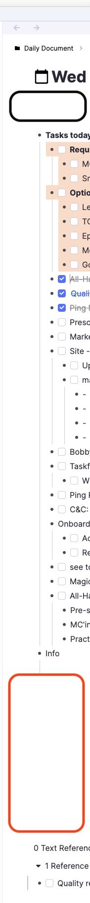
I feel there’s too much space at the top of the editor, but – even more painful for me – there’s always a massive amount of space between the bottom of my doc and the references :frowning:

Please please consider reducing this! In particular, I would LOOOOOVE if there was just a light solid line at the bottom of my doc and then references just below that. Would require SO much less scrolling!

P.S. – If anyone has a CSS hack for this in the meantime, I’d be grateful for your wisdom :slight_smile:

2 Likes

I would like to reduce the white space as well

it’s been bothering me for a long while. Wish there was a way to make the UI more compact while keeping the notes spacious

The whitespace below the title is for showing Source and Tags, I think It should be there…
image
With the whitespace between Content and References, you can use the snippet in this post => What is the CSS selector that makes this giant space between the last rem and the references? - Community Q/A - RemNote

1 Like

ThatOneOutlier… heh, I initially misread your name as “ThatOneOutliner” :smiley: Close enough, eh? But anyway, glad I’m not the only one excited about, er, more density.

TaQuangKhoi, re the whitespace between content and references… yep, I get that’s what it’s for, but I’d love for that space to be ‘reclaimed’ when there isn’t a source or tags (and for most of my docs, there isn’t either one).

Re the CSS… thanks! Somehow I missed that in my searching!

2 Likes

The white spaces have been bothering me a lot as well haha. I like my notes to be condensed.

I agree with Adam, when there isn’t a tag or source, it should compact itself. I have a lot of documents where I have sources and tags but for my reference master page, it sticks out like a sore thumb

Thanks for the CSS! I will incorporate it in mine, However I do wish the upper part whitespace can be reduced as well

See