[Wiki] CSS snippets to make things more compact and information dense and/or less visually obtrusive

You might wanna try zoom property like so.

/* All Remnote */
#content {
  zoom: 80%;
}

But zoom doesn’t work on Firefox, according to the documentation.

Here’s some selectors you might wanna use individually.
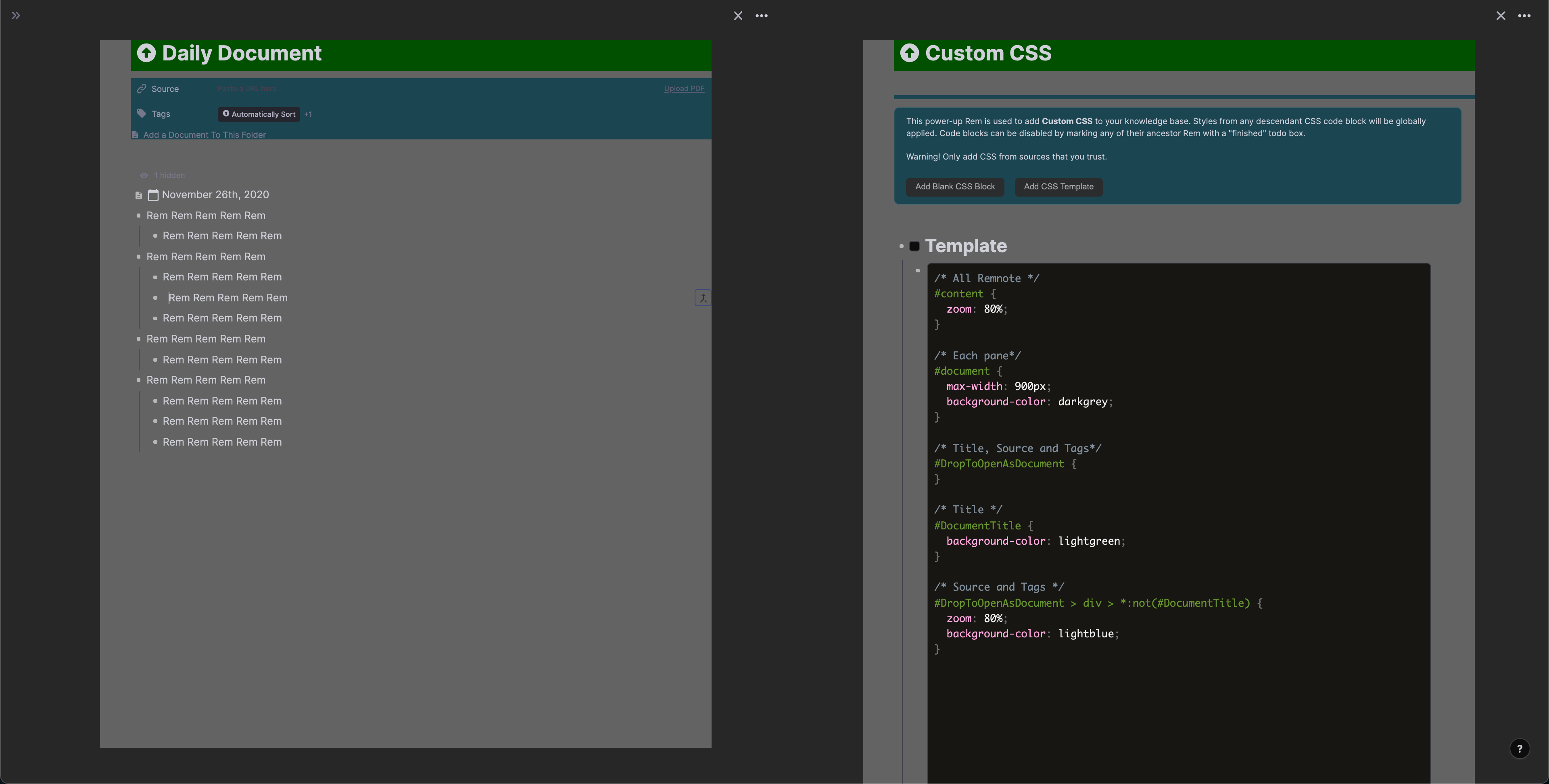
CSS in the image:

/* All Remnote */
#content {
  zoom: 80%;
}

/* Each pane */
#document {
  max-width: 900px;
  background-color: darkgrey;
}

/* Title, Source and Tags */
#DropToOpenAsDocument {
}

/* Title */
#DocumentTitle {
  background-color: lightgreen;
}

/* Source and Tags */
#DropToOpenAsDocument > div > *:not(#DocumentTitle) {
  zoom: 80%;
  background-color: lightblue;
}
2 Likes

Thanks, but that’s just a bit too brute-force for my tastes - hopefully there is a more elegant solution to reducing the space these new elements take up. Great work getting those selectors though!

Another piece of the puzzle: line height inside rem, default is 24px.

/* line height in text, overriding a variable */
.rem-container {
	--line-height: normal;
}

Before:


After:

Also edited the document title snippet to use the property name with dashes to directly override.

A snippet to make the zoomed in rem less bold, default is 700 (which should be regular bold, but seems a bit much to me).

/* less bold document title */
.font-bold {
    font-weight: 500;
}

Before:image
After:image

Same declaration can be added to headers to bring them under control as well (they are also 700 by default).
Before:image
After:–image

Some more selectors, for concepts and for general in-text bold, thanks to @TaQuangKhoi and to myself.

/* set the concept bold */
.concept_rem_type{
	font-weight: 600; /* default is 600  */
}
/* set the text bold to be as bold as the default concept bold */
.bold {
    font-weight: 600; /* default is 700 */
}

Another de-bolder, for bolded text in zoomed in rem.

/* less bold bold text in document title */
.document-title .bold {
    font-weight: 700; /* default is 850 */
}

Before:

After:

2 Likes

I have been using this snippet for a while and I found a problem when using Windowed Panes with hidden Sidebar…
.document-sidebar--collapsed--vertical is so long.

You will have trouble using these buttons when they are near the left margin of remnote
image
So I made it shorter

.document--ltr {
	padding-left:32.5px!important;
}
.document-sidebar--collapsed--vertical {
	height: 5%;
}
2 Likes

Sorry, could you expand a little? What’s the problem this is solving?

2 Likes

I’m both appreciative and confused. Could you show a before and after screenshot, illustrating the problem? The more of your screen captured, the better.

1 Like

Sorry about confusion, I have recorded a video and embed it to my previous post, you can watch it… This problem just happens when you hide the Sidebar and use Windowed Panes

1 Like

Seems like it might be worth reporting as a Windowed Panes-specific bug?

This bug only occurs when we use the code above that makes the space between the sidebar and the .document--ltr smaller. If you don’t use this code, RN works fine. . So, I don’t think it is a bug…

But I don’t know why this .document-sidebar--collapsed--vertical is so long. If you are in RemNote 1.3 or below, this class can be used for show the sidebar when we move the cursor near the left margin …

2 Likes

Ah, an oversight then. Still, might be worth telling the team to remove the unused stuff to avoid it causing problems in edge cases like this one.

2 Likes

Is there a way to reduce this space? (Between title and Source and Tags). Also, what is the :hover for the “Show Source”? I never know where to click, so I have to wave the mouse around. It’s one thing I would like visible, if possible. Thanks!

3 Likes

Updated the OP with a new snippet for space between a bullet and its rem text and made it into an actual wiki. Contributors welcome!

1 Like

same concern here because I’m printing my notes on notebook paper and that’s a lot of space wasted :frowning:

I tried to update this wiki in the Requests section, and to add a section “Make elements more prominent”. I hope I didn’t mess up anything! I might suggest renaming this page to be more general, "CSS snippets to adjust compactness and minimalness: :smiley:

2 Likes

Edited the edits, renamed the topic. Please don’t add stuff that doesn’t have to do with the goals: Hannes’ kanban is an additional feature.

1 Like

No problem! Sorry about that!

1 Like

This is really useful! Just wondering if you know how to reduce the minimum size an image can be resized to? Line height doesn’t have any effect.

Is there a way to hide the “Flashcards” and “Edit Later” in the Sidebar? I never need those things and that’s prime real estate for me.

div.flex.items-center.mb-1.h-\[32px\].overflow-hidden.text-gray-60 {
	display : none;
}
4 Likes

Thanks so much Achyut! Worked so perfectly! I will add it to the wiki.

3 Likes