Looks like the font is an easy enough fix - just edited out the new one from the front of the value (doesn’t look the size needs changing). Would be lovely to get a confirmation from someone who has 1.3 installed that that was indeed the case, i.e. what were the exact values then. The current default values for reference: font-family: "Inter",-apple-system,BlinkMacSystemFont,"Segoe UI",Roboto,Helvetica,Arial,sans-serif,"Apple Color Emoji","Segoe UI Emoji","Segoe UI Symbol"; and font-size: 16px;. For some reason headers won’t take Segoe UI instead of their current Inter, or else they do take it and are just getting bolded so much that it doesn’t seem to do much.
/* Smaller and more condensed font */
.rem-text {
	font-family:"Segoe UI",Roboto,Helvetica,Arial,sans-serif,"Apple Color Emoji","Segoe UI Emoji","Segoe UI Symbol"
}
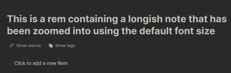
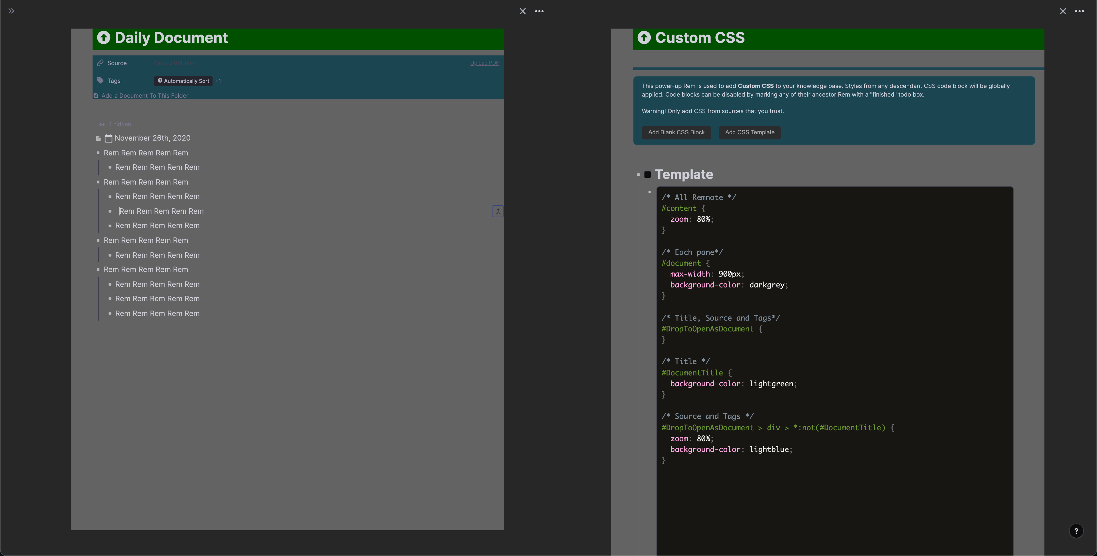
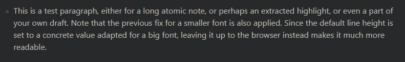
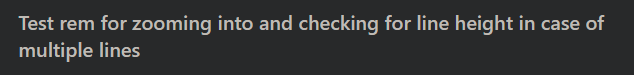
Before: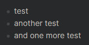
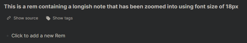
After:-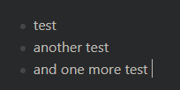
Also a bit of a twist on the fix to the space between rem in the editor, this time using the same properties as the native “interface - editor line spacing” options do. Keep in mind that they change the selector name, so make sure you set yours to “Compact”. For reference, the option names correspond to these values: “Compact” = 2.5px, “Default” = 4px, “Spacious” = 5px. If using other minifying snippets (especially line height), use 2px to maintain separation.
/* less space between rem using the native setting's properties */
#hierarchy-editor .rem-container--compact .EditorContainer, #hierarchy-editor .rem-container--compact .rem-text {
    padding-bottom: 1.5px;
    padding-top: 1.5px;
}
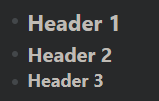
Native “Compact” of 2.5px---------: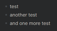
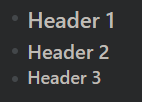
My override of “Compact” to 1.5px: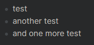
Obviously, feel free to combine with the smaller font and/or use an even smaller value. Here’s the combined comparison.
Before: 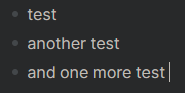
After: –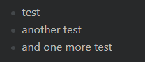
I suspect the boldness of everything has something to do with font weights, will keep digging away as I am able.