[Wiki] CSS snippets to make things more compact and information dense and/or less visually obtrusive

.rich-text-editor-placeholder {
display: none;
}

Name: Also unknown :sweat_smile:
Desc.: Removes “Type / for commands” text on empty bullet points. A side effect is, the “Untitled” text of unnamed Rem is also removed.
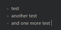
Visual comparison: CleanShot 2021-09-27-mKlsKBmu
Source: RemNote 1.4 Redesign Miscellaneous Questions - #20 by M_Young


Not relevant to compactness, instead to further the minimal interface preference.

2 Likes

Tighter sidebar, courtesy of @steveaw . 0 may be a bit too severe, try 1 px as well.

/* tighter sidebar */
#document-sidebar div {
	padding-top: 0px;
	padding-bottom: 0px;
}
1 Like
#hierarchy-editor .rem-container--compact .EditorContainer {
margin-bottom: -4.5px;
margin-top: -4.5px;
}

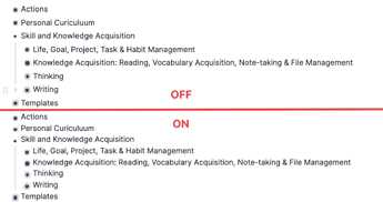
Name: CleanShot 2021-10-02-JnWDiHIi Leaner Bullets
Desc.: This snippet reduces space between bullet points by decreasing the size of the margins both above and below each individual bullet point. The smaller you go, the less white space you have. For example, -6.5px would be even smaller than mine. By default, RemNote (1.4) has these set to -2.5px.
Visual comparison:


Here’s another. I suspect this one will be of the greatest value to most people. Especially those who preferred the slimmer look of patch 1.3 and prior.

3 Likes

At least a partial fix to zoomed in rem - now they are less enormous, but still a bit too bold for my tastes. Alas, leaving the line height up to the browser doesn’t work for headers (or I’m doing something wrong).

/* smaller zoomed in rem title */
.document-title{
	font-size: 22px;
	--line-height: normal;
}


3 Likes

Looks like the font is an easy enough fix - just edited out the new one from the front of the value (doesn’t look the size needs changing). Would be lovely to get a confirmation from someone who has 1.3 installed that that was indeed the case, i.e. what were the exact values then. The current default values for reference: font-family: "Inter",-apple-system,BlinkMacSystemFont,"Segoe UI",Roboto,Helvetica,Arial,sans-serif,"Apple Color Emoji","Segoe UI Emoji","Segoe UI Symbol"; and font-size: 16px;. For some reason headers won’t take Segoe UI instead of their current Inter, or else they do take it and are just getting bolded so much that it doesn’t seem to do much.

/* Smaller and more condensed font */
.rem-text {
	font-family:"Segoe UI",Roboto,Helvetica,Arial,sans-serif,"Apple Color Emoji","Segoe UI Emoji","Segoe UI Symbol"
}

Before:image
After:-image

Also a bit of a twist on the fix to the space between rem in the editor, this time using the same properties as the native “interface - editor line spacing” options do. Keep in mind that they change the selector name, so make sure you set yours to “Compact”. For reference, the option names correspond to these values: “Compact” = 2.5px, “Default” = 4px, “Spacious” = 5px. If using other minifying snippets (especially line height), use 2px to maintain separation.

/* less space between rem using the native setting's properties */
#hierarchy-editor .rem-container--compact .EditorContainer, #hierarchy-editor .rem-container--compact .rem-text {
    padding-bottom: 1.5px;
    padding-top: 1.5px;
}

Native “Compact” of 2.5px---------:image
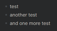
My override of “Compact” to 1.5px:image

Obviously, feel free to combine with the smaller font and/or use an even smaller value. Here’s the combined comparison.
Before: image
After: –image

I suspect the boldness of everything has something to do with font weights, will keep digging away as I am able.

3 Likes

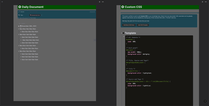
You might wanna try zoom property like so.

/* All Remnote */
#content {
  zoom: 80%;
}

But zoom doesn’t work on Firefox, according to the documentation.

Here’s some selectors you might wanna use individually.

CSS in the image:

/* All Remnote */
#content {
  zoom: 80%;
}

/* Each pane */
#document {
  max-width: 900px;
  background-color: darkgrey;
}

/* Title, Source and Tags */
#DropToOpenAsDocument {
}

/* Title */
#DocumentTitle {
  background-color: lightgreen;
}

/* Source and Tags */
#DropToOpenAsDocument > div > *:not(#DocumentTitle) {
  zoom: 80%;
  background-color: lightblue;
}
2 Likes

Thanks, but that’s just a bit too brute-force for my tastes - hopefully there is a more elegant solution to reducing the space these new elements take up. Great work getting those selectors though!

Another piece of the puzzle: line height inside rem, default is 24px.

/* line height in text, overriding a variable */
.rem-container {
	--line-height: normal;
}

Before:


After:

Also edited the document title snippet to use the property name with dashes to directly override.

A snippet to make the zoomed in rem less bold, default is 700 (which should be regular bold, but seems a bit much to me).

/* less bold document title */
.font-bold {
    font-weight: 500;
}

Before:image
After:image

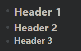
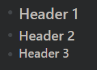
Same declaration can be added to headers to bring them under control as well (they are also 700 by default).
Before:image
After:–image

Some more selectors, for concepts and for general in-text bold, thanks to @TaQuangKhoi and to myself.

/* set the concept bold */
.concept_rem_type{
	font-weight: 600; /* default is 600  */
}
/* set the text bold to be as bold as the default concept bold */
.bold {
    font-weight: 600; /* default is 700 */
}

Another de-bolder, for bolded text in zoomed in rem.

/* less bold bold text in document title */
.document-title .bold {
    font-weight: 700; /* default is 850 */
}

Before:

After:

2 Likes

I have been using this snippet for a while and I found a problem when using Windowed Panes with hidden Sidebar…
.document-sidebar--collapsed--vertical is so long.

You will have trouble using these buttons when they are near the left margin of remnote
image
So I made it shorter

.document--ltr {
	padding-left:32.5px!important;
}
.document-sidebar--collapsed--vertical {
	height: 5%;
}
2 Likes

Sorry, could you expand a little? What’s the problem this is solving?

2 Likes

I’m both appreciative and confused. Could you show a before and after screenshot, illustrating the problem? The more of your screen captured, the better.

1 Like

Sorry about confusion, I have recorded a video and embed it to my previous post, you can watch it… This problem just happens when you hide the Sidebar and use Windowed Panes

1 Like

Seems like it might be worth reporting as a Windowed Panes-specific bug?

This bug only occurs when we use the code above that makes the space between the sidebar and the .document--ltr smaller. If you don’t use this code, RN works fine. . So, I don’t think it is a bug…

But I don’t know why this .document-sidebar--collapsed--vertical is so long. If you are in RemNote 1.3 or below, this class can be used for show the sidebar when we move the cursor near the left margin …

2 Likes

Ah, an oversight then. Still, might be worth telling the team to remove the unused stuff to avoid it causing problems in edge cases like this one.

2 Likes

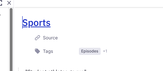
Is there a way to reduce this space? (Between title and Source and Tags). Also, what is the :hover for the “Show Source”? I never know where to click, so I have to wave the mouse around. It’s one thing I would like visible, if possible. Thanks!

3 Likes

Updated the OP with a new snippet for space between a bullet and its rem text and made it into an actual wiki. Contributors welcome!

1 Like

same concern here because I’m printing my notes on notebook paper and that’s a lot of space wasted :frowning:

I tried to update this wiki in the Requests section, and to add a section “Make elements more prominent”. I hope I didn’t mess up anything! I might suggest renaming this page to be more general, "CSS snippets to adjust compactness and minimalness: :smiley:

2 Likes

Edited the edits, renamed the topic. Please don’t add stuff that doesn’t have to do with the goals: Hannes’ kanban is an additional feature.

1 Like