WIP: Table Layout

A first step towards Table / spreadsheet functionality.

For me personally this would be enough as far as tables go. Databases like Notion or speadsheets like Excel are certainly powerful, but there is a reason those apps have hundreds of developers implementing only this. Data aggregation can (and should?) be done with queries. You could even argue that this is how it should be: Each cell is a single rem which can be referenced separately (as opposed to having the whole table in one rem).

The only thing missing for RemNote (AFAIK this is the same power level as roam tables?) is more powerful flash card generation. This could be done with more powerful flashcard generation (similar to #Extra Card Detail) or using Queue Plugins in the future.

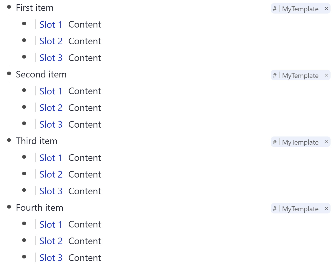
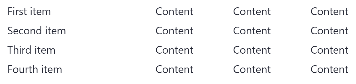
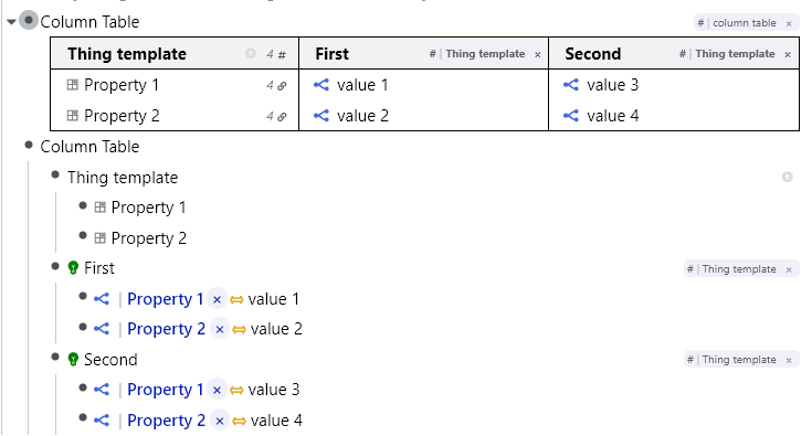
How it looks at the moment

Rendered Table and corresponding rem:

Generated flash cards for a cell
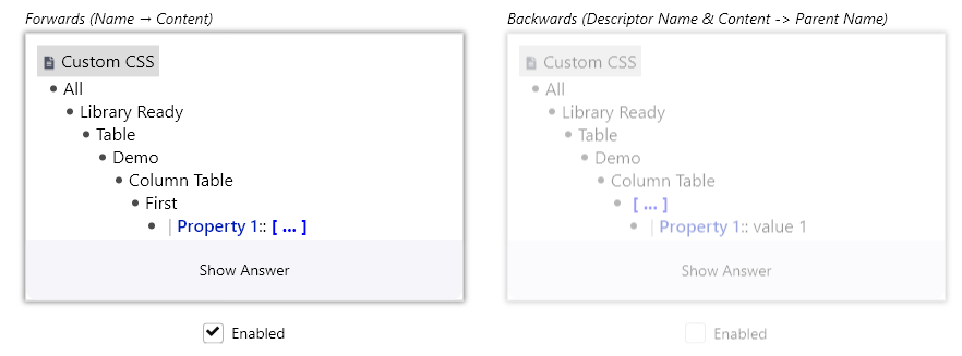
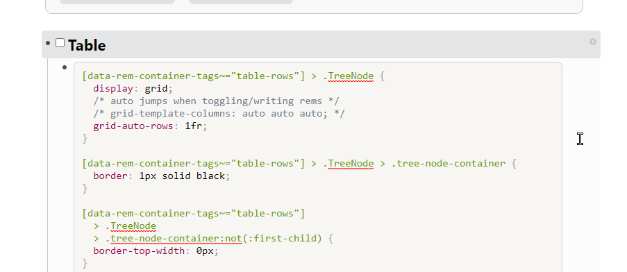
CSS

See What is Custom CSS and how do I use it?

This is not yet polished enough to put on the Library but since many people asking for table visuals I’ll put the CSS here anyway. Maybe someone else can even improve the code :smiley:

.tree-node-container[data-rem-container-tags~=column-table] > .TreeNode > .tree-node-container {
  border: 1px solid black;
}

/* fix collapsing borders */
.tree-node-container[data-rem-container-tags~=column-table] > .TreeNode > .tree-node-container:nth-child(n+2) {
  border-left: unset;
  margin-left: -1px;
}

/* remove indentation marker */
.tree-node-container[data-rem-container-tags~=column-table] .TreeNode {
  border-left: unset !important;
}

.tree-node-container[data-rem-container-tags~=column-table] > .TreeNode > .tree-node-container > div:first-child {
  border-bottom: 1px solid black;
  font-weight: bold;
  background-color: rgba(0,0,0,0.05);
}

.tree-node-container[data-rem-container-tags~=column-table] > .TreeNode > .tree-node-container > .TreeNode > .tree-node-container > div:first-child:not(:focus-within) .descriptor_rem_type,
.tree-node-container[data-rem-container-tags~=column-table] > .TreeNode > .tree-node-container > .TreeNode > .tree-node-container > div:first-child:not(:focus-within) .separator-symbol {
  display: none;
}

#hierarchy-editor .tree-node-container[data-rem-container-tags~=column-table] > .TreeNode > .tree-node-container > .TreeNode {
  margin-left: 0;
  padding-left: 0;
}

.tree-node-container[data-rem-container-tags~=column-table] > .TreeNode:not(:hover) .rem-bullet__container {
  visibility: hidden;
}


.tree-node-container[data-rem-container-tags~=column-table] > .TreeNode {
  display: grid;
  /* auto jumps when toggling/writing rems */ 
  /* grid-template-columns: auto auto auto; */
  grid-auto-columns: 1fr;
}

.tree-node-container[data-rem-container-tags~=column-table] > .TreeNode > .tree-node-container:nth-of-type(1) {
  grid-column: 1;
}
.tree-node-container[data-rem-container-tags~=column-table] > .TreeNode > .tree-node-container:nth-of-type(2) {
  grid-column: 2;
}
.tree-node-container[data-rem-container-tags~=column-table] > .TreeNode > .tree-node-container:nth-of-type(3) {
  grid-column: 3;
}
.tree-node-container[data-rem-container-tags~=column-table] > .TreeNode > .tree-node-container:nth-of-type(4) {
  grid-column: 4;
}
.tree-node-container[data-rem-container-tags~=column-table] > .TreeNode > .tree-node-container:nth-of-type(5) {
  grid-column: 5;
}
.tree-node-container[data-rem-container-tags~=column-table] > .TreeNode > .tree-node-container:nth-of-type(6) {
  grid-column: 6;
}

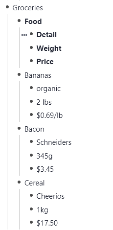
Content to generate the table

- Column Table   
    - Thing template
        - Property 1
        - Property 2
    - First
        - Property 1:: value 1
        - Property 2:: value 2
    - Second
        - Property 1:: value 3
        - Property 2:: value 4

Property 1 and Property 2 should/could be slots.

TODO

These things are unfinished in particular:

  • I did not explore all flashcard possibilities yet. E.g. it might be nice when practicing to have multilines as columns to practice a whole column in one go somehow.
  • Only multiple lines in a cell break the layout. This could be solved with row tables (fixed column width).
  • Maybe use flexbox instead of grid. (I had experimented with this when making the original demos and it is sometimes more better.)
  • (Option to) hide tags.
  • Style first column if it is the template (maybe use extra tag).
  • Make it easier to follow lines, e.g. alternate colors or borders.
  • Compatibility with bullet point changing CSS (tskn theme) and Rem Type and Practice Direction icons.
11 Likes

Thanks for working on this, as always!

Couple comments:

  1. At least to me, it’s much more common to need each row to be a Thing (ex. Countries), with columns being the attributes/properties (ex. Capital, Population, Area…). Would it be possible to invert if needed? Of course, I’d still want each Thing to be readable without the table tag, as an individual Rem with subRems (ie., the main Rem “UK”, with subRems “Capital: London”, “Population: 66M”, “Area: 242k”…).
  2. What happens if I change the order of subRems within a Thing (ex. move Property 1 under Property 2), or insert arbitrary subRems in random positions (ex. if I insert a normal text Rem between Property 1 and Property 2)? Does this mess up the table, or is the table grabbing only the Property X slots? This was my main concern with your first demo for the table - as useful as it is, the table doesn’t actually reflect the inherent structure of the data (I don’t think Rem ordering by itself is reliable for that, since it’s so easy to insert, remove and move them about), so it’s easy to make a mistake and everything becomes unaligned…
2 Likes

Yes. You might remember the grocery example in the original Table FR.

This is just CSS. Think of it as the column layout with borders. But this is just the same with a markdown table.

For the column table you can give the rows a fixed row height though, or a fixed column width for the row tables.
Or you assign different colors to each row (when editing) to make making mistakes harder.

2 Likes

Another way I was thinking, to partially avoid the issues I mentioned (ie., keeping things aligned) would be to add the Automatically Sort powerup to each Thing (alongside the Thing template). That way at least the order of the Property slots would be the same always (since the sorting is based on the slot names, rather than the content).

Of course, this is assuming that all Things have the same properties… And that no other sibling ends up mixed into them. So this solution might still be too unreliable for longer tables, at least for someone absent-minded like me… (in fact, the reason I want true tables in the first place is to help me make sure things stay structured :slight_smile: )

(By the way, I just realized that if you change a property name, the Automatically Sort powerup doesn’t act right away on the Rems that contains it. You need to click on the Rem to make it “wake up” and be re-sorted.).

PS: Sorry if this is a stupid question, but could you elaborate what this is in reference to?:

1 Like

Column table means children of the table rem are columns and their grandchildren are cells of the column (row table means they are rows …).
A cell has a width and a height. If you have too much text it gets expanded and pushes other cells away.
For column layouts you can set a fixed width but then longer text will result in heigher cells pushing all following cells down in that column only.
For row layouts this is more natural (since you need a somewhat fixed width anyway or else your text is always just one long line): An increased height affects all other cells on that row but none of the other rows (since they are contained in other rows).

2 Likes

I hope some developers gather around and make this thing as a finalized feature. I believe this is a very powerful feature and will take some time.

and thanks to @hannesfrank a lot to show the possibility in a workable and visual way :slight_smile:

2 Likes

@ognsya Here is the requested row table CSS:

CSS
[data-rem-container-tags~="table-rows"] > .TreeNode {
  display: grid;
  /* auto jumps when toggling/writing rems */
  /* grid-template-columns: auto auto auto; */
  grid-auto-rows: 1fr;
}

[data-rem-container-tags~="table-rows"] > .TreeNode > .tree-node-container {
  border: 1px solid black;
}

[data-rem-container-tags~="table-rows"]
  > .TreeNode
  > .tree-node-container:not(:first-child) {
  border-top-width: 0px;
}

/* remove indentation marker */
[data-rem-container-tags~="table-rows"] > .TreeNode {
  border-left: unset !important;
}

[data-rem-container-tags~="table-rows"]
  > .TreeNode
  > .tree-node-container
  > .TreeNode {
  margin-left: 0;
  padding-left: 0;
}

[data-rem-container-tags~="table-rows"]
  > .TreeNode:not(:hover)
  .rem-bullet__container {
  visibility: hidden;
}

[data-rem-container-tags~="table-rows"]
  > .TreeNode
  > .tree-node-container
  > :first-child {
  float: left;
  width: 100px;
}

[data-rem-container-tags~="table-rows"]
  > .TreeNode
  > .tree-node-container
  > .TreeNode {
  display: flex;
  flex-direction: row;
}

[data-rem-container-tags~="table-rows"]
  > .TreeNode
  > .tree-node-container
  > .TreeNode
  > .tree-node-container {
  flex: 1 1 0;
}

turning this:

image

into this:

6 Likes

Nice! Thank you for that.
It’s a great workaround while I don’t find a proper spreadsheet solution.
Especially since it allows me to just keep my Rems as they are.

PS: I changed this to:
grid-auto-rows: auto;
(intead of 1fr)

That way if a row needs to have more than 1 line, this doesn’t affect the others.
Let me know if you’d recommend against it!

1 Like

I did a couple more small modification to better support templates.

So this:

Can look like this:

Too bad changes in slot order in the template doesn’t affect instances - that would allow reordering columns easily.

2 Likes

Fantastic job, @hannesfrank! Thanks for sharing!

Sorry to bother you, but I tried using it, but my tables are not using the full available horizontal space; they are shrinked to the right; because of this, sometimes the lines break, and the lines get out of alignment. Also my left column does not have left border. Would you know what is causing it?

Wow, that looks interesting. Can you share the CSS for that - I’d love to give it a go.

Hi Hugo,

I use the table-rows version as it copes with row heights varying. Also I use the following css to make some nodes use the full available width.

/* ==================== Allow wide pages */
.tree-node-container[data-rem-container-tags~=wide]{
width: calc(100vw - 400px) !important;
margin-left: calc(-50vw + 600px) !important;
}

You can play with the pixel settings to suit your setup.

1 Like

I don’t think there is an easy, automatic fix for aligning row heights in the column version. You can only manually set the height of a specific row when you find it needs it with another tag.

For the missing first column, could it be that this is the hidden Alias child? In this case we came up with this workaround in Discord:


To hide a full subtree we need to target data-rem-container-tags instead of data-rem-tags like this:

[data-rem-container-tags~="column-table"] [data-rem-container-tags~="aliases"] {
   display : none;
}

But I think there is a bug with the data-rem-container-tags: The implicit tags (the ones which add the little x after references when they the last element on a rem) are not reflected there. This means you have to add #Aliases manually each time you want to hide.

Next problem: The code posted uses an explicit grid layout. Use this instead:

.tree-node-container[data-rem-container-tags~=column-table] > .TreeNode {
  display: grid; 
  grid-template-columns: repeat(auto-fit, minmax(100px, 1fr));
 }

Last problem: If you hide the first column the left border of the second column is gone. Removing the border-left: unset line altogether is the simplest way to fix this.

1 Like

Amazing! Worked perfectly! Thanks for sharing!

Thanks! Your tips solved the problem for me!

Mister, could you tell me how to make this CSS works? I tried to add it by Custom CSS page using a template and pasted the code on, but eventually it doesn’t work.

Tag a rem with “table rows”. Now its children should become rows (the cells of the first column actually) and its grandchildren the other cells of the row of their parents.

thank you man, it works ! And besides, I wonder if there any plan on adding attachment files ( not only PDF) feature?

I’m trying to get this work. But without any luck

I have added the CSS code by pasting it into a new blank CSS block.

But when I tag with “table rows” nothing happens.

Screenshot please! :slight_smile: Does your CSS contain data-rem-container-tags~="table-rows"? The CSS in the first post uses #column table.