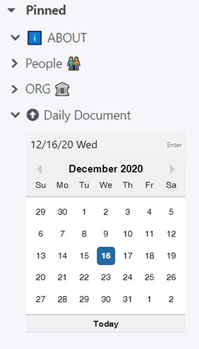
Has anyone tried using CSS to make sidebar children under Daily Documents more usable? It would be nice to be able to quickly click on a day in a calendar layout to either jump to that Daily Document (or create it if it doesn’t already exist). A calendar (like the RemNote !! calendar) that expanded under Daily Docs to show children like this would be great:
With perhaps the addition of arrows to quickly switch year, as in < 2020 >.
I was looking with great interest at @hannesfrank’s CSS for kanbans or columns (at 🎄 Advent Calendar: Every day a new Custom CSS Snippet). A table in a typical calendar layout where each day box held the contents (perhaps overflow collapsed) of that Daily Document would be very useful for me. Useful because I often access what I’m looking for by remembering the day I wrote it (hence easy access to the Daily Document) rather than a search or other context.

