Windowed Panes In Depth

I love the new lab feature “Windowed Panes”. It allows opening up even more references for the project I am working on.
The corresponding Feature Request is Arbitrary number of panes and the ability to arrange them freely, it has 20 upvotes.

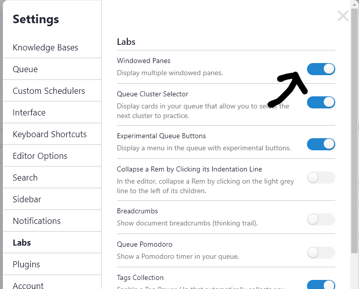
It is available in v1.3.8 and you can enable it Settings > Lab > Windowed Panes

In this topic I share a few more things I found out.

The JavaScript library used is react-mosaic. Here is a Demo of it. You can it has a nice flat styling and the toolbar can have a title, many buttons and even dropdown menus. I think the document menu could be integrated there to always be visible.

Pane Management

  • To split a pane use Shift + Click on a reference or Ctrl + Shift + P.
    • The first split is horizontal.
    • After that the split direction depends on the previous direction: If a pane is part of a horizontal pair, then it will split vertical and vice versa.
  • To rearrage panes drag the title bar. This way you can also form a column layout which is not possible with the default splitting behavior.
  • To resize panes drag the divider.
    • To enlarge a pane click the left toolbar button.

URL Format - Saving and Restoring Workspaces

Previously we had this URL format: https://remnote.io/document/LEFT_REM_ID/RIGHT_REM_ID specifying the opened rem id of the left and right pane.

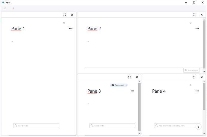
The new pane layout also has an URL format! E.g. this is the URL for the screenshot above:

https://www.remnote.io/d/(REM_ID_1)_((REM_ID_2)-((REM_ID_3)_(REM_ID_4)_50)-50)_50
  • A horizontal split has the form: (LEFT)_(RIGHT)_LEFTWIDTH where LEFT and RIGHT are rem IDs and LEFTWIDTH is the percentage of horizontal space the left pane occupies.
  • A vertical split has the form: (TOP)-(BOTTOM)-TOPWIDTH which is analogous to the horizontal form except it uses dashes instead of underscores.

These can be nested to specify arbitrary layouts.

Like previously the URLs are used to make the Forward/Backward navigation possible.

In the web app you can bookmark it to save a workspace! The link can also be pasted into RemNote and clicking it restores the workspace directly.
This does not work in the Desktop App yet.

Styling

Understandably the visuals of a lab feature are not polished yet. But on the demo above you can see how it can look in the end. All windowing buttons have CSS classes you can target.

Here some CSS for a flat style similar to the demo:

image

CSS
.mosaic-window-toolbar {}

.mosaic-window-toolbar .mosaic-window-title {}
.mosaic-window-toolbar .mosaic-window-controls {} 
 
.mosaic-default-control {
  color: #738694;
  background: none;
  display: -webkit-inline-box;
  display: inline-flex;
  -webkit-box-orient: horizontal;
  -webkit-box-direction: normal;
  flex-direction: row;
  -webkit-box-align: center;
  align-items: center;
  border: none;
  cursor: pointer;
  font-size: 14px;
  -webkit-box-pack: center;
  justify-content: center;
  padding: 5px 10px;
  text-align: left;
  vertical-align: middle;
  min-height: 30px;
  min-width: 30px;
}

.mosaic-default-control:hover {
  background: rgba(167,182,194,.3);
}
.mosaic-default-control:active {
  background: rgba(115,134,148,.3);
}

TODO

A few things have to still be implemented for this to become the default:

14 Likes

Any way to measure performance of many panes in the same tab vs many tabs of single panes? Doesn’t have to be too exact, just curious.

I’m so excited about this. I just figured out a workflow for me using the split window view that existed prior, and then today I go to log in and now this feature is here. I’ve been waiting and wondering, and now I’m just ready.

3 Likes

We’ve intentionally kept this feature in labs to get feedback on it, so we’ll be closely reading things here! Thanks for documenting this for us, @hannesfrank :wink: .

We definitely want to enable workspace saving. I like the “bookmarking to save a workspace” trick, and we additionally want to enable this in-app.

Performance with multiple tabs should roughly scale with the total # of bullet points, in a similar way that it does for normally documents.

We’re not 100% satisfied with the current interactions around creating new tabs, rescaling things, or moving things around, so please let us know if you all have any ideas there!

8 Likes

A possible idea for the desktop app regarding multiple workspaces with the multiple panes

If we had a tab option would be nice as we could pop between work spaces

Just a thought

2 Likes

Looks great. Once it leaves Lab, will this feature be pro-only, or will it be for everyone?

@hannesfrank thanks for pointing this out, so cool :smiley:

1 Like

Here’s a very minimalist CSS for the UI, in case anyone is interested (adjust values accordingly).
I also included some of @hannesfrank’s CSS.

.mosaic-window-toolbar.draggable,
.mosaic-preview .mosaic-window-toolbar, .mosaic-window .mosaic-window-toolbar
{
height: 15px;
}

i.icon.close,
i.icon.expand {
width: 2px;
font-size: 0.7em;
vertical-align: top;
}

.mosaic.mosaic-blueprint-theme .mosaic-preview .mosaic-window-toolbar, .mosaic.mosaic-blueprint-theme .mosaic-window .mosaic-window-toolbar {
    box-shadow: 0 0px 0px;     }

.mosaic-tile {
margin: 0.2px;
}

.mosaic-default-control {
  color: #738694;
  background: none;
  display: -webkit-inline-box;
  display: inline-flex;
  -webkit-box-orient: horizontal;
  -webkit-box-direction: normal;
  flex-direction: row;
  -webkit-box-align: center;
  align-items: center;
  border: none;
  cursor: pointer;
  font-size: 14px;
  -webkit-box-pack: center;
  justify-content: center;
  text-align: left;
  vertical-align: middle;
}

Edit: You can also make the scrollbars more minimalist with something like this

   div::-webkit-scrollbar {
        width: 12px !important;
        height: 2px !important;
    }
    div::-webkit-scrollbar-track {
        background-color: transparent !important;     
    }
    div::-webkit-scrollbar-thumb {
        background-color: rgba(200, 200, 200, .3) !important;
        border-radius: 10px!important;
    }
    div::-webkit-scrollbar-thumb:hover {
        box-shadow: 0px 0px 4px 1px rgba(200, 200, 200, .6) inset;  
    }
3 Likes

How does the Ctl+Shf+P shortcut work? When I do this I just get the search popup (Windows desktop).
Shf+click works fine, looks great.

It should be the exact same popup as just Ctrl+P. Just type the name and click/press enter on any rem to open it in a new pane.

1 Like

This is what I was expecting. They have implemented it really soon. Thanks for pointing this out.

Ah, ok, thanks. Somehow I thought Ctl+Shf+P would open the rem my cursor was currently on in a new window.

1 Like

You may shift-click the rem’s bullet for that.

2 Likes

is it possible to drag a pane so that:

  1. it replaces another existing pane? (holding a key for example)
  2. it replaces a group of existing panes? (like hovering over the limit of two panes)

Personally, I think sliding panels is a good idea. Since you do not need to resize it. After resizing, one panel will become too small to read. However, people can not focus on multiple panels at the same time by nature. So sliding panels please…

3 Likes

It would be amazing if this workspaces feature were available in desktop (as opposed to just web with bookmarks) :slight_smile:

2 Likes

I’d really like a close pane shortcut asap. =)

2 Likes